The independent creative agency Niedermeier Design, headed by Kurt Niedermeier, recently worked on the visual identity of a very interesting brand – TVM Con.
In short, it’s a conference held annually for a narrow target audience. Since TVM stands for “tensor virtual machine,” it is already clear that engineers, technologists, researchers, and practitioners who have dealt with this mechanism and the field of machine learning are interested in it. In short, it is a deep learning platform with source code. It reduces or bridges the gap between machine learning models and their production output.
New research, advances, and current engineering issues are all major areas and interests of the conference. Through the combined efforts of scientists and users, the boundaries of the use of TVM software developments are being expanded, and the efficiency and productivity of machine learning are increasing.
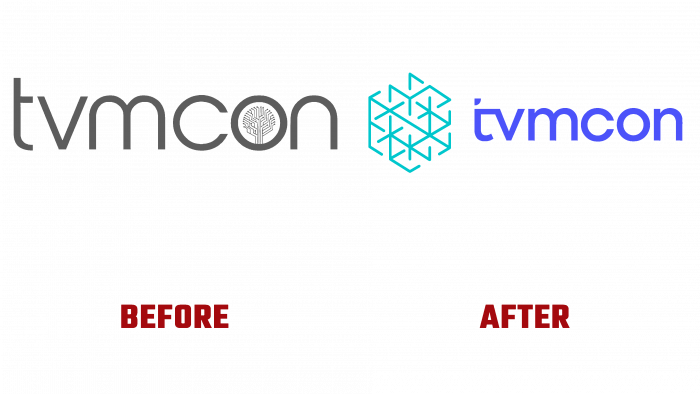
The logo that originally represented the conference emphasizes the subtle letter lines in dark gray, shows a neural tree inside the letter O. Below the conference name, the date is 2021.
A sad, boring, uninteresting ordinal logo with a claim to a twist.
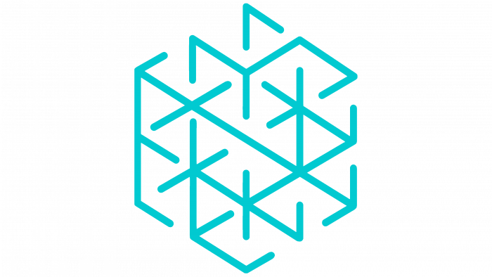
The new logo pays attention to the selection of color and different kinds of visual imagery. First, there is a distinctive and self-sufficient icon. It looks like a labyrinth, a connection, a snowflake, and is a hexagon with thin turquoise lines connected inside. Next to it is a blue inscription – the name of the conference. The letter T is the highlight in the font design. Its upper part has a beveled corner, and the lintel with the letter V has a gap in the corner as if part of the letter was cut out.
The new logo looks confident and creative. This design style and the overall identity with its bright blue and green hues set a certain tone for the brand.
Confidence that the new conference will be a success is evident at a glance from the logo. The new identity looks organic, knowing the specialization of the event and its target audience.


