Using advanced data capture technology, U Group, an Australian market research and data company, helps brands understand customer behavior. Established in 2016, U Group works with clients like Unilever, Dove, Nestle, and Ben & Jerry’s by transforming raw data from online and offline receipts into valuable insights.
Recently, U Group introduced a new brand identity designed by For The People. This change reflects the company’s shift in visual representation and highlights its human-centric approach to data.
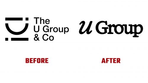
The old logo prominently displayed the letter “U,” but its design was somewhat confusing, with ambiguous lines and dots that might have represented binary or Morse code. The overall look was serviceable but lacked clarity. The new logo moves to a serif typeface and a more organic design, featuring a tactile ink-bleed effect. This softer aesthetic contrasts with the typical rigid and sterile designs in the data and tech industries. The tight typesetting creates a cohesive and visually engaging mark.
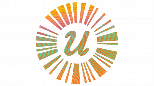
A key element of the new identity is the monogram surrounded by a barcode, which can be enhanced with a holographic security pattern. Combining the italic, gooey “U” with the sharp, circular barcode mimics security features found on passports or banknotes, reinforcing themes of security and authenticity.
U Group’s new slogan, “People Before Data,” encapsulates its human-first perspective. This approach influences every aspect of U Group’s operations, from data points and conversations to graphs and analytics.
The new brand identity draws inspiration from identification, authentication, and security. The logo, based on a functional Code-128 barcode, symbolizes holographic certification. The ink-bleed effect in the wordmark provides a softer contrast to typical industry visuals—a punch-card graphic device anchors imagery and text.
The color palette balances professionalism and approachability. Primary colors are muted tones that evoke reliability and trust, while secondary colors are brighter to highlight key elements. The custom typeface, designed by Dalton Maag, features flowing lines and hidden smiles, adding personality and referencing drops of liquid, aligning with the human-centric theme.
The new branding is versatile, with the monogram and barcode elements used across digital interfaces and printed materials. The holographic pattern adds sophistication and security, reinforcing the company’s commitment to data integrity and authenticity.


