Education is like gold against ignorance. The university’s emblem indicates the desire for discovery, knowledge of the universe, and everything unexplored. The UCF logo is a prototype of books, the pages of which give access to secret knowledge.
UCF: Brand overview
| Founded: | June 10, 1963 |
| Headquarters: | Orlando, Florida, United States |
| Website: | ucf.edu |
Meaning and History
After the solemn speech of John F. Kennedy, which was delivered in 1962, a serious rise in the field of space technology began. The fact is that the president set the country to complete a flight to the moon by the end of the decade. As a result, the importance of space exploration for central Florida increased significantly since it was located near Cape Canaveral. At that time, prominent representatives of the local population and political leaders raised the issue of expanding access to higher education in the Space Coast zone with the Florida State Legislature.
As a result, in the summer of 1963, Senator William A. Shands and Senator Beth Johnson promoted the passage of an executive order, and Governor Farris Bryant signed it. The bill authorized the Florida Board of Regents to establish a university in East Central Florida that trains personnel to support and advance the space industry. The basic emphasis was to be placed on engineering and other technological specialties.
Then, for $500,000, a 1,000-acre site was purchased in remote pastures and forests of Orlando to construct buildings. Another 227 acres were donated by the local population, also raising more than $1 million to purchase the needed land. In 1965, the Board of Regents approved Charles Millican as the university’s first president. This person played a very important role in the emergence of the university’s identity and in the launch of the educational process, which did not begin until 1968, since buildings were being built before that time.
After speaking with a group of citizens, Millican said that the educational institution would be called Florida Technological University. He also designed and designed the institution’s hallmark, drafted the motto, chose the official colors, conceived the concept, unveiled the mascot, created the original campus layout, and, with Governor Claude Kirk, laid the foundation stone for the future of UCF. In the first year, 1948, students entered the university. They were educated in 55 programs. And now it has grown to an incredible size.
For the role of the university mascot, Charles Millican proposed Citronaut – an image combined from orange and an astronaut (after the name of the district where the university is located). But he did not take root, being unclaimed. Therefore, in 1969, it was announced that new options for the role of a mascot were being put forward. The search went on for over a year. They ended in 1970 when nurse Judy Hines suggested using Vincent the Vulture, which was an unofficial sign. In 1971, the students chose and approved the sports teams’ mascot. They became the Knight of Pegasus (Knightro). In total, there were several emblems in the history of the university.
Old
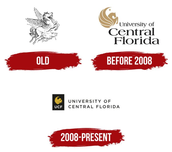
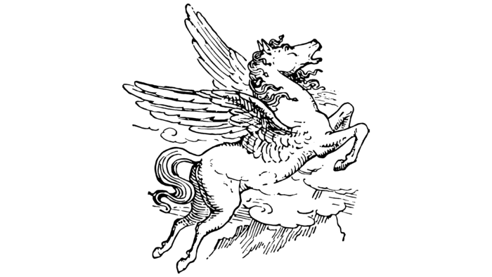
The debut emblem features a winged horse from ancient Greek mythology – Pegasus. He was chosen for the possibility of reaching limitless heights, to which the path is open only to those who have wings behind their backs, that is, determination, hope, and faith in their strengths. This is how he earned his place in the galaxy of bright stars. The university identifies itself with just such a character – who will certainly get his corner of glory in the starry sky.
The presentation of the logo took place in the spring of 1968. Designed by Norman Van Meter and Jim Shattuck, Charles Millican introduced it. The figure shows a horse soaring among the clouds, easily jumping over obstacles. The wings of Pegasus are spread wide and raised; the front legs are bent, the hind legs are extended. This posture speaks of a powerful jump. The emblem is made with thin strokes and includes only black and white colors.
Before 2008
The modern identification mark was adopted in 2008, and until that time, a golden-black logo on a white background was used. It consists of two equivalent elements. The text part is made in the Gotham family font, so the letters are squat, rounded, with short and sharp serifs. To the top left of the university’s name is a miniature Pegasus icon. But the horse is no longer realistic, as in the first case, but schematic. The wings are unrolled and culminate in a small star with four rays.
2008 – today
The changes affected the design of the emblem and a slight rearrangement of elements. The round Pegasus badge is painted in deep yellow, placed in a black rectangle, and supplemented with the abbreviation “UCF” at the bottom. Its decoding is located on the right. It stands for “University of Central Florida.” The inscription is in a thin, sans-serif typeface in the upper case. It occupies not three lines, as before, but only two.
Central Florida Knights Logo
The sports department of the UCF is abbreviated as the Knights. Its member teams compete at the NCAA Division I level and are members of the American Athletic Conference. An anthropomorphic mascot was approved at a student meeting in 1970 and began to be used as an official logo only in 1996, replacing Citronaut and Vincent the Vulture. The varsity team was renamed the Knights of Pegasus but was often referred to as the Golden Knights due to the corporate color.
1996 – 2006
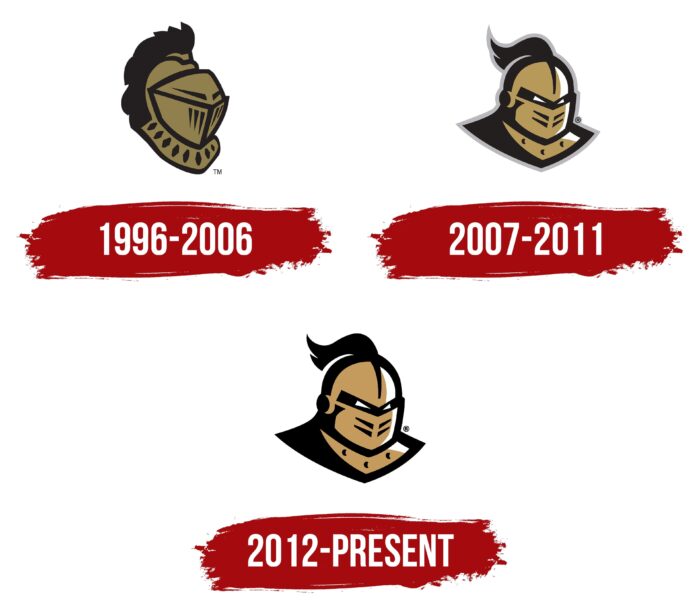
The logo shows a knight in a helmet with a closed visor. Behind, you can see a fluffy and long feather, which begins at the top of the head. The emblem is made only in two colors – in gold and black. The first is the fill; the second indicates the contours of the parts.
2007 – 2011
The developers have added a frightening look to the knight, so white triangular eyes are visible through the thin slots on the helmet. In addition, the altered form took away the rest of the Knight’s attributes; the Knights were then more like a robot. The edging lines have become much wider, and a massive shadow has appeared on the left. For balance, on the right side of the helmet, the designers added a light glare – as if from a nearby light source.
2012 – today
After the redesign, a bright golden hue appeared on the logo. Also, the gray outline around the knight’s head has disappeared.
Font and Colors
The academic and sports identities of the university do not coincide at all. The only thing they have in common is the golden color. The logo of the university teams also lacks the text part, which is the basis for the university-wide symbols.
UCF’s main typeface is Gotham and Chronicle. The varsity palette consists of black and Hex FF C904 metallic gold.
UCF color codes
| Tangerine Yellow | Hex color: | #ffc904 |
|---|---|---|
| RGB: | 255 201 4 | |
| CMYK: | 0 21 98 0 | |
| Pantone: | PMS 7549 C |
| Black | Hex color: | #000000 |
|---|---|---|
| RGB: | 0 0 0 | |
| CMYK: | 0 0 0 100 | |
| Pantone: | PMS Process Black C |

