


![]() UDC Logo PNG
UDC Logo PNG
The emerging University of La Coruña features a UDC logo that reflects the institution’s bright, distinctive character. It is characterized by demonstrating historical continuity. The design and graphics symbolize the brand’s orientation to serve as a guiding light of knowledge in the twilight of ignorance.
Universidade da Coruña was created on July 20, 1989, when Galicia adopted Law 11/1989 to reorganize its university system. Before that, local students relied on campuses affiliated with the Universidad de Santiago de Compostela, founded in 1495.
The reform split the system into three independent institutions: UDC, Universidade de Vigo, and a restructured Universidad de Santiago de Compostela. UDC united existing academic centers in A Coruña and Ferrol.
Ferrol shaped the university’s technical profile. In the early 1960s, a School of Naval and Industrial Engineering operated under the Ministry of Education. In 1990, it was integrated into UDC, establishing marine and ocean engineering as a core field tied to the region’s port and shipbuilding background.
On February 4, 1992, the founding senate approved the university statutes, published on September 17, 1992. From that point, UDC operated with full institutional autonomy. Its structure is centered on campuses in A Coruña, across Elviña, Zapateira, and Oza, and in Ferrol.
From the start, UDC competed with Universidad de Santiago de Compostela and Universidade de Vigo, focusing on engineering, IT, and applied sciences.
In 2007, the university adopted a language policy to expand the use of Galician in teaching, following a 2005 study that found it was used only to a limited extent. It introduced requirements for faculty hiring and curriculum changes.
Research capacity grew through centers such as CITENI in Ferrol and INIBIC in A Coruña. UDC joined Erasmus+ and international networks, and in the QS World University Rankings 2026, it was placed in the 1001–1200 group.
Meaning and History
![]()
The logo reflects the distinctive features of the educational institution that are very important to the local community. The debut version was used until 1999, after which it was replaced with updated symbolism. The logo was developed from the previous one and is its graphic continuation, emphasizing continuity. But the original version is not written off – it is used to this day. It is intended for special occasions and holidays and is also preserved on diplomas, university pennants, badges, and flags.
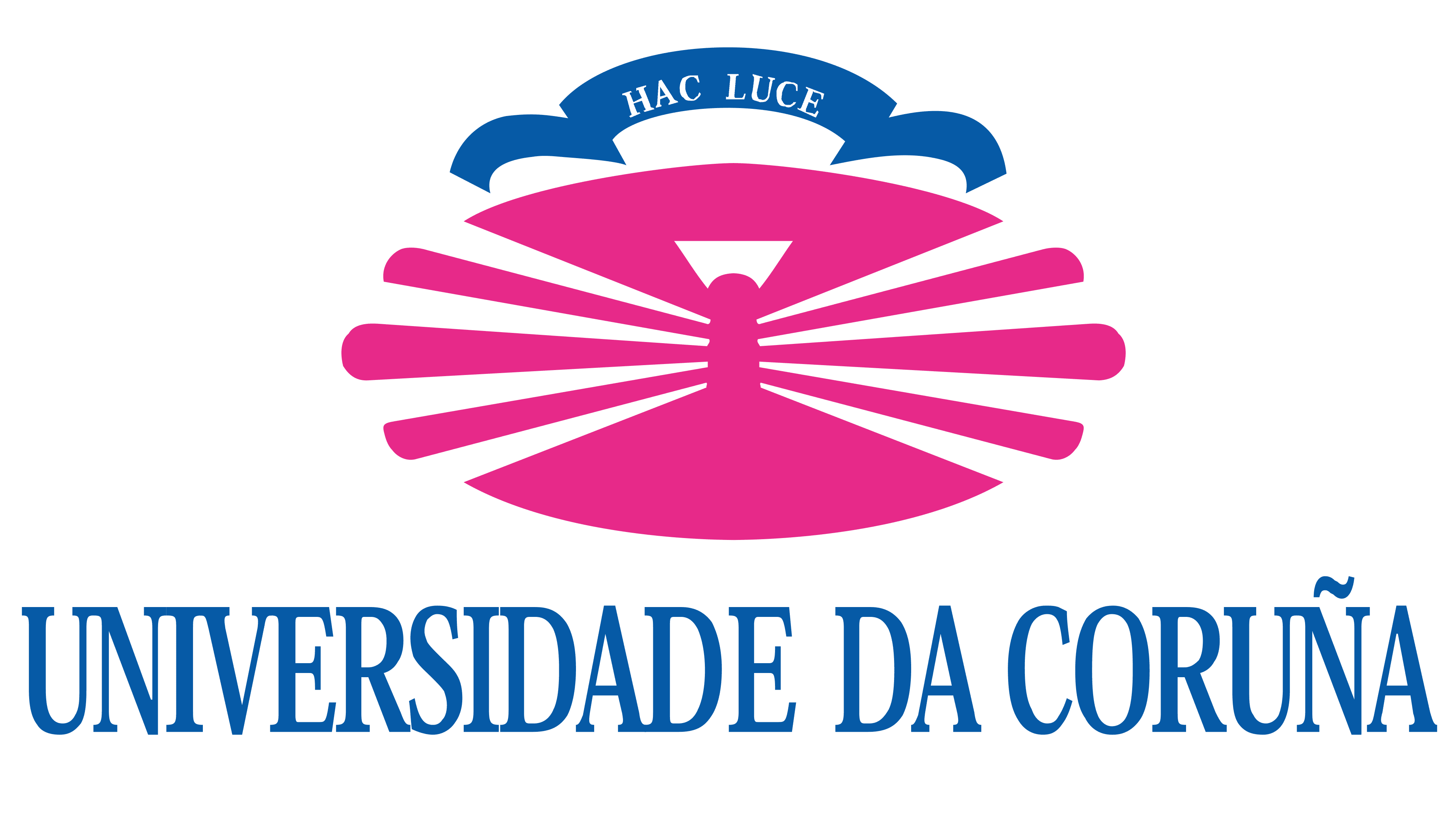
The UDC logo, which appeared after the redesign, echoes the debut. It depicts a lighthouse with rays diverging to the sides: four narrow ones on the left and right, plus one wide one on top. Above the composition is a ribbon bearing the motto “Hac Luce,” meaning “With this light.” At the bottom is the university’s full name. The lighthouse and the surrounding space (it’s oval) are purple; the light is white, and the ribbon and the inscription are blue.
What is UDC?
UDC is the University of A Coruña in the autonomous community of Galicia, Spain. The history of this university began in 1989, when two campuses of the University of Santiago de Compostela decided to separate from the university and become independent educational institutions. UDC attracts students with a wide selection of educational programs across several faculties. Mathematics, physics, computer science, medicine, philology, engineering, law, and architecture are just a small part of the available specialties.
![]()
This logo was used until 2008, when the updated symbolism was introduced. Its key element was the university’s name, “Universidade da Coruña.” It is written in a large sans-serif font in uppercase. The spacing between the letters is much wider than in the previous version, making the logo easier to read.
The design of the graphic sign was radically changed. The tower was removed, leaving only the rays diverging to the sides, piercing the darkness. But their number has been reduced: now there are three rays on each side, and they converge in the center of the ellipse. According to the developers’ idea, this version is a minimalist reflection of the previous one, emphasizing Galicia’s traditions.
Font and Colors
The tower, used as the central element, has a real prototype. It’s the oldest architectural monument in Europe, the functioning lighthouse Torre de Hercules. It is located in the north of La Coruña. It is not only a local but also a global attraction, dating back to the Roman Empire. Therefore, the university administration draws parallels with the region’s history, remaining true to its native roots.
The emblem is presented in several color variants. The main one is purple (fuchsia), and the additional ones are white, dark blue, and black. There is also a monochrome logo. It is intended for use in business papers, print media, and colorless publications.
![]()
Another variant lists the faculties, institutes, and vice-chancellors. It is gray. It is used in official documents. The font used for the inscriptions and the university’s name in both the old and new designs is Arial, Helvetica, or its free-distribution analog.