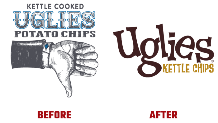
Beloved by many Americans, the national potato chip brand, Uglies Kettle Chips, has undergone a long-overdue rebranding this year. Delicious, cauldron-cooked Uglies chips, made from selected potatoes, have finally acquired a package appearance and corporate identity worthy of their quality and taste. With a delicious crunch, nice dark color, and brown edge, this favorite product of all began to look tasty. Phoenixville, PA-based Virtual Farm Creative has applied all of its professionalism to make the look and feel of the brand fully match the taste of the product itself. Due to the unsuccessful image decision of the past years, many true chips lovers lost a lot by ignoring the manufacturer’s unattractively designed offer. Today this gap is filled. The new visual identity is attractive and tempting but fully reflects the features of the product, its appearance, and taste, causing a real appetite in the audience.
Created by the VFC studio, the new logo is playful and has an attractive character designed with soul. And this despite his “ugliness.” A cheerful and funny chip named Uglie, never losing his composure, cheerfully meeting any situation, became the missing element for the brand, which united all lovers of real goodies around the product. The logo emphasized the “ugly” yet appealing aesthetic of the brand’s visual design and packaging, which was enhanced with a wry wordmark. The designers have applied a spectacular professional move by applying the most stylish typeface from the 90s family called Rat Fink from House Industries. The Roman typeface is used throughout the company’s visual identity. The created talisman has an amazing vitality, a pronounced individuality, even real courage, somewhat reminiscent of western heroes of the 90s. Radiating incredible energy, this character, together with a bright and varied color palette applied on the packaging, covering a wide range of tastes of these products, creates an indescribable feeling of eating crispy, fragrant, and very tasty chips.
And all this goes through the self-affirming almost serious white and gold color of the text name of the brand, which jokingly “flirts” with every future buyer of Uglies Kettle Chips.
