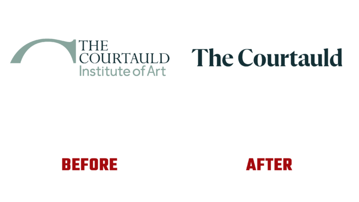
Located in the heart of London, the Courtauld Gallery decided to change its visual identity. The revision of one’s goals in the new modern conditions the setting of the main task – to make art accessible to everyone, became the reason for changing one’s visualization. This decision was also influenced by an important feature of the gallery – its belonging to an educational institution – the college of the University of London, which specializes in studying art history. The desire to convey to the masses the acquired knowledge, to arouse a deep interest in art itself, as such, required changes in the very presentation of the brand. His commitment to the philosophy of One Courtauld was reflected in the repositioning of the gallery itself and its website. Considering that the museum solves two main tasks – providing education and an informative visit, the designers of Spy Studio carried out a complete immersion in the world of art in which the Courtauld Gallery lives and works.
This separation of the directions of one institution has led to some historical confusion in the definition of one brand. The changes were supposed to solve this problem by bringing everything into one identity while working out the visual space so that it would help its owner stand out favorably. The new logo is a wordmark that is clearly defined in its own graphic space. The style successfully resonates with the image of a sandstone structure, and the letters themselves resemble their handwritten execution. In this way, the atmosphere of the intersection and overlapping of history with a contemporary reflection of art was accurately conveyed. To provide a contrasting accent in writing the logo, a font like GT America was used. The use of a condensed style and boldness in the use of sizes ensured the practicality of transferring academic titles. At the same time, this typeface is very well transmitted, both when using typography and digitally.
A well-thought-out color palette also provides a high-quality visual and informational transmission of the main concept of the brand. It has become the most important element in conveying the features and individuality of the museum. A large selection of vibrant color hues and solutions creates a cohesive and harmonious color space that works well with images of a new identity. In turn, this decision contributes to the required maximum impact on the viewer. It was color that managed to solve the problem of mixing directions, creating an atmosphere of their unity, focusing on the individual characteristics of each of them.


