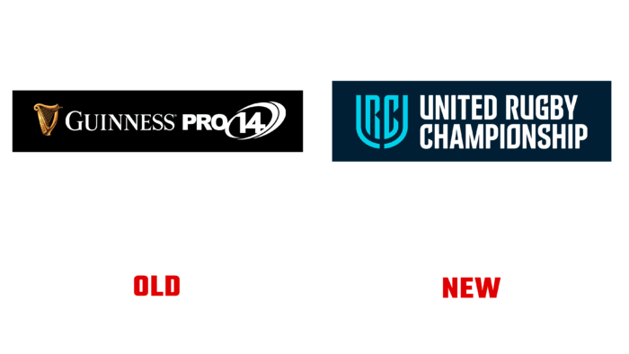
 The PRO14 brand has been surprising the public since 1999. It is a rugby tournament held annually among professional teams in Italy, Scotland, Ireland, Wales, and even South Africa. Not so long ago, the organization announced a name change. The United Rugby Championship will see the light of day in September 2021 when the 2021-2022 game season kicks off.
Many teams are expected to participate, including Cell C Sharks, DHL Stormers, Emirates Lions, and Vodacom Bulls. A large-scale merger with Guinness PRO14 is planned to unite 16 major teams into one rugby league in the northern and southern hemispheres. The implementation of the new identity of the championship belongs to the London company “Thisaway.”
You can see that there are striking differences in the approach of the creators of the brand. London visual designers decided to move away from the traditional image of swords, direction arrows, rings. Now the brand is bright, catchy, monolithic, indestructible. This is not just a logo; it is a reflection of the wedded credo. The graphic monogram of the letter U-R-C, the association with the shield, makes the logo impressive and solid. This is an open statement to future partners that the brand is ready for dialogue and, at the same time, knows what it wants and how to achieve it. The typeface and shield simplify the presentation of the brand’s values and mission, making it clear that working with it contributes to a mutually beneficial exchange of experience. The removal of the sponsor’s logo gave a lot of freedom and space to the brand; the pointed letters and bold tone in the font indicate the character of the sport being represented. The logo can be divided into two opposite equal parts, but still, they stick together. The shield and words of the United Rugby Championship are compositionally competently and seamlessly combined, without mixing elements for perception.
Following the logo, three concept fonts were developed for different purposes: URC Sans is the main font for titles. At the same time, URC Hand, dynamic and energetic, add speed and lightness to the main font. And finally, the third – URC United – a combination of URC Sans and Hand elements. It generalizes, creates a picture of integrity and inseparability. The idea of embracing the versatility very well reflects the idea of the upcoming event to create a multinational league of rugby teams.


