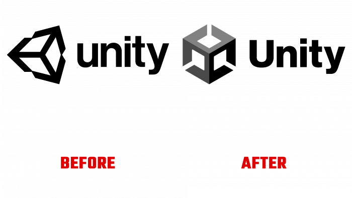
This fall, for everyone to see the world, Unity Technologies unveiled its new 3D logo, both for the company itself and the Unity game engine. More than 17 years ago, the Unity platform was created by the American company Unity Technologies. It was released in 2005 at the Worldwide Developers Conference. To this day, it does not stop developing and expanding. As a cross-platform environment for developing computer games, Unity opens up the most unexpected solutions for designers. Their search, acquisition of skills, and desire to get the best result have made the platform one of the best in the world for real-time software development. Today it consists of more than 50 products of a wide range in various fields. Unity brings real benefits to a visual rendering environment across platforms and modular components. With its help, thousands of the most popular games have been written today, a wide variety of mathematical models have been created and visualized. Its advantages have been appreciated not only by leading and largest developers but also by independent studios.
Today, the platform is experiencing another birth, updating its visual “wardrobe.” A new image, a logo – everything aims to create an identity that will help you immediately break into the market without unnecessary preparation. The sign developed by the designers – a cube – has no fixed boundaries. This corresponds to the project’s structure, which is divided into several levels – separate files, where certain worlds are located with their full set of characteristic markers, determinants, settings, etc. The cube becomes that defining accent element that characterizes the essence of the new logo – each side is unique. But this is the side of this very same cube. These are bricks and platforms, levels and puzzles, crystal lattices, and much more, including the periodic table of Mendeleev.
The cube, made in steel-gray color, reminiscent of anchors or rays in shape, symbolizes the base on which everything should be fastened and around should “revolve,” as well as limitless possibilities, unlimited by nothing. Next to the sign – on the right, along with the height of the cube face, there is an inscription of the platform name. The first lowercase letter, “U,” does not go beyond the three-dimensional character. All text is in black, which makes it especially easy to read the name on any of the packages and directly on digital media. At the same time, the volume has significantly improved the memorability of the logo, its recognition, and its impact on visual perception.


