The Unity logo shows that collaboration is only successful when all team members complement each other. The “team” in the case of the Unity ecosystem is the software tools that help develop computer games.
Unity: Brand overview
| Founded: | 2004 |
| Founder: | David Helgason, Nicholas Francis, Joachim Ante |
| Headquarters: | San Francisco, U.S. |
| Website: | unity.com |
Unity Technologies is an American company that has influenced the gaming industry today. After an unsuccessful attempt to create the action game GooBall (or rather, after its commercial failure), it realized that its vocation was not to develop video games but to offer other specialists effective tools. One of them was a cross-platform engine, which is used not only in game development but also in other industries: military, construction, engineering, architecture, automobile industry, and film industry. Unity Technologies and its product Unity have only one logo. The overall visual identity reinforces the brand’s presence.
Unity Software Inc. wasn’t always called that. It was launched in 2004 as Over the Edge Entertainment and didn’t rebrand until 2007. Then it was renamed to signify a change of business. The fact is that the developer’s first project was a video game GooBall, which was unsuccessful in every respect. After the crushing failure, the three founders of OTEE decided to focus on the tools that help professionals produce interactive content. In 2007 they found their target audience: the creators of mobile games for the newly appeared iPhone. Thus began a new era in the development of game technology.
With time Unity became available for other devices, so by 2012, the number of engine users grew to 1 million. Its popularity is explained by its simplicity: even those who lack practical experience in game design can manage this programming environment. Moreover, in the 2010s, the platform became famous outside the gaming industry. For example, automakers began using it to test cars in virtual reality.
Meaning and History
Given the growing popularity of Unity Technologies, this company needed a memorable brand identity. Part of it is a verbal trademark accentuating the brand name. The second component is the iconic logo, which has remained in its original form since 2007. All attempts to change the design have come down to minor adjustments to the length, thickness, and color of the lines. The software developer is aware of the value of visual identity and wants it always to remain recognizable.
What is Unity?
Unity Technologies is the brand name of Unity Software Inc. It is a developer of software for creating interactive 2D and 3D content. The company should not be confused with its production of the same name – the cross-platform game engine Unity.
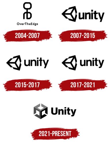
2004 – 2007
The launch of Over the Edge Entertainment was accompanied by the creation of a logo with the name of this company. So in 2004, a graphic symbol appeared, which contained a white inscription “OverTheEdge” without spaces between the words. For the design, the designers chose a simple, thin font without serifs. Above the text was the same white monogram in the form of linked letters “o” and “e.” They were turned 90 degrees downward and resembled a little man. The middle stroke of the “e” served as the torso, the sidelines looked like bent arms, and the “o” acted as the head. Both the inscription and the monogram were located inside a black square.
2007 – 2015
The Unity game engine created by OTEE proved so popular that the company decided to change its name to be associated with its core product. This was reflected accordingly in the logo: its key element was the word “unity,” written in a font similar to TipoType’s Trasandina Bold. All the letters were lowercase and black. The left half was occupied by a complex geometric figure consisting of three black arrows from the center pointing in different directions. The white gaps between the lines resembled the faces of a cube in three-dimensional space.
2015 – 2017
Another redesign was done simultaneously when the fifth version of the Unity game engine came out. The American company decided to use the logo created at that time as the main logo. Almost nothing in it has changed except the font. The developers rounded out the letters “u” and “n,” removed the bottom ledge at the “t,” and balanced the two parts of the “y.” In addition, they aligned the top of the “t” and changed the cut angle of the horizontal stroke to make it parallel to the diagonal of the “y.” The result was a custom set of glyphs that were adapted specifically for the word mark. For visual balance, the designers raised the inscription slightly, placing it on the same line as the emblem. For the same purpose, they made the three arrows slightly thinner than in the previous version.
2017 – 2021
In 2017, Unity Technologies again released a new game engine version and changed its logo simultaneously. This time only two letters were transformed: “t” and “y.” First of all, they have curved strokes at the bottom. Secondly, the “t” lost its slash, so it looked standard. Overall, the font resembled such grotesques as Gothic 725 Black by Tilde and Core Sans E 65 Bold by S-Core. The three-arrow symbol remained in its original place.
2021 – today
Designers modernized the three-dimensional cube, giving it a modern look. This was influenced by a new concept built on the Unity of three components: technology, user experience, and the Unity community. These are embodied in three arrows pointing from the center to the edges. Each of them is divided into two differently colored halves in the middle. The combination of colors resulted in the top third of the figure is light gray, the left side dark gray, and the right side black.
Now the arrows merge only in the middle – at the point where they come out. Their protruding lines are no longer long enough to touch as before. Because of this, the white gaps between the dark fragments of the cube also resemble arrows, but not ordinary ones, with rhombuses at the ends.
The uppercase letter “U,” which is used instead of a lowercase letter, demonstrates the growing importance of Unity Technologies. Otherwise, the font is almost unchanged; only the glyphs have become squatter than those in the previous wordmark. At the same time, the lettering remained black, with no color transitions.
Font and Colors
At the core of Unity’s identity is the fusion of axes that conventionally denote technology, experience, and those who use the tools to create apps. The point where the three arrows converge symbolizes the union of these essential components. Together they form a three-dimensional cube created using an isometric grid. As the arrows point in different directions, they hint at endless possibilities.
There are several fonts similar to the one used in the Unity logo. Among them are Craft Gothic Bold by FontSite Inc., Urania Black by Hoftype, and Facto Extra Bold by The Northern Block. As for the color scheme, the branding guidelines indicate the preferred shades: black (#000000), dark gray (#4C4C4C), light gray (#808080), and white (#FFFFFFFF). With their help, the designers tried to create a visual depth to the image.
Unity color codes
| Neon Gray | Hex color: | #808080 |
|---|---|---|
| RGB: | 128 128 128 | |
| CMYK: | 0 0 0 50 | |
| Pantone: | PMS Cool Gray 8 C |
| Davy’s gray | Hex color: | #4c4c4c |
|---|---|---|
| RGB: | 76 76 76 | |
| CMYK: | 0 0 0 70 | |
| Pantone: | PMS 7540 C |
| Black | Hex color: | #000000 |
|---|---|---|
| RGB: | 0 0 0 | |
| CMYK: | 0 0 0 100 | |
| Pantone: | PMS Process Black C |
