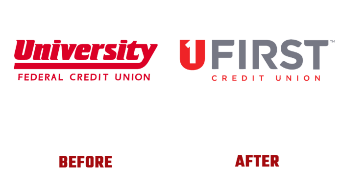
The University Federal Credit Union remained committed to its rules and obligations by changing its name. Changes have become a necessity in light of the dramatic changes in brand strategy and the desire to reflect current changes in strategy in line with current trends. Working in the field of lending for more than 65 years, the company decided to create a new, simplified name – UFirst, which, with a significantly smaller number of words and characters, provided complete visual information. The new name fully reflects the promise made to its customers – to put people first, regardless of situations and current conditions. The new visualization is an effective way to show how the brand is getting better and more efficient. The brand strives better to serve the growing number of members of the Union, extending its services further beyond its state of Utah.
The update covers the company’s name, its logo, signs and visualization elements, website and email address, card design. This uses new, clearer graphics, font, and execution of all elements of the visual composition. Keeping red as the signature color, the brand adjusted its brightness and saturation. The new shade is more attractive and effectively draws the eye, filling the free space of the brand name. Made in the form of the first letter of the brand name – U, its internal free field is created in the form of a white number “1”, reflecting the digital value of the brand’s very essence. The text of the first word of the sign – FIRST is made in the same lowercase font in gray, which creates the required contrasting background for the sign and an additional inscription under the main word. This execution removed the visual overload from the logo, focusing the required attention on the elements of the logo composition that are important in their informational content.
The new visualization has become a spectacular reflection of the changes that have taken place and changes in the brand strategy, and keeping pace with brevity and conciseness. Having made it a priority to reflect the desires and requirements of its customers, the company shifted its visual accents. Now the main element has become superiority and a guarantee of security. The sign in the form of the letter U has a different interpretation – a shield, symbolizing the factor of guaranteed security, both for the interests and finances of each client, ensuring stability and constancy of growth, both for the brand itself and for each of its clients.


