


![]() The University of Kentucky Logo PNG
The University of Kentucky Logo PNG
The University of Kentucky logo is businesslike and serious. It exemplifies the mark of a public institution of higher learning closely associated with the state. The emblem demonstrates the most comfortable environment for students and the best student services for the good of Kentucky.
The University of Kentucky traces its origins to the Morrill Land-Grant Act, signed by President Abraham Lincoln in 1862. On February 22, 1865, Kentucky’s legislature used the law to create the Agricultural and Mechanical College of Kentucky. It was formed as a public division of the private Kentucky University, owned by the Christian Church, with John Bryan Bowman as founder.
The first classes were held at Ashland, the former estate of Henry Clay. James Kennedy Patterson became the college’s first president three years later, and in 1869, the first three students received degrees. Master’s programs began in 1876. In 1878, the legislature separated the college from Kentucky University, now Transylvania University, making it an independent public institution.
In February 1880, Lexington donated about 52 acres of old fairgrounds for a new campus. A teacher-training department opened, and women began enrolling. On February 15, 1882, the college moved to its current campus, where the president’s house, a men’s dormitory, and an academic building had been built. Royal blue and white became the official colors in 1892.
In 1908, the college became State University, Lexington, and gained university status. The College of Agriculture and the Law School were founded that year. On March 16, 1916, it officially became the University of Kentucky, with the College of Home Economics created the same year. The College of Commerce opened in 1925. Lyman T. Johnson’s 1949 lawsuit opened graduate study to Black students. The Medical College was approved in 1956, admitted its first students in 1960, and, in 1997, the legislature backed increased research funding. Construction of the William T. Young Library began on April 3, 1998.
Meaning and History
![]()
The University of Kentucky (UK) is an ancient educational institution that has become the largest in the state and strengthened its image with a consistent corporate style. Its official colors – white and royal blue were adopted in 1892. This combination of shades has been used for all subsequent logos to emphasize their affiliation with the university.
As the university grew, so did its brand recognition. In 2016, it was decided to unite all UK centers, departments, faculties, and colleges with a common wordmark. At the same time, the educational institution’s leaders introduced a set of standards requiring the elimination of all secondary emblems. Since then, the strict, businesslike wordmark of the University of Kentucky has been complemented by a stylish monogram of the letters “U” and “K.”
What is the University of Kentucky?
This is the flagship public university in Lexington, Kentucky, known for its programs in business, engineering, medicine, and agriculture. It includes 16 colleges, among them the respected Colleges of Medicine and Pharmacy, and offers over 200 academic programs. The expansive campus houses modern research centers, the UK HealthCare medical center, and the state’s largest student center. The basketball program stands out, with the Wildcats one of the most decorated teams in NCAA history. The College of Agriculture and the equine research center highlight the university’s contributions to the horse industry, which is particularly significant in a region with a long-standing tradition of horse racing.
before 2016
![]()
At the center of the logo is the blue abbreviation “UK.” The negative white space between the letters depicts the Memorial Hall clock tower. It is presented in a frontal view, with one round clock face outlined by a thin blue ring. Memorial Hall is one of the most important symbols of the university. This building was constructed in 1929 in memory of the students who died during World War I. It hosts performances, lectures, and graduation ceremonies. However, the architectural landmark gained fame most by appearing on the University of Kentucky emblem.
Below, the name of the educational institution is written in blue capital letters. It is divided into two lines, centered. The same serif font is used in both cases, but the glyphs below seem bolder. This impression arises because the lower half of the wordmark is larger than the upper half.
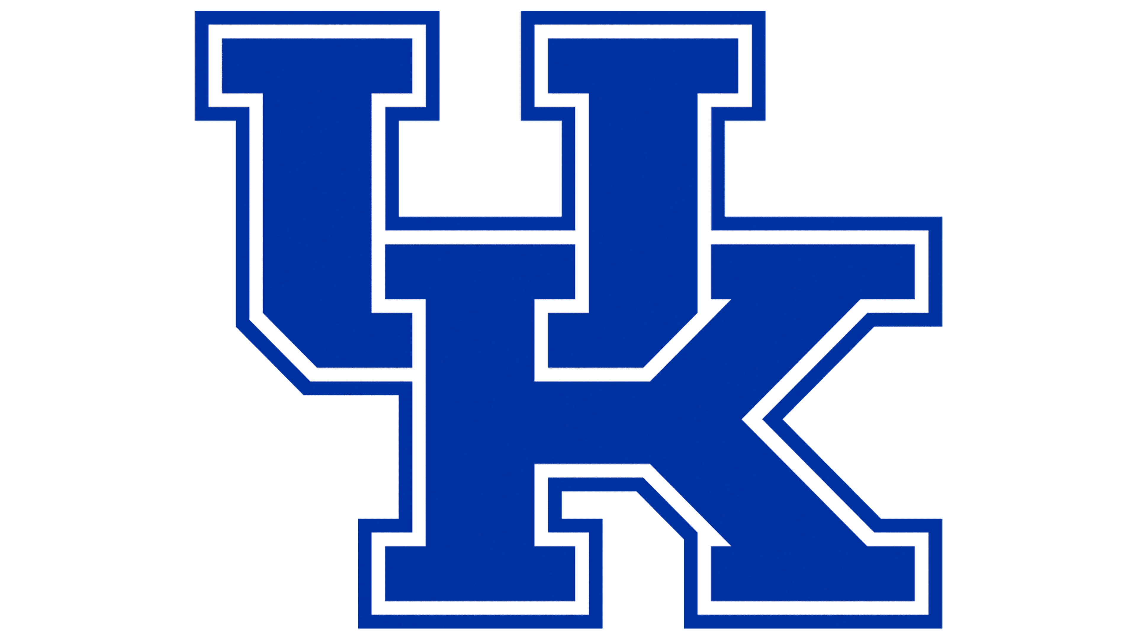
2016 – today
![]()
The university’s logo demonstrates the institution’s stability and reliability. It consists of two parts:
- The beautifully intertwined letters of the abbreviation.
- The deciphering of the inscription on the right is done in two levels.
U and K are in a wide serif typeface, one above the other. Their elements fit together perfectly, like puzzles, creating a stepped composition. The figure represents the steps to gaining knowledge and moving through the ladder of academic degrees the university offers, from Bachelor’s to Doctor of Science.
The clutch of letters demonstrates the close connection between the university and the state. The institution was created and continues to exist through a special program administered by the state of Kentucky. In 2007, the state raised about $1 billion for improvements. At the same time, the university conducts research to achieve a 20th-place national ranking, in line with the state Assembly’s wishes.
The black lettering inscription contains the institution’s full name: University of Kentucky. The words are arranged in two tiers, matching the initial letters of the acronym. University is at the top, and Kentucky is at the bottom. The state’s name is in a larger font, indicating a state institution that depends on the territorial unit’s administration.
The Seal
![]()
The seal details the university’s history. It consists of a double circle, the outer rim of which is made of a twisted rope. Between the first and second rims, the institution’s name is in large letters, and at the bottom is the motto: United we stand, divided we fall.
The inscription’s meaning is embodied by the central image, in which an Indian and a gentleman settler make a deal, and the gentleman thanks the native by shaking his hand. The intertwined rope on the outer rim symbolizes this union.
The composition points to the Morrill Act. The document authorized the taking of their land from the Indians by treaty or by simple confiscation. The land was then divided into tracts and distributed among the states. Each state could sell the land and use the proceeds to establish and maintain educational institutions to teach the necessary trades. Kentucky had two such institutions, and the Agricultural and Mechanical College was one of them.
The seal depicts the land-treaty process between the government and the Indians, without which the college could not exist.
The center circle of the seal has three significant dates for the institution:
- In 1865, the founding year, educator John Bowman, using Morrill’s Law, founded the Agricultural and Mechanical College as a branch of the University of Kentucky, which later became Transylvania University. This relationship is one of the meanings of the seal’s motto.
- 1878: Separation of the college from the University of Kentucky into an independent unit.
- 1916: Renaming the college a university.
The entire composition duplicates certain elements of the state of Kentucky’s seal, which is located in the university’s state.
Font and Colors

Blue and white are the university’s primary colors.
- The royal blue demonstrates the university’s values of learning and innovation. It expresses a businesslike approach and a desire to educate students in science and to provide the most up-to-date facilities.
- White indicates the upbringing of the younger generation and hints at one of the nation’s best on-site medical centers.
Fleischman BT Regular inscription font.