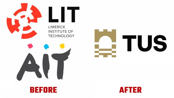
Founded recently by Athlone IT, Limerick IT, and the Limerick School of Art and Design, Shannon’s Irish University of Technology (TUS) has opened its doors. For the opening, a new visual identity was developed and implemented by the dynamic media agency Piquant (Limerick City, Ireland), with a wide range of skills, modern technical capabilities, and a creative approach. TUS has six modern, comfortable campuses in Westmeath, Limerick, Clare, and Tipperary counties with over 850,000. The Shannon River flows through these areas, providing a unique environment and nature. By combining several educational institutions into one, it is assumed that it will accept up to 14,000 students. The new identity of the university provides for the reflection of basic information about the institution’s features, goals, and objectives. It demonstrates the creation of a new impulse in the formation of new opportunities and positive consequences for the future generation and the economic development of the regions, which became possible thanks to the receipt of the status of a technological university.
The formation of a new image began with the development of the name, the monogram of which formed the basis of the logo. TUS – the first three letters of the three words of the university name formed the text element of the logo. They have several meanings, which makes their application especially effective. In addition to the fact that the letters form the monogram of the brand name, they are a word that is translated from Irish as “beginning.” This meaning especially accurately conveys the spirit of the brand, symbolizing the beginning of a new era in the region’s development in the educational sphere, the beginning of the opening of new opportunities. At the same time, the logo is associated with the Shannon River, which is a symbol of the flow of knowledge and ideas.
The latter is the result of using the region’s mythology, where the Connla’s well is indicated as the source of the river, which is considered a source of wisdom, which endows water with special properties. Thus, two main elements of the logo were chosen – a river, a symbol of knowledge and information, and a bridge – support and a convenient way of access to knowledge. A spectacular tandem in the form of these elements reflects the unique spirit and essence of the new brand.
The color palette also plays an important role in shaping the visualization of information. For this, an atypical solution was used, gold color as the key solution. But it is not a shade but a reflection of the material’s properties from which the components of the logo are created, which provides the composition with individuality, elegance, durability, and perfection. All these features are emphasized by a bright secondary palette, which avoids stereotypes, ensuring recognition and memorability.


