UK-based beverage packaging and beverage branding agency Thirst has developed a new visual identity for the Scottish brewer Brewgooder. The brewery’s management decided on the need for urgent changes in its image after visiting Nepal, where it was on a working visit in search of new places for its expansion, opening new points. Unexpectedly, the company faced the availability of clean water in the region, which is why the threat of outbreaks of infectious and other types of diseases is constantly high here. The situation affected the company’s head so much that it was immediately decided on the need for deep participation in the program for the purification and delivery of clean water to where there are problems similar to those in Nepalese. A partnership agreement was signed with the non-governmental charity organization Charity Water.
In light of the new directions that opened up for Brewgooder, there was an urgent need to make changes in the production technology of its product and change the company’s image. The latter called for a new style that reflected these changes while encouraging Brewgooder beer consumers to participate in joint crowdfunding, joining a new community, popularizing the company’s efforts to solve clean water problems, and striving to improve the quality of beer in the global brewing industry.
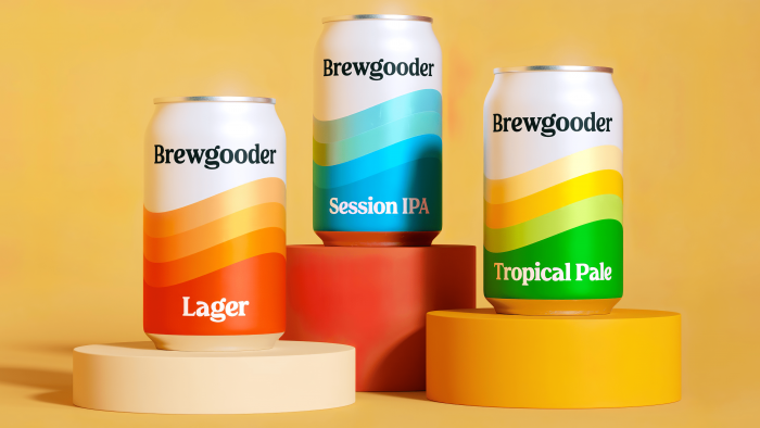
Such a large scale of the new project made very serious demands on the developer of the new corporate identity – the Thirst agency. The new visual identity was supposed to drive more than just sales. Taking this into account and the appearance of new Lager lines, which indicated the presence of pure water, Thirst rethought the color version of the design of containers and cans, playing on a combination of bright, attractive shades of the palette. Orange became the main color of the brand, which made it a bearer of optimism and positiveness, providing each can with solar heat. In a harmonious combination with crystal clear white with a wave-like application of paints on containers, it has become a symbol of solidarity in a single striving to achieve the set goals. The new style is completely different from the traditional visual language of craft beer. Brewgooder is a beacon of positive and progressive beginnings.
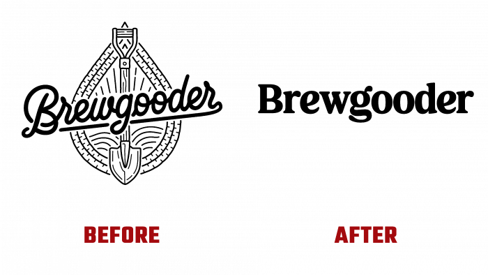
Against this background, the strict and laconic execution of the logo in black – the name of the company, executed in the monotype type FS Rosa, has become an accent element for each type of the company’s advertising product, including in the design of the blog and website.


