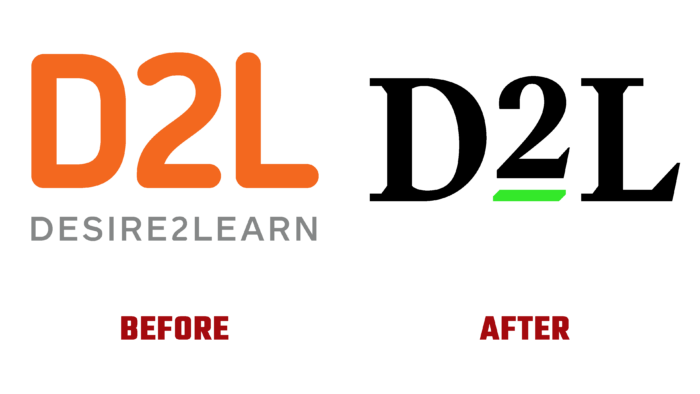
For more than 20 years, D2L has brought people knowledge and opened up prospects. Millions of those who have embarked on the learning path today are harnessing the power of a brand that has opened a new chapter in its development. By helping others gain the knowledge they need, get back on their feet and gain confidence in their future, D2L today recognized the need to grow and develop with its users. The overdue changes caused by the life-giving movement, contained in the very nature of obtaining and accumulating knowledge, required their obligatory visual reflection in the company’s new image, which became a full-fledged reflection of the eternal passion, strength, and potential of each of the clients. At the same time, the created new image did not lead to changes in the main goals and objectives, only strengthening the company’s commitment to its main mission.
Over the 20 years of its existence, the organization has changed qualitatively and quantitatively, has grown, and felt the ability to solve more complex and extensive tasks. Working in almost every corner of the planet at all stages of human education, the brand has accumulated a huge reserve of knowledge and strength for the next stage of its evolution. A radically new approach to forming one’s own visual identity and the ways of its formation became a reflection of new solutions and opportunities. The graphics and execution of the new logo represent the powerful potential and unrivaled power of branded learning. At the same time, with the help of the new visualization, its simplicity, and accessibility, as well as the clarity and transparency of the technology used, are very accurately conveyed. By using the number “2” raised above all the letters of the name, the idea of exponential progress was conveyed. The highlighted image of the deuce and its emphasis made the element the main factor in the implementation of growth and development.
The rich green color favorably emphasizes and highlights the main information reflected in the logo while symbolizing the constant growth and brightness of the brand. The mark was developed as a universal variant for its application in different company products, uniting a new family consisting of orange and blue colors of various products. Brightspace uses it to demonstrate how knowledge is transferred. The process resembles the spread of a flame, which, finding food for itself, only grows, increasing its brightness. D2L Wave demonstrates the ripple effect of employee knowledge transfer that occurs throughout their careers in company detailing.


