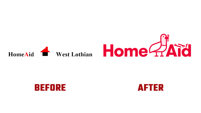
HomeAid West Lothian was founded in 1996 to recycle used furniture. In the process of its development, the brand has expanded its capabilities, providing effective support to community members in the field of formation and housekeeping. The company has become especially popular by opening a new direction to provide vital furniture and household appliances used, but in good working conditions at affordable prices to people facing social and economic exclusion. Its contingent is low-income families, single parents, formerly homeless people who have decided to change their lifestyle. At the same time, the company’s activities have a beneficial effect on the preservation of the environment, thanks to the efficient recycling of obsolete household items and the thoughtful redistribution of still functional elements. To more fully and more accurately reveal its essence, the brand decided to change its visual identity.
Pigeons became the brand’s symbol, which inspired the creation of an original visualization with their participation. The pigeons’ characteristic concern for their chicks, which is expressed, among other things, by the constant construction of nests before breeding offspring, has become the basis for creating a strong visual effect and brand recognition. A vibrant color palette of rich reds and soft pinks was used to enhance this effect and expand the visualization further. Plumage and twigs for nests, the main visual elements of the composition, have become defining assets for creating the necessary brand atmosphere.
The formation of a common identity contributed to developing a complete marketing set of the most effective materials that ensure a successful promotion. Various printing means and digital technologies were used. Postcards, tags, social skins, a website, and even a tent for a van were created with a common desire to ensure the effectiveness of the new visualization and make it more attractive and unique. The new logo features cute charm and a symbolic approach. The option of building a house from the furniture with the constant presence of a dove, which is also busy creating a nest above the verbal module, provides the composition with special information content. Bold font with a thick stroke adds softness to the friendliness and appeal of the logo.


