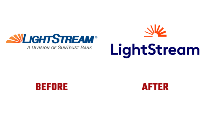
LightStream is an active online lending arm of SunTrust, launched in 2013. Its main goal was to simplify the loan application processes for borrowers. Thanks to the possibility of using a new division, the design made it possible to abandon paperwork. Using LightStream services, it became possible to avoid filling out many documents, communicating with a loan officer, and not even going to a bank branch. Approved applicants can receive a positive response and funding on the same day. LightStream offers a wide range of loans, including the purchase of motorcycles, boats, mobile homes, improvement and renovation of houses and apartments. Consumers are provided with secured and unsecured loans for medical needs and education up to K-12. Today, there is a need to reflect all the new changes and additional features in our identity, which has been redesigned to comply with modern visual identity requirements.
The brand’s new logo design has become simpler and more understandable. Its design contains only two elements – a text module and a sign. The sign repeats the previous version in its semantic purpose but in a revised version that provides a visual connection with the parent company’s logo. It is a stylized image of the rising sun, still half-hidden behind the horizon. Its divergent rays are depicted with variable thickness, which increases from left to right, symbolizing the brand’s constant progress, the desire to constantly improve conditions for its customers, protecting their interests and making lending more attractive and profitable.
The text part is the name of the brand, made in bold sans-serif type Okta Bold by Groteskly Yours, which conveys a sense of confidence and reliability, most accurately reflecting the main properties of the brand. It emphasizes the brand’s uniqueness, ensuring the readability of the text, adding significance and weight to it. The letters’ slight narrowness and vertical design enhance the appeal, focusing on its minimalist design.
The brand’s color palette is based on its historic colors, which have been redesigned with modern technology. Deep blue – in which the company’s name is made, symbolizes reliability, organization, not haste in making decisions, deep concentration on the fulfillment of tasks, which favorably characterizes a financial brand. The bright orange color of the symbol stands out in combination with dark blue. This is effectively used in the architecture of the logo, where the symbol is located exactly in the center above the title text. The whole composition has a strong visual impact on the person, creating the necessary atmosphere around the brand visualization.


