The Dutch Mondriaan Fonds has been successfully promoting its offerings since its inception. Over the years, the brand has established itself as an effective financial structure. It has also become the main driving force for the development of fine art, the preservation, and promotion of this direction in the Netherlands. The company provides financial support for projects and programs aimed at developing national art, artists and platforms in this area, publishers and representative offices, museums, and institutions whose activities are aimed at preserving cultural heritage. In addition to providing the necessary financial support, the brand organizes various events in this area – exhibitions, flash mobs, competitions. The developed system of guarantors works especially effectively, with the help of which Mondriaan Fonds helps both organizations and artists themselves, young talents, to realize their plans.
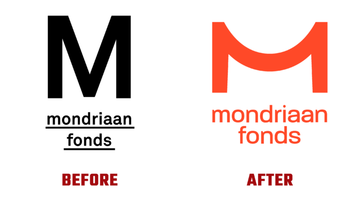
To strengthen the visual support of its capabilities and new offerings, the company carried out a rebranding, which was being prepared for several months. The new visualization was created taking into account the huge number of differences among fund applicants. The new brand strategy required the humanization of all elements of visualization, which was reflected in the identity, which focused on the accessibility and usefulness of this organization. The update was the beginning of a well-thought-out plan for positioning the organization. Reflection of close and meaningful interaction between employees and customers has become just one of the points. Thanks to the new visualization, the company’s internal culture were created, allowing the human potential to effectively fulfill the promises made by the brand to its immediate audience. The developed style inspired certain behavior, spanning the managerial and worker levels.
The basis of the new visualization was the logo, which appeared in a rethought version. The brand sign in the form of the first letter of the company’s name – “M” has acquired an unexpected visual interpretation, having acquired a central element with a smooth curve. The desire for simplicity and creating a comfortable visual space with its minimum load is reflected in this new form, reflecting the full depth of the created identity. The formation of the overall harmony of the entire composition was based on its construction’s symmetry rules. Beneath the sign, the brand’s full name is inscribed in lower case type Neue Plak SemiBold by Monotype. Placement of a word symbol in 2 lines with a centered beat and the clarity of the image of each letter provide ease of reading the text. To enhance the attractiveness and ease of remembering, all logotype elements are made in a bright red hue, which has become a corporate color, forming the main features of the style and visual reflection of the brand.


