Founded in 1935, Ramblers focuses its charitable activities on removing barriers that prevent people from enjoying the natural environment. Her mission is to create optimal conditions for walking in green spaces while ensuring that the countless trails and paths that pass through the green spaces of England, Scotland, and Wales are preserved and improved. The brand makes every effort to provide an opportunity for everyone to walk in the eco-friendly countryside, making it open to everyone. The company maintains and creates the most optimal conditions for walking, allowing you to enjoy nature and get full pleasure from hiking. The brand has established itself as Britain’s largest active walking community, with over 100,000 members and growing numbers.
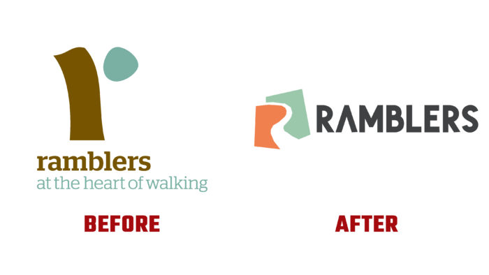
The company decided to reflect its main idea, expressed in the slogan – “Open the way,” in its own identity, making it more attractive and easier to understand. With the help of graphics, a composition was created, which is a conditional paper cut in the form of the letter “R,” symbolizing openness, the absence of obstacles for movement along the path chosen by each. Rethinking the brand’s philosophy and its essence within the framework of modernity required a fresh look at the color palette, which acquired a cheerful set of shades of earthy tones. The text information of the logo has also changed in terms of its display options. A bold and rounded font was used for it. This design provided a better attraction for hikers by successfully imitating the hues and shapes characteristic of the natural background, bringing the open and active properties to life.
The inspiring paper appliqué created by the icon created a visual perception of the various forms typical of garden and forest paths, hinting at the openness of the paths with the possibility of individual interpretation. Using a modern approach to the selection and reflection of corporate colors in the new identity ensured that the entire composition correctly matches the way a person perceives the environment when walking. There is so much warmth and light here that it is difficult to refuse the feeling of naturalness of the whole composition. The names – “sunset”, “granite”, “sunrise”, etc., also strengthen the accent. The RuckSack bold font chosen for the text design realizes the openness and activity of all the features characteristic of Ramblers, thanks to the purity of the roundness of each letter. Selected images also play an important role. High-quality thematic photos emphasize the brand’s huge and useful practical experience, its desire to cover and reflect all areas and features of the life of pedestrians – lovers of walking on any terrain.


