Sanofi is a French healthcare company founded in 1973 that is constantly expanding its capabilities and offerings. Its main focuses are research, development, and production of pharmaceuticals that promote the use of potentially life-changing treatments and effective protection with the latest vaccines for people around the world. The brand is located in Paris, France, with offices in more than 100 countries. The brand’s products have a wide range of applications, covering immunology, inflammatory processes, oncology, and rare diseases, including blood, in the field of neurology. All this has led to the need to take a different look at their visualization to match the visual perception as a future brand.
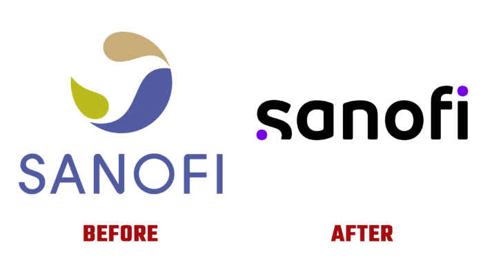
The main task of the updated visualization was the formation of different identities and the demonstration of new goals. An important point was the shift in emphasis from the brand’s presentation as a large enterprise to its profile – the medical direction and modernity. At the same time, the new identity reflects the main desire to transform current medical practice. The new brand turned out to be ambitious, giving a powerful signal, perceived within the company and beyond, providing a clear perception of the information transmitted. This is ensured with the help of simple and dynamic codes typical for the technological industry.
The new identity is more understandable and attractive. At the same time, the presence of a corporate logo only enhances these effects. The sans-serif typeface is easy to read and has eye-catching, enticing elements, such as the “hook” of the “s” below the baseline, while the “a” and “o” are designed to float visually. Attractive symmetry of the text block is ensured by the rounding of the lower parts of its elements, aligned in strict accordance with the construction of the entire composition. The original solution is not the ideal roundness of the contour of the dots, which adds warmth, liveliness, and individuality to the entire visualization.
Individuality is maintained by the family of fonts used – with and without serifs. The sans-serif provides the visual beauty of the block. At the same time, the serif version enhances the appeal and creates a unique look through the original execution of bulges that appear to be created with eyedropper drops. All designed app icons dramatically showcase the direct connection to health and body, providing a visual insight into the brand’s profile.


