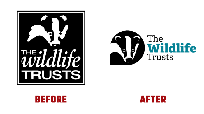
The natural world is directly dependent on the rationality of human activity. Today, he is experiencing huge problems, declining, including in one of the leading countries – Great Britain. To provide effective assistance in the fight against climatic and environmental emergencies, the Royal Society of Wildlife Trusts (RSWT) was organized in 1912, today consisting of 46 foundations. They are now in charge of more than 2,300 reserves. The Society is a charitable and independent organization and acts as an umbrella structure for its member organizations. The foundation’s patron is Charles, Prince of Wales. The brand acquired its current name in 2002, when the badger symbol, which is still valid today, was adopted as a common symbol for the entire identity system of the funds of this group. Due to the need to keep up with the times, the brand has revised its identity and redesigned it to meet modern requirements, reflecting all the changes that have taken place in it.
The new identity was presented, taking into account changes in the brand’s strategy and expansion. The goals set for it are restoring a third of the UK’s land and water expanses by 2030. The rebranding was based on the principle of minimalism, which was reflected in the formation of a new logo. It is an image of a badger in a teardrop-shaped figure filled with black. The badger’s face is formed by creating outlines from negative space. The retention of this symbol ensured that the brand was easily recognizable, even in its updated version. At the same time, while forming a new identity, the designers demonstrated a close connection with the brand’s deep history.
The logo also consists of textual information – the fund’s name, made using Univers and Sabon fonts. The choice fell on them because of the clarity of execution, clarity, and ease of use. Univers light /roman/ – Bold and rounded was used for headings and headings. Ordinary or universal Sabon provided high-quality visualization of the main text, the convenience of reading it even on a small scale. Consistent execution of typographic elements contributes to the public recognition of the funds that make up the group and their collective identity.
The brand’s color palette includes the main tones characteristic of nature – sea, and land. The colors adopted in the 2000 identity were taken as the basis. They have been modernized, acquired brightness and juiciness, which are effectively conveyed with the help of modern digital technologies and typographic printing as process separation (CMYK) on promotional materials.


