Among mobile financial applications, Truebill is in great demand due to its convenience and ease of management. With its help, it becomes easy and fast, but the main thing is safe to control your financial life. The system allows you to save more and spend less, see all operations in detail. As it evolves, the app has attracted over 2 million users over the past five years, and the number continues to grow. Constantly improving its capabilities, the Truebill service is gaining more and more advantages.
This and:
- Control oversubscriptions
- Convenient breakdown of finances by cost categories
- A timely reminder of important events
- Automatic saving of the amounts required to pay off upcoming payments
- Minimization of overdraft fees and much more.
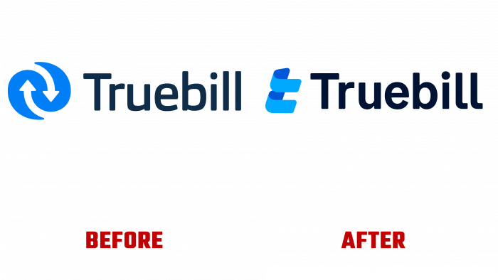
So that current and future users can more accurately familiarize themselves with the capabilities of the site, its features, and convenience, the brand decided to rebrand, changing not only the appearance and logo but also the strategy itself.
Modern trends in advertising and the formation of the image of companies and brands require conciseness and a creative approach to creating an identity. The peculiarities of the current era are expressed in the lack of desire of the modern consumer to delve into the study of details, a large amount of information, and complex images. The founders of the brand initially approached the issue of visualizing their application with all these features in mind. But the development of the service demanded revising its visual presentation and making changes in signs, logo, and visual identity.
The new logo has not been drastically changed to maintain its visibility and its existing users. The new version uses a new sign that resembles a money clip and a stabilization device, support, which reflects the application’s main purpose. It is created in two shades of blue – the background elements are in the dark, and the foreground elements are in the light.
To the right of the sign is the text – the brand name, which is executed in a font that is more appropriate to reflect the essence of the application. It is in a typeface of the Special Alphabets 10 by Monotype, which is crisp, bold, and stands out well against any print or digital background. Made in black, it stands out in contrast and is very harmoniously combined with any color shade.


