Upwork freelance platform partnered with agency Alto to create a new logo.
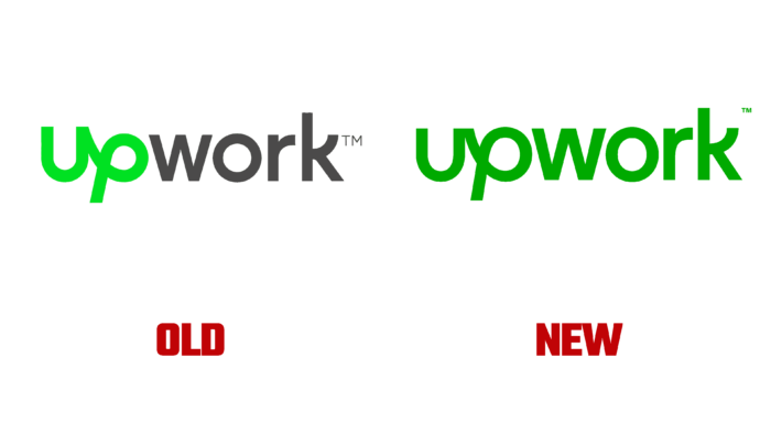
At first, it may seem that the logo has not changed dramatically, and the designers have replaced the main colors. If you compare the two pictures, you can see that the changes affected the font primarily. The designers have worked on the spacing between the letters, making it the same. The team also made the “up” particle more “down-to-earth,” and now all the letters have the same height.
Part of “up” stands out in the word itself due to the interesting connection of letters to each other. The designers changed the letter “r,” making it wider. In addition, the main color of the logo has changed. If the first part of the word was painted in acid light green earlier, the full name has now received a contrasting green color. It’s not a secret for anyone that when the service is opened on different devices, the color of any image can change, and with bright shades, this phenomenon is even more noticeable. A rich dark green almost solves this problem.
The Upwork rebranding symbolizes the changes taking place in the labor market now, especially during the pandemic. But the service is optimistic about the future, which is reflected in a new visual identity. Upwork reveals itself to users from two sides: it gives warmth and pleasant communication, but at the same time, it embodies the efficiency and accuracy of specialists.
The rebranding is accompanied by the release of a short video that tells the story of the customers. They managed to change their lives for the better with the help of the platform. The main characters are:
- The CEO.
- An encoder from Hong Kong.
- An engineer who left Silicon Valley with his family.
- A designer in the UK who moved to Italy with his girlfriend.
The plot is based on real customer experiences, and by the end of the film, the developers showed the team’s success thanks to flexible working hours and the ability to work remotely.


