“Sweet treat” of the British bakery Urban Legend – harmless donuts prepared using revolutionary technology has acquired the most attractive design. A unique product demanded an equally unique and equally attractive design for the packaging and advertising of the product and the image of their manufacturer. This difficult but “tasty task” was taken on by the well-known design studio Biles Hendry. This was not the first experience of their collaboration.
The British bakery Urban Legend has revolutionized the field of everyone’s favorite donuts. Its founder, Anthony Fletcher, is known as a fighter for a healthy lifestyle and the creation of products that are harmless to the body that retains their taste and provide the pleasure of eating without ingredients familiar to everyone, but far from safe for health as cooking methods. New donuts from Urban Legend are a unique product made without sugar and fat. Cooking technology does not require frying. They are steamed, keeping the same taste as traditional cooking. Instead of sugar, equally sweet natural alternatives to the latter are used.
Fletcher demonstrated its innovative ideas not only in the field of sweets. Working closely with the designers of Biles Hendry, he constantly inspired them to all-new original solutions. Created virtually from scratch – strategy, style, name, website and blog, packaging, and, most importantly, concept, the new brand is not just a reflection of the ideas and spirit of Fletcher itself. It turned out to be very attractive, even funny, but also especially “tasty,” whetting the appetite, the desire to buy the product right now.
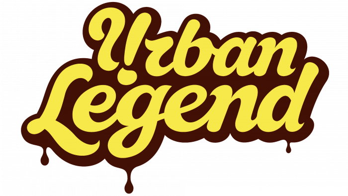
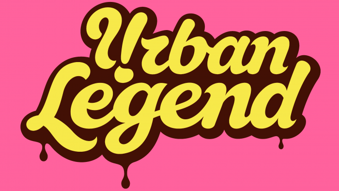
When designing the logo, three colors were used that are characteristic of the appearance of the donuts themselves – a pink background (cream covering their surface), yellow letters (the color of the finished dough), brown to imitate shadows that provide volume (the color of an amazing crust and chocolate). The text was developed jointly – “funny,” a bit fabulous, but very lush letters of the company name – Urban Legend, located one under the other. At the same time, a unique advertising move was applied, designed specifically for the sweet tooth – drops of the most amazing chocolate glaze flow down from the letters “L,” “g,” and “d.” For small icons, it was decided to use only the first brand name on a pink background.


