


![]() US Bank Logo PNG
US Bank Logo PNG
The US Bank logo symbolizes honest money transactions and a high volume of American currency turnover. The emblem demonstrates a business approach and the ability to avoid risky transactions, thereby promising the safety of customer funds and timely interest calculations.
The history of US Bank dates back to July 13, 1863, when the National Banking Act established the First National Bank of Cincinnati. It received charter No. 24 from the Comptroller of the Currency under Abraham Lincoln. The bank operated near Civil War front lines and established early principles focused on real capital.
Parallel roots formed across the Midwest. In 1864, the First National Bank of Minneapolis was founded, later shaping the company’s headquarters. In 1853, Farmers and Millers Bank opened in Milwaukee, and it evolved into Firstar Corporation. These institutions developed separately through regional expansion.
In 1929, the Cincinnati and Minneapolis banks merged into First Bank Stock Investment Corporation, which was renamed First Bank System in 1968. Consolidation accelerated in the 1990s, involving First Bank System, Star Banc, Firstar, Mercantile Bancorporation, and US Bancorp of Oregon. In 1997, First Bank System acquired US Bancorp and adopted its name.
In October 2000, Firstar announced a $21 billion acquisition of US Bancorp. The deal closed on February 27, 2001, forming one of the largest US banks, behind JPMorgan Chase and Bank of America. The combined company kept the US Bancorp name and moved its headquarters to Minneapolis.
During the 2008 financial crisis, US Bancorp acquired assets of Downey Savings and Loan Association and PFF Bank & Trust, expanding its West Coast presence.
On September 21, 2021, the bank announced the acquisition of MUFG Union Bank’s retail business for $8 billion. Approved on October 16, 2022, and closed on December 1, 2022, the deal added about $82 billion in assets and strengthened its position in California.
Meaning and History
![]()
Due to its complex history, frequent mergers, and rebrandings, US Bancorp has had many logos. The same applies to its subsidiary, US Bank, which operated under a different name as early as 1863. Therefore, only the last official emblem is now considered. It is difficult to trace its history: it is unknown when or by whom it was developed, or when it began to be used.
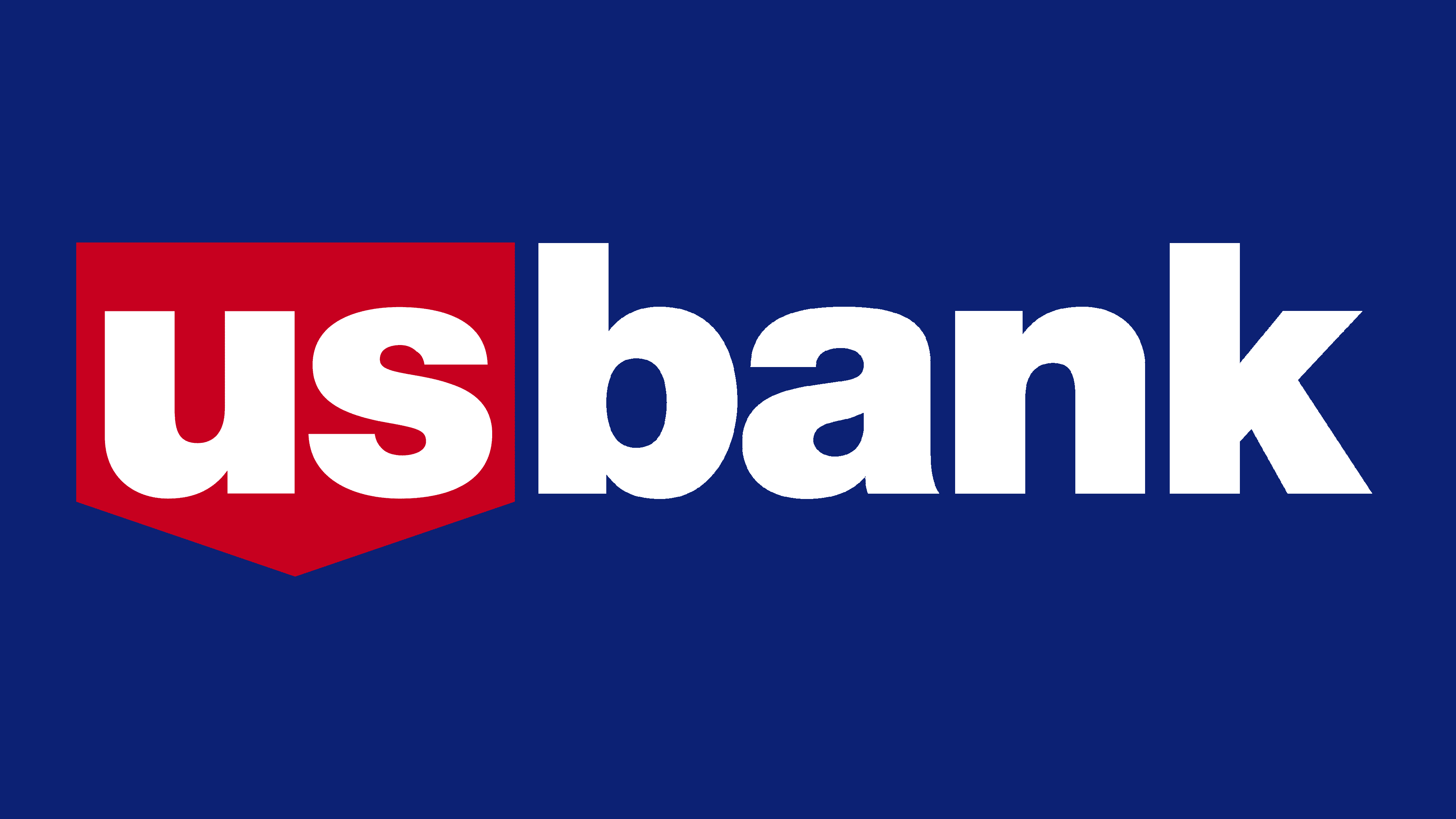
The distinctive mark of the US Bank is a simple three-color inscription in lowercase letters. The first part, “us,” is white and is inside a red pentagon. On the right is the dark blue word “bank.” The logo contains nothing else; everything is concise, as it should be for financial institutions. The chosen minimalism underscores the financial institution’s seriousness, its impeccable image, and, of course, its connection to US Bancorp. By the way, the parent company has a similar emblem, but with the word “Bancorp” instead of “bank.”
What is US Bank?
It is the fifth-largest financial institution in the United States by assets. It is part of the large US Bancorp, which provides a wide range of services to individuals, legal entities, and government organizations. The history of the banking structure dates back to 1981.
Old
![]()
In the distant past, the US Bank logo contained a rectangular shield with a pointed base and triangular ridges at the top. Inside, it was white; outside, it was outlined in black. It contained the letters “U” and “S” with dots after each. To the right of the shield was the word “BANK.” The inscription was in bold sans-serif font.
1990s -1998
![]()
In the 1990s, the letter type was changed to bold, italic, and sans-serif, and all were set to dark blue. The bank’s name occupied one line and was underlined with a thin horizontal red line. The shield disappeared, revealing an abstract red figure with an eagle’s head. She was on the left and did not fit with the inscription.
1998 – today
![]()
The designers kept the color scheme but adjusted the hues to match more closely. They also redesigned the graphic on the left, giving it a pentagonal shape that resembles an upside-down “house” in children’s drawings. Now, inside this red geometric shape are the white letters “US.” As before, the blue word “bank” is on the right. Notably, both parts of the inscription are translated into lowercase.
Font and Colors
The lettering font belongs to the extensive Helvetica family, which originated with the Haas’sche Schriftgiesserei. More specifically, this is the Helvetica Neue LT Bold, a neo-grotesque released by Linotype in 1983. The typeface features many glyphs and is used in the logos of large corporations such as Samsung, Panasonic, Nestlé, Google, and BMW.
The US Bank logo is available in two dark shades: Midnight Blue (#00438F) and Rusty Red (#D8273F). The designers diluted the first part of the lettering white and placed it inside a red geometric shape. The background in the original is also light, though it can vary across visual contexts.
FAQ
What is the brand name of US Bank?
US Bancorp is the publicly traded parent company of US Bank, listed on the New York Stock Exchange under the ticker symbol USB.
The name US Bancorp is used in formal documents and corporate filings. At the same time, US Bank is also used at branches, in app stores, in national TV commercials, and in other customer interactions.
The bank is widely recognized and trusted by customers across the United States. The brand provides various financial services, including personal banking, business banking, wealth management, and investment. With a strong nationwide presence, the bank aims to offer reliable, convenient financial solutions to individuals and businesses.
What is the US Bank logo?
The logo is a wordmark featuring the bank’s name. It is divided into two parts. On the left, a red pentagon with “us” in white appears inside it. On the right, the word “bank” appears in blue.
All the letters are lowercase and use a sans-serif font, giving the logo a modern, clean look. The red and blue colors and the simple design make the logo easy to recognize.
The red pentagon with the white “us” highlights the bank’s focus on serving the United States. The blue “bank” conveys trust and reliability. The logo design reflects the brand’s commitment to clear, accessible, and trustworthy financial services.
What is the logo for a US bank?
The logo is simple and striking. It features the bank’s name in a clean, modern design, set in Helvetica Neue LT Bold. The logo is visually divided into two parts.
The first two letters, “us,” are white and placed on a Rusty Red background (#D8273F). This red background makes the logo bold and eye-catching. The second part, “bank,” is in Midnight Blue (#00438F), conveying trust and reliability.
This combination of colors and a modern font gives the logo a professional, approachable look. The red and blue colors make the logo easy to recognize and remember, reflecting the brand’s commitment to clear and trustworthy financial services.