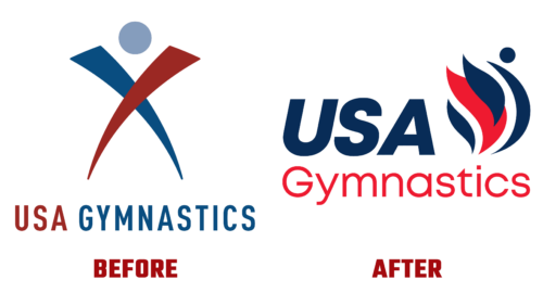
In the second half of August this year, the sports organization USA Gymnastics announced a total renewal of the visual identity. She intends to implement a real evolution of the identity gradually. The announcement of the upgraded brand and new logo took place on the first day of the OOFOS’22 USA Gymnastics Championships.
Li Li Leung, CEO, and President of USAG, said that this is a true rethinking of the concept, manifesto, and mission. Such work fits perfectly into the aspect of the company’s activities because it continues to develop actively. And the renovation carried out is an important action within the framework of the publicity of an organization that seeks not just to create a community but wants to make a center that promotes the spread of a culture of health. And she started with the logo.
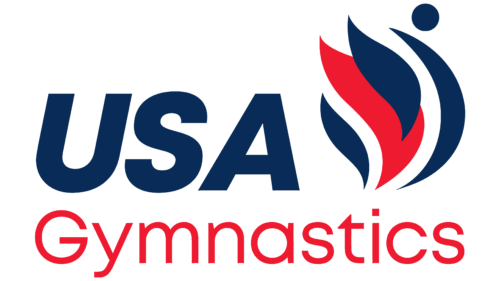
The updated USA Gymnastics logo features an abstract human figure: the dot is his head, and the vertical arc is his body. The athlete moves to the right side, which can be seen from the chest arched forward. Behind him are a blazing fire – a symbol of rebirth, the Olympic spirit, and knowledge. It consists of three flames: the largest is the central one, painted red.
On the left is the first part of the organization’s name, made in italics to match the dynamics conveyed in the figure of a person. It also reflects the correct movement vector – from the dark past to the bright future. So the design echoes the modern font. The second half of the text is at the bottom and serves as a hypothetical platform for all the top elements. This inscription is in thin, lowercase letters, except “G,” which is capitalized. The glyphs are neatly rounded and placed at a minimum distance from each other.
As part of the concept update, the USA Gymnastics slogan was revised. Now it sounds like this: “The movement starts here.” The new motto embodies an introduction to sports and a transition to a better one – from a simple passion for physical exercises to steps to the Olympic level. The adopted logo promotes the sport, unites its fans, reflects the organization’s identity, and demonstrates the desire for progress.


