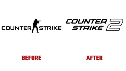
In March 2023, the well-known game developer Valve officially announced an update to its esports shooter CS: GO (Counter-Strike: Global Offensive). Its flagship first-person product is in the closed beta testing stage. The testing began on March 22, with the full version available to the majority coming this summer.
Several modernizations will be introduced, and not all will be related to enhancing the optional gaming capabilities. Some innovations will concern the video game’s visual identity. Only one thing is certain: it will be a worthy continuation of the first part. The preliminary testing has been entrusted to selected players.
So, what will we see on the cover? A rearrangement of elements, continuous text, an updated font, and an indication of version sequence. This novelty departs from previous Counter-Strike updates when multiple game versions with different cyberscenes were launched simultaneously. This time, the franchise will appear separately and with a revamped visual identity.
Thus, in the logo:
- the title is arranged in two levels and aligned on the right side;
- the font is italic, bold, chiseled, with a shortened leg of “R” and elongated crossbars of “E”;
- some letters are complemented by triangular indentations, reminiscent of “reverse serifs,” meaning they look like sharp notches;
- the legs of some glyphs have one-sided rounding (not only at the bottom but also at the top);
- the number “2” is very large and spans both lines, positioned at the end of the text (on the right);
- Unlike the title, the “2” is hollow (white) and outlined with a thin black stripe forming a decorative frame.
Fundamental changes in Counter-Strike 2 are also reflected in the logo alterations to form a harmonious union of form and content. The emblem’s style is strict, business-like, and practical, demonstrating steadfastness, confidence, and reliability.


