 Vanderbilt Commodores Logo PNG
The Vanderbilt Commodores logo represents the pride of sports teams in their glorious victories. It also expresses confidence in a bright future, success, determination, and unchanging leadership. This is a symbol of a stable position, which helps to get first place in intercollegiate competitions.
Vanderbilt University: Brand overview
| Founded: | 1873 |
| Headquarters: | Nashville, Tennessee, United States |
| Website: | vanderbilt.edu |
Meaning and History
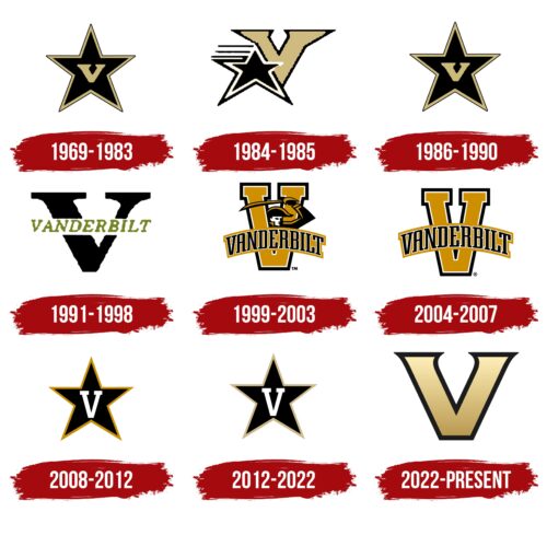
The word “Commodores” denotes a senior naval rank. The sports teams at Vanderbilt University chose this name in honor of the business magnate Cornelius Vanderbilt, who earned the nickname Commodore because of his passion for shipping. But the authors of the logo decided to focus not on this word but on the letter “V.” It was she who, in 2022, became the main symbol of the university and united all areas of its activity, showing the connection between athletics and science. Before this, athletes used different versions of the emblems, with the image of a five-pointed star representing success. On the other hand, its appearance is because Commodore is a military rank with one star.
Over the years, designers have tried in various ways to combine the star and the letter “V,” and only in the late 1990s departed from the familiar motif to create something completely new: the original arched inscription depicting a warlike sailor. The experiment was unsuccessful; therefore, the sports teams returned to the traditional identity very soon. This continued until 2022 when a logo was created with a large golden “V.” But not everyone liked this option. He was criticized for disrespecting the history and traditions of the brand – primarily due to the lack of a star.
What is Vanderbilt Commodores?
The Vanderbilt Commodores are owned by Vanderbilt University and compete at the NCAA Division I level. Almost all of them, with a few exceptions, are in the Southeastern Conference. By the way, VU is the only school in the SEC that doesn’tdoesn’t have a softball program.
1969 – 1983
The star immediately appeared in the VU identity. It adorned sports paraphernalia and uniforms, standing out spectacularly in black and gold. The logo was in the form of a single element on a white background. The edges of the figure had a double border and in the middle was a capital “V.” It was bold and looked more like a Roman numeral five than a text mark.
1984 – 1985
The designers used even strokes and disproportionate parts to add dynamics to the emblem. As a result, the star has a slight slope and two large lower beams. To its left (side) were three dark lines. Next to it was a large “V” whose serifs looked like sharp triangles.
1986 – 1990
In 1986, after an experiment with dynamism and disproportion, the leadership of the sports department again approved the debut version of the logo. It was adopted without changes.
1991 – 1998
For a long time, university teams used the logo as an enlarged “V.” Throughout the letter, the inscription “Vanderbilt” ran horizontally. It was essentially a transcription of a single symbol painted black. The name of the university and the name of its chief patron were in gold.
1999 – 2003
To emphasize its Commodores nickname, the teams adopted a modernized logo with a naval officer. At the same time, the letter through which he peered was updated. In the hands of the Commodore, dressed in uniform and triangle, was a saber. The developers made the “V” more compact and supplemented it with rectangular serifs. They curved the inscription in the form of an arch, so it repeated the curve of the saber blade. The dark golden color was lightened. There was a black border around the edge of the sign.
2004 – 2007
Everything was retained in the updated logo except for the Commodore going through the intra-letter “V” gap. The athletic department abandoned this image because of the difficulty in conveying it to the media.
2008 – 2012
After the transformation of the emblem, the varsity teams again have a black star in a gold frame with a “V” in the middle. But it is not an identical repetition of the earlier version of the logo: it uses light gold and white colors.
2012 – 2022
The contour of the five-pointed star changed from bright gold to beige. At the same time, he acquired a gradient, especially noticeable at the ends. The shape and color of the block “V” have not changed. The background of the letter remained black, which preserved an advantageous contrast.
2022 – today
It took about two years to create this logo. The Boston studio Upstatement, which worked on the new design, retained the recognizable letter “V” and made it the main unifying symbol of the university, all its departments, and sports teams. This decision was made in order to form a unified identity for the educational institution. When creating a new emblem, the opinion of focus groups, which also included coaches and athletes, was considered. It turned out that baseball and football coaches had long favored the blocky “V” because it looked better on helmets and caps.
But there are problems with the star. As it turned out, this element drew attention from the “V,” which was undesirable. In addition, the angles and the distance between the lines did not quite match. Upstatement designers fixed the situation radically: they completely got rid of the star and left only the “V.” The letter was enlarged and acquired a pleasant golden color with a gradient – from a light top to a dark bottom. Wide rectangular serifs have been transformed into small sharp triangles that support visual dynamics. For better perception, the “V” is surrounded by a wide black outline.
The new sports team symbol was introduced in 2022, but it will not appear on uniforms until the second half of 2023. The previous version of the star emblem will continue to be used on some merchandise.
Font and Colors
Gold and black are the main distinctive colors of Cornelius Vanderbilt. They were reflected in the logo, and the designers used a gradient to make the image more voluminous. As for the font, the letter “V” has an individual design and does not belong to the official typeface of the university (JJannon). It has elegant triangular serifs that balance visually heavy elements.
Vanderbilt Commodores color codes
| Sand | Hex color: | #cfb470 |
|---|---|---|
| RGB: | 207 108 112 | |
| CMYK: | 0 13 46 19 | |
| Pantone: | PMS 7508 C |
| Eerie Black | Hex color: | #1c1c1c |
|---|---|---|
| RGB: | 28 28 28 | |
| CMYK: | 0 0 0 89 | |
| Pantone: | PMS Neutral Black C |


