![]() Oklahoma Sooners Logo PNG
Oklahoma Sooners Logo PNG
The Oklahoma Sooners logo is concise and assertive. The emblem reflects the accumulation of energy, enabling players to achieve victory. The symbol encodes luck and readiness to enter the fray at the first whistle.
The Oklahoma Sooners, representing the University of Oklahoma in Norman, have a storied history that epitomizes collegiate athletics at its finest. The Sooners’ athletic programs are a testament to tradition, excellence, and the relentless pursuit of victory, defined by their participation in various conferences over the years, including their primary membership in the Big 12 Conference. A significant transition awaits as they prepare to join the Southeastern Conference (SEC) on July 1, 2024, marking a new chapter in their illustrious history.
Under the leadership of Athletic Director Joe Castiglione, the Sooners have become a powerhouse in the NCAA Division I, particularly in the Football Bowl Subdivision (FBS), showcasing their prowess across 19 varsity teams. The heart of their athletic spirit is housed in several state-of-the-art facilities in Norman, Oklahoma, each a fortress in its own right. The Gaylord Family Oklahoma Memorial Stadium, home to the football team, stands as a coliseum of collegiate competition, while the Lloyd Noble Center offers a haven for basketball enthusiasts. The L. Dale Mitchell Baseball Park, Love’s Field for softball, John Crain Field for soccer, the Jimmy Austin OU Golf Club, the Headington Tennis Center, the John Jacobs Track and Field Complex, and the Mosier Indoor Track Facility round out the impressive list of venues that foster the development of Sooners’ athletes.
The mascot, the Sooner Schooner, embodies the pioneering spirit of Oklahoma, and the nickname “Sooners” itself is deeply rooted in the state’s history, referring to the participants in the Land Run of 1889 who staked their claims sooner than permitted. The fight song “Boomer Sooner,” alongside crimson and cream colors, rallies the spirit of athletes and fans, creating a formidable camaraderie and fierce competition.
Throughout the years, the Oklahoma Sooners have not only excelled in football but have also achieved remarkable success in gymnastics, with the men’s team competing in the Mountain Pacific Sports Federation (MPSF) and other sports, demonstrating versatility and excellence across the board. Their athletic dominance is showcased in numerous conference championships and national titles, making them a beacon of athletic achievement in the collegiate landscape.
Meaning and History
![]()
The team’s logo is closely linked with the university and replicates its symbolism, merging the athletes’ achievements with their famous alma mater and enhancing mutual popularity. The team’s well-known logo appeared significantly later than the club itself. The Oklahoma Sooners adopted their name in 1908, a year after the state of Oklahoma was officially created, although the football team began playing even earlier. However, emblems from that time have not been preserved.
What are the Oklahoma Sooners?
The University of Oklahoma’s (OU) sports movement includes 19 teams. It supports basketball, football, golf, track and field, tennis, and gymnastics. The teams have won 43 national championships. The club has trained 82 Olympians. The movement is part of the Big 12 Conference.
1951 – 1966
![]()
The first known emblem of the players is connected to the history of the club’s name.
“Sooners” first appeared in the Indian Appropriation Act of 1889. As a result of the agreement with the Confederacy, the Indians were forced to cede part of their territory. The government set up a race to settle this land. However, some settlers took plots for themselves before the law was enacted.
The word “Sooners” referred to these first illegal occupiers, people who occupied the free lands of Oklahoma before the issue was legislatively settled.
Although the rights of the “Sooners” were soon annulled, the nickname Sooner State stuck with the state. Years later, when the University of Oklahoma’s team adopted this name, it became associated with rebellion, courage, pioneers, and a sense of adventure.
As an emblem complementing the name, the athletes chose the image of a receding wagon drawn by horses. It was in such carriages that settlers transported their belongings. These wagons entered the competition for land. On the race day, 50,000 people on horses and wagons rushed to the territory to claim one of the 12,000 free plots. The “Sooners” had moved their belongings and settled before the race began.
With the symbol and name, the players wanted to pay tribute to those who dearly loved this land and fought desperately for the right to own it, indicating that the club would also fight and claw for every reward.
1966 – 1979
![]()
In 1966, the OU logo, which remained with the team for many years, first appeared. The emblem consists of 2 letters in a monogram. The smooth lines and intertwining of symbols speak of conciseness and speed. The emblem resembles a kicked ball. The football club was the first to appear at the university and is considered the most successful and effective. Seven students of the team have been awarded the Heisman Trophy.
1979 – 2000
![]()
In 1979, the chosen symbol became larger and gained 3D volume. It seemed as if the viewer was looking at the emblem from below. The choice showed the club’s great success. In 1975, the women’s softball team qualified for the World College Championship. In 1977 and 78, the men’s gymnastics team won the national championship. In the same years, the football team made it to the national championship. The massive OU logo created a sense of grandeur and triumph. It described the club’s heyday.
2000 – 2018
![]()
For the new millennium, the Oklahoma Sooners updated their logo again. The letters became closer to the viewer but resembled faceted gemstones. The choice emphasized the teams’ prestigious awards. A pleasant surprise in 2000 was the victory in the national softball championship. The combination of the students’ knowledge and their successes in sports made the OU students the true diamonds of the state.
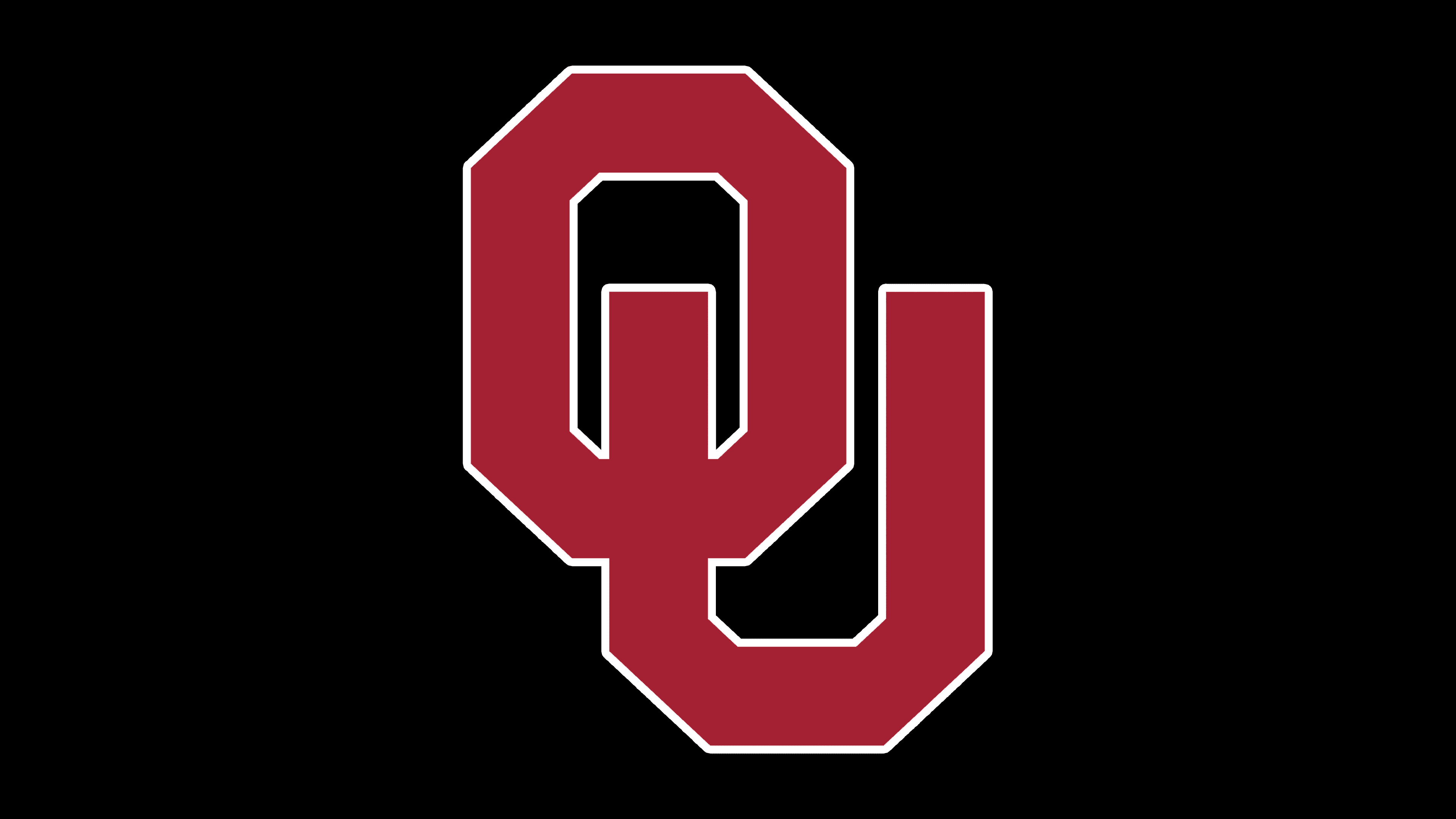
2018 – today
![]()
In 2018, the symbol was slightly adjusted, lightening the emblem’s tone to signify the athletes’ youth. Interestingly, the leg of the U ends right in the middle of the O, making the combination resemble a Start symbol. The association fits perfectly with the themes of speed and energy, which the club prides itself on.
Font and Colors
Crimson has been the team’s color since the very first symbol. The shade reflects energy, confidence, and nobility, emphasizing the university’s ancient roots, being one of the first to be founded in the state.
The letters of the inscription are unique due to their faceted structure and overlapping layout. This choice suggests that the university’s sports movement nurtures stars and multifaceted and vibrant personalities.