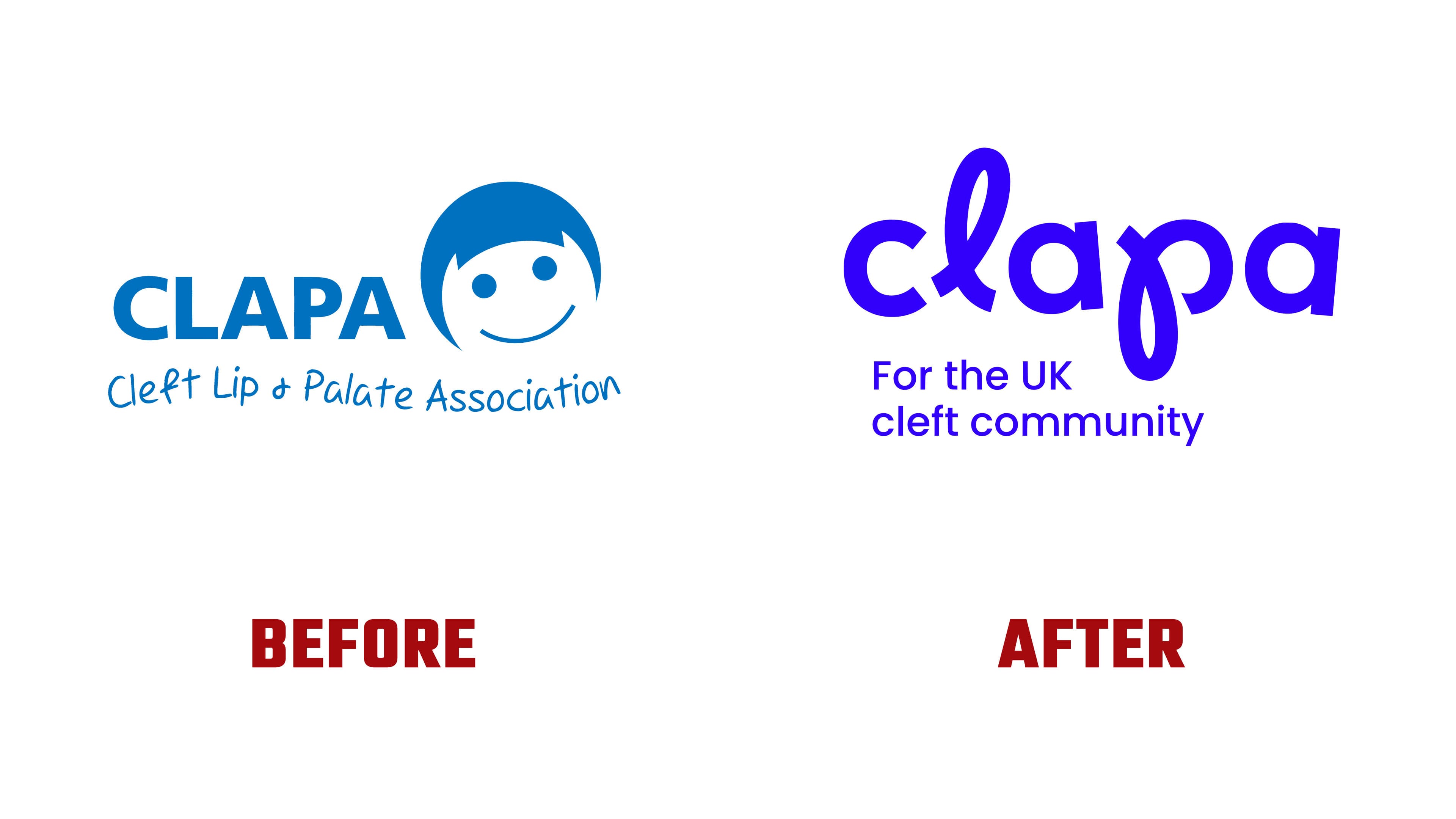
The company updated its image after many years with a smiling mark. The Team handled the project. The full name, Cleft Lip and Palate Association, was changed to Cleft Lip and Palate Action. The CLAPA abbreviation stayed to preserve the connection with the community.
The community supports people with cleft lip and palate from pregnancy through adulthood. The organization provides verified information, emotional support, community access, and connections with specialists. It works with NHS Cleft Teams, researchers, parents, patients, and doctors. Its projects are developed through donations, grants, and partnerships.
The old logo, featuring a childlike smiling face, served as a sign within the community for many years. People valued it for its warm tone and closeness to the people it served. Over time, the organization’s work became broader. Adult patients, teenagers, expectant parents, foundations, and partners needed an image of support across the entire life journey.
The new identity is built around the idea of Thread for Life, a thread running through life. It is based on the image of a surgical thread used in the first operations to close a cleft. For CLAPA, the thread became a sign of support across different stages, from diagnosis and treatment to growing up, communicating with doctors, and participating in the community.
The logo became more grown-up through the new CLAPA display font. The letters gained soft curves resembling thread within the word. The main focus is on the letters “L” and “P” in the name. They connect Lip and Palate into a single mark, giving both parts of the name equal weight.
The childlike smile was replaced by a typographic mark tied to medical experience, personal history, and long-term support. It conveys the topic with care, respect for patient experience, a focus on help, and ongoing guidance.

Blue remained to keep the link to the previous image. More vivid tones were added to communicate with the community and people with diverse experiences. The main idea in the logo rests on line, curve, and the feeling of thread. Color helps preserve a familiar base while moving away from child-centered symbolism.
The change from Association to Action strengthened the new image. CLAPA shows its work in support, advocacy, the medical system, and community development. The logo brings the organization’s different roles into one short mark. The abbreviation stayed the same and is now connected with action, maturity, and lifelong support.
For the community, the new mark keeps the familiar name and sounds more grown-up. After 45 years with the previous visual system, CLAPA received a logo that reflects a long line of support across different ages and stages of care.