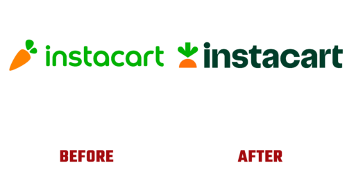
In mid-March 2022, an American grocery delivery company unveiled a new look for its brand. This was done amid its growing popularity due to the COVID-19 pandemic when many people began to order groceries online instead of going to the nearest store.
Wanting to consolidate the received authority and remind itself of itself in the face of easing coronavirus restrictions, the Instacart service announced another rebranding. With support from TwentyFirstCenturyBrand and Wolff Olins, her designers redesigned the entire visual identity system, including the iconic carrot emblem.
If earlier the orange vegetable was depicted in its entirety, now it is only visible by a third. It is assumed that its lower part is in the ground. This was done so that the company would not be associated with food products because as it expanded, it became involved in delivering electronics, drugs, cosmetics, household goods, and more.
The whole history of Instacart logos is the evolution of carrots. But now designers have shifted the focus from the vegetable to its green tail of leaves, which are shaped like a downward arrow. The company plans to use this element as an icon on the web, where it will be displayed when items are added to the shopping cart. Users have already appreciated this innovation because the new corporate identity was introduced into the service’s applications at the end of March.
The typography of Instacart has now been upgraded too. The brand name is written in lowercase bold letters that do not have glyphs but have unusual curves that create a sense of dynamics. This is an Instacart Sans font introduced by Ryan Budgen and adapted for mobile device screens. The color scheme uses shades of “Guava pink,” “Turmeric yellow,” and “Kale green” – a clear reference to the theme of food.


