Fresh vegetables and fruits promise to deliver the Instacart logo and other products from stores. According to the emblem, the service will take care of the maintenance of vital energy and the necessary set of proteins, fats, and carbohydrates for their clients.
Instacart: Brand overview
| Founded: | 2012 |
| Founder: | Apoorva Mehta, Max Mullen, Brandon Leonardo |
| Headquarters: | San Francisco, California, U.S. |
| Website: | instacart.com |
Instacart is an American home delivery company that operates in the United States and Canada. It offers a personal shopper service, receiving orders through a mobile app and its Website. Customers leave requests with a list of what they need, and the service assigns an employee to buy and deliver everything specified. The company was founded by Apoorva Mehta (with the participation of Max Mullen and Brandon Leonardo). The year of its foundation is 2012. The location of its headquarters – the city of San Francisco, California. Served territory – 5,500 settlements.
The company originally demonstrated an entrepreneurial streak rather than a pro bono business because a former Amazon.com employee started it. Apoorva Mehta hails from India. He and his family moved to Canada in 2000. He then went to the University of Waterloo, where he graduated in 2008 with a degree in engineering. At the same time, he took part in Y Combinator’s Summer 2012 (startup organization) and, in the end, created Instacart. His concept received financial support and consumer support, so a year later, the budding entrepreneur was already on Forbes’ list of successful people under thirty.
In addition to Amazon, he also worked at Qualcomm and BlackBerry as a supply chain specialist. Eventually, he created a profitable supply chain to move goods from online stores’ warehouses to customers’ homes. But his first attempts to get into this business on his own were not successful. So before he became the owner of a perfectly working scheme, he launched no less than twenty other services.
At first, the company operated only in San Francisco, but gradually the service covered the neighboring communities. The company itself expanded: by the spring of 2015, it had about two hundred employees. Gradually it acquired its stores, taking orders within them. At the same time, the service did not refuse to deliver purchases from other outlets. And it repeatedly got into various scandals related to the dissatisfaction of its employees and software errors that led to incorrect customer service.
Since Instacart is a branched service network, it has several commercial partners with whom it has made arrangements for home delivery. But because of its wide recognition, it is often chosen to make purchases from other stores, for which it charges an additional percentage. Requests come mostly through the online site, where they display their assortment. The site is decorated with a personal logo that marks everything related to the service. It has changed its identity only once.
Meaning and History
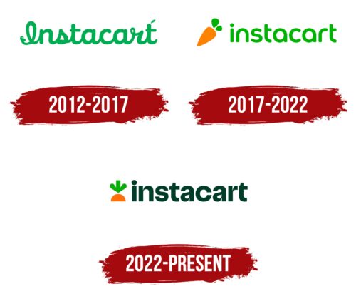
When Instacart first came into being, it was a food delivery company. Therefore, it was represented by an emblem depicting large, bright, and appetizing carrots. At the same time, there was a green wordmark that was used separately. A little later, the brand was forced to combine its graphic symbol and inscription to get a solid logo. And in 2022, there have been radical changes associated with the growth and expansion of the brand.
The business is no longer limited to food delivery and covers a wide range of products outside of groceries, from electronics and technology to cosmetics and medicines. Consequently, the carrot no longer reflects the fullness of the Instacart concept. To show the transition to a progressive era, the designers updated the company’s visual identity. As part of the rebranding, colors, typography, and the overall style of the emblem was changed. At the same time, the developers tried to keep familiar elements, including the original image of a carrot. But now the vegetable is almost completely hidden under the imaginary earth – only a green arrow-shaped tail looks out.
2012 – 2017
The emblem is concise. It contains just one word – “Instacart.” The lettering is in the calligraphic, straightforward script where each character is connected to adjacent characters. Though the design style imitates handwritten text, the letters are vertical instead of slanted, distinguishing the logo from similar ones. And the “I” looks fanciful, looking more like an “l,” a hinge, the handle of a grocery bag, or from a shopping bag. The last “t” has a miniature leaf. It is located at the top right.
2017 – 2022
After the redesign, the logo has taken on a different style and is much more modern. On the one hand, it shows practicality; on the other hand, it informs about itself. That is, it consists of graphic and text parts. On the left side, there is a standard orange carrot. It was used because it slightly echoes the word “instaCART” fragment. It has two small leaves that are not connected to the vegetable. On the right is the company name, but in a different font: lowercase, smooth, rounded. All lines are smooth and streamlined, so there is only one 90-degree angle – at the trimmed rung of the letter “t.” In addition, the designers changed the color scheme: they added orange and brightened the green.
During the evolution, the Instacart logo gained more personality and clarity. The handwritten lettering has become printed, and the letters have become separated. The font is now less decorative and more practical. A small symbol – a carrot – appeared next to the name.
For the word “Instacart,” the developers used a custom typeface that has no counterparts. They cut the protruding tops of the printed “n” and “r,” shortened the tail part of the letter “a,” pulled out the ends of the “s” and rounded them. The result is a soft font with sloping elements. The only corner was left at the “t” bar. Now the signature palette consists of light green and orange. Previously, it included only green.
2022 – today
The company’s team created the new visual style for Instacart in collaboration with the American consulting firm TwentyFirstCenturyBrand and the British advertising agency Wolff Olins. The developers originally planned to keep the carrot icon even though the business had expanded beyond food delivery. Thanks to this, the modernized emblem looks as friendly as the old one.
The designers reimagined the familiar orange vegetable, inspired by the ideas of transformation and movement. So the carrot, which previously hung indefinitely in space, was “planted” in an imaginary earth. Its top of green leaves in the form of a downward arrow symbolizes the ease of adding items to the shopping cart. This is the most dynamic element of the Instacart identity. The orange part of the carrot protruding from the ground is the epitome of good taste. And it’s not just about the taste of the food.
The soft curves of the emblem are in harmony with the rounded and smooth geometry of the wordmark, which is located on the right. As in the previous version, all letters are lowercase, but now they have a different shape. Designers used glyphs with lots of angles and unusual cuts. Remarkably, the two “t” in the inscription look different: one has a prominent horizontal stroke on the left, while the other does not. This was done so that there would be no extra space between “r” and “t” at the end of a word. The logo was launched at the end of March 2022 on Instacart apps.
Instacart: Interesting Facts
Instacart, started in 2012 by Apoorva Mehta, a former Amazon worker, revolutionized online grocery shopping. It quickly allows people to order from local stores for home delivery or pickup.
- Origin: Mehta was inspired to start Instacart out of frustration with traditional grocery shopping. He created the app from his San Francisco home in just weeks.
- Expansion: Originally serving just the San Francisco Bay Area, Instacart now operates in thousands of cities in the U.S. and Canada, working with big and small stores.
- Work Model: Instacart uses a gig economy setup, where shoppers work as independent contractors, picking and delivering orders. This flexibility has helped it grow.
- Boost from the Pandemic: The demand for Instacart’s service skyrocketed with the pandemic, with orders increasing up to 500% early on.
- Funding and Value: Instacart has attracted significant investment, reaching a multi-billion dollar valuation showing strong investor confidence.
- Tech Use: The company uses advanced algorithms and machine learning to make shopping efficient, including route planning for shoppers and inventory management.
- Subscription Service: Instacart Express is a subscription that offers benefits like lower service fees and free delivery on large orders.
- Store Variety: Beyond groceries, Instacart delivers from liquor, pet, and specialty stores, catering to various needs.
- Personal Touch: Shoppers can chat with customers through the app to ensure accurate orders, providing a personalized shopping experience.
- Eco-Friendly Steps: Instacart addresses environmental issues by promoting greener delivery options and partnering for reusable bag initiatives.
Instacart has significantly impacted e-commerce and changed how people shop for groceries, offering remarkable convenience and adaptability.
Font and Colors
In 2022, the company updated the typography of its wordmark and online store. Now its name is written in Instacart Sans signature font, created specifically for the logo. The designers made it so that the junctions of the curves with the vertical parts of some letters (for example, “n” and “a”) corresponded in shape to the angles that are formed when the leaves merge at the top of the carrot.
The cut lines at the “s” and “c” ends are horizontally aligned. At the same time, the “c” is distinguished by its round geometry, despite the bulges on the sides. Both “t’s” are also notable. They both have a smooth notch at the top, but the last “t” is missing a piece on the left side. The designers removed it to balance letter spacing.
As of 2022, the Instacart logo uses a food-related color palette. In the context of a vegetable theme, the main one is the carrot shade of orange (#FF7009). For the wordmark, the designers chose dark green Kale (#003D29) and a bright and rich light green color for the carrot leaves.
Instacart color codes
| Pumpkin | Hex color: | #ff7009 |
|---|---|---|
| RGB: | 255 112 9 | |
| CMYK: | 0 56 96 0 | |
| Pantone: | PMS Bright Orange C |
| Kelly Green | Hex color: | #0aad0a |
|---|---|---|
| RGB: | 10 173 10 | |
| CMYK: | 94 0 94 32 | |
| Pantone: | PMS 354 C |
| British Racing Green | Hex color: | #003d29 |
|---|---|---|
| RGB: | 0 61 41 | |
| CMYK: | 100 0 33 76 | |
| Pantone: | PMS 7729 C |


