Allen Institute updated its identity so its different scientific areas would be perceived as one organization. The rebrand was introduced in May 2026. The system was developed by Brody Associates and the institute’s internal team.
The institute works in brain science, cell science, neural dynamics, immunology, synthetic biology, and brain health. It creates open data, tools, and materials for scientists. The brand needed an image with an open tone, close to people and modern science.
The main change is visible in the logo. The old mark with colored intersecting arcs recalled many science brands from the early 2000s. It showed a connection between disciplines, but it looked heavy.
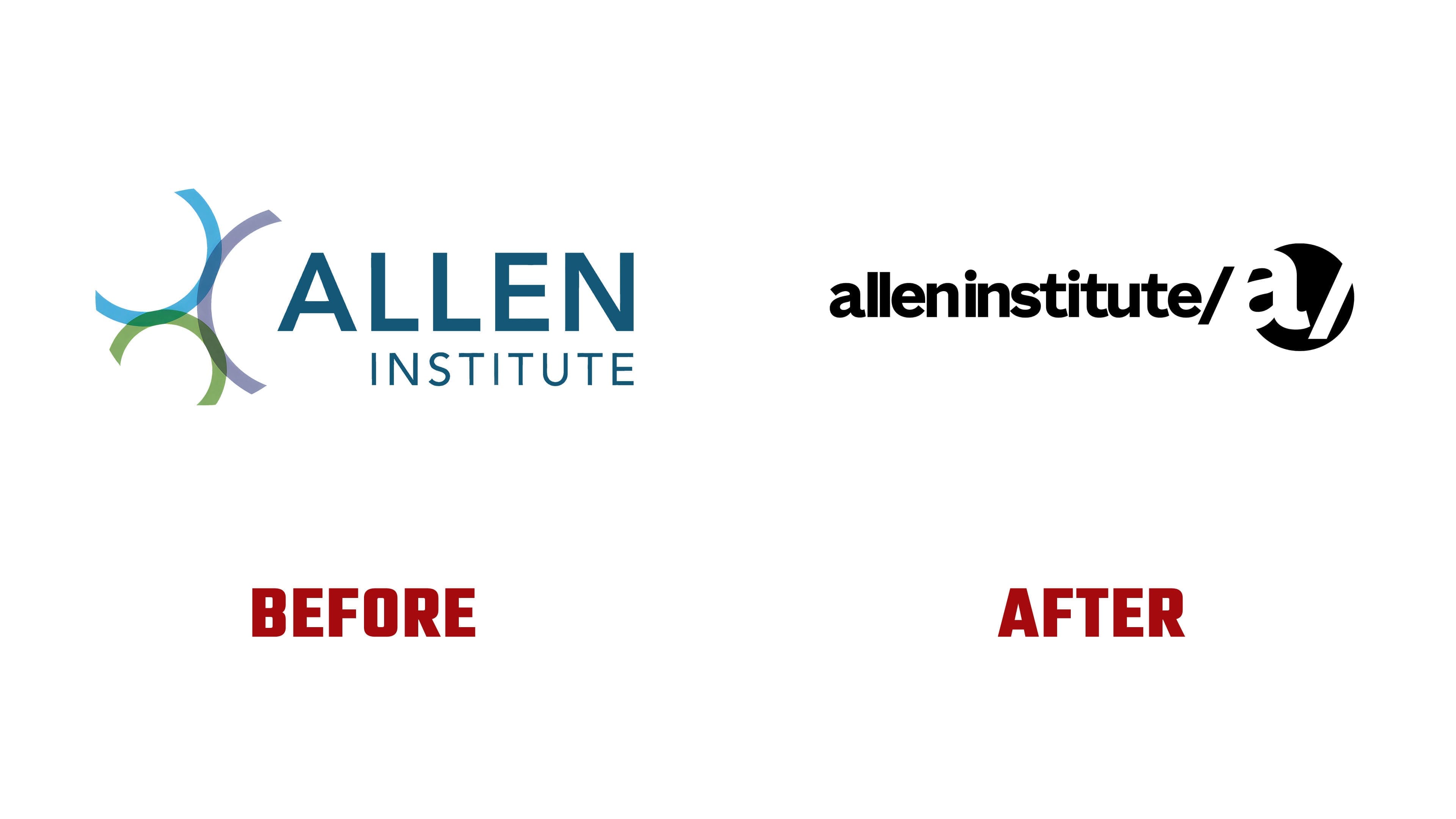
The new system is simpler. It is based on the lowercase Allen Institute wordmark, the “ai” monogram, a circular lens with the letter “a” inside, and the “/” mark. Together, they bring together the institute’s name, the idea of scientific observation, and the connection between teams.
The lens is connected with observation and focus. The circle with the letter “a” recalls optics, a microscope, and work with scientific images. Through it, the brand presents interest in cells, the brain, and living systems in a compressed form.
The slash “/” connects fields and programs. Brain science/cell science/immunology read as parts of a shared scientific field, linked within a single environment.
The lowercase Allen Institute wordmark makes the brand feel less formal. The dense custom typeface gives the name weight, while lowercase lettering adds a calm human tone. The “ai” monogram reads “Allen Institute”. The association with artificial intelligence appears alongside the main meaning, broadening the brand image.

The color system became livelier than the familiar scientific range of blue, gray, and white. It now includes purple, teal, yellow, green, and pink accents. They are connected with microscopy, scientific data, and images from the institute’s research.
The new platform is based on Open Science, Big Science, and Team Science. Open Science is tied to access to data and tools. Big Science concerns large-scale research challenges. Team Science describes the work of teams inside the institute and with external partners.
The logo turns the platform into a compact visual form. The lens shows the scientific view. The slash connects the fields. The Allen Institute name brings different laboratories and programs into one brand.