Innovation is a constant in the bustling world of decentralized finance (DeFi). Zerion, a prominent leader in this arena, has just revealed its refreshed brand identity, underlining its commitment to transparency, efficiency, and censorship resistance. Known for processing transactions over $1 billion and engaging over 300,000 monthly active users across 150 countries, Zerion’s unveiling of the Zerion logo’s new design marks a significant step forward in the company’s visual presentation.
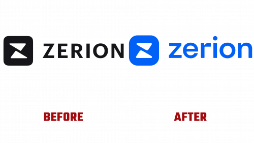
Although the Zerion logo may appear largely untouched, a closer look reveals a conscientious transformation. The new design emphasizes a harmonious aesthetic through a balance of rounded corners, well-proportioned holding shapes, and a subtle shift from uppercase to lowercase typography—these changes, though slight, result in a visual representation that’s more pleasing and cohesive.
Its innovative visual language truly differentiates the Zerion logo’s new design. This is most clearly seen in the logo’s two triangular elements, activated through varying graphic treatments. Whether taking the form of simple overlapping shapes or intricate patterns and immersive 3D graphics, these triangles breathe life into the logo. A particular highlight within this visual vernacular is the blending of psychedelic-3D-AI-generated-looking Web3 icons, fusing the modern Web3 aesthetic with Zerion’s distinct flair.
Zerion’s embrace of Web3 graphic standards is both well-crafted and methodical. It transcends mere abstract design by incorporating graphics and motion with deliberate intent. Even with certain superfluous elements, likely a nod to the abstract nature of blockchain technology, the overall visual impression appealingly disrupts the status quo.
While some might view the Zerion logo’s new design as somewhat generic, deploying this captivating visual language elevates it beyond surface appeal. The decision to subtly refine the logo while investing in a dynamic visual language aligns with Zerion’s core philosophy—innovating within existing frameworks, prioritizing quality and balance, and remaining grounded in its heritage, even amidst the fast-paced changes in DeFi.
Summarizing the change, Zerion’s new branding—marked by meticulous attention to detail and engaging visual language—underscores its dedication to maintaining its vanguard position in the DeFi sector. More than just a visual overhaul, the new logo and accompanying graphics dovetail perfectly with Zerion’s mission to provide robust and transparent financial tools to a worldwide audience. It symbolizes a brand that continues to break barriers and redefine how individuals engage with finance in a decentralized ecosystem, encapsulating a subtle revolution in the DeFi space.


