


Durham University St John’s College updated its image. It restored details to the coat of arms that had been lost over previous years of simplification. The academic community began in 1909 as a theological college. Today, it is part of Durham University, but it retains a separate academic status. London’s Kit Studio developed the new style. The reason was the college’s move out of the university’s shared web environment and the preparation of a separate digital space.
The work began with the historic coat of arms. Over the years, the mark had changed many times. Digitization and repeated simplification gradually removed some of the living details. The previous version still had the shield, eagle, lion, and strict Trajan typography. But the overall look had become too plain for an English college. The coat of arms still recalled the past, but it felt dry.
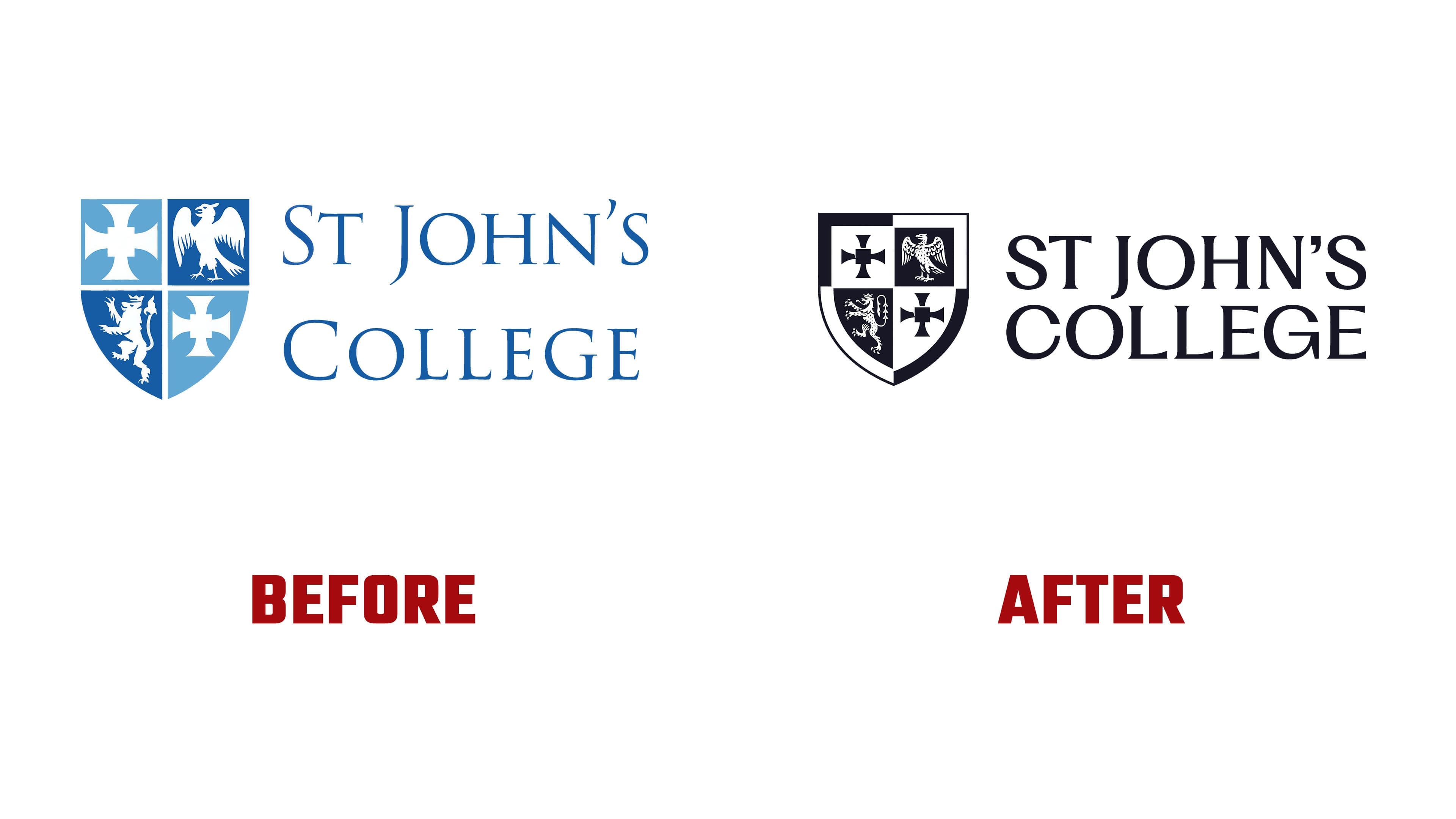
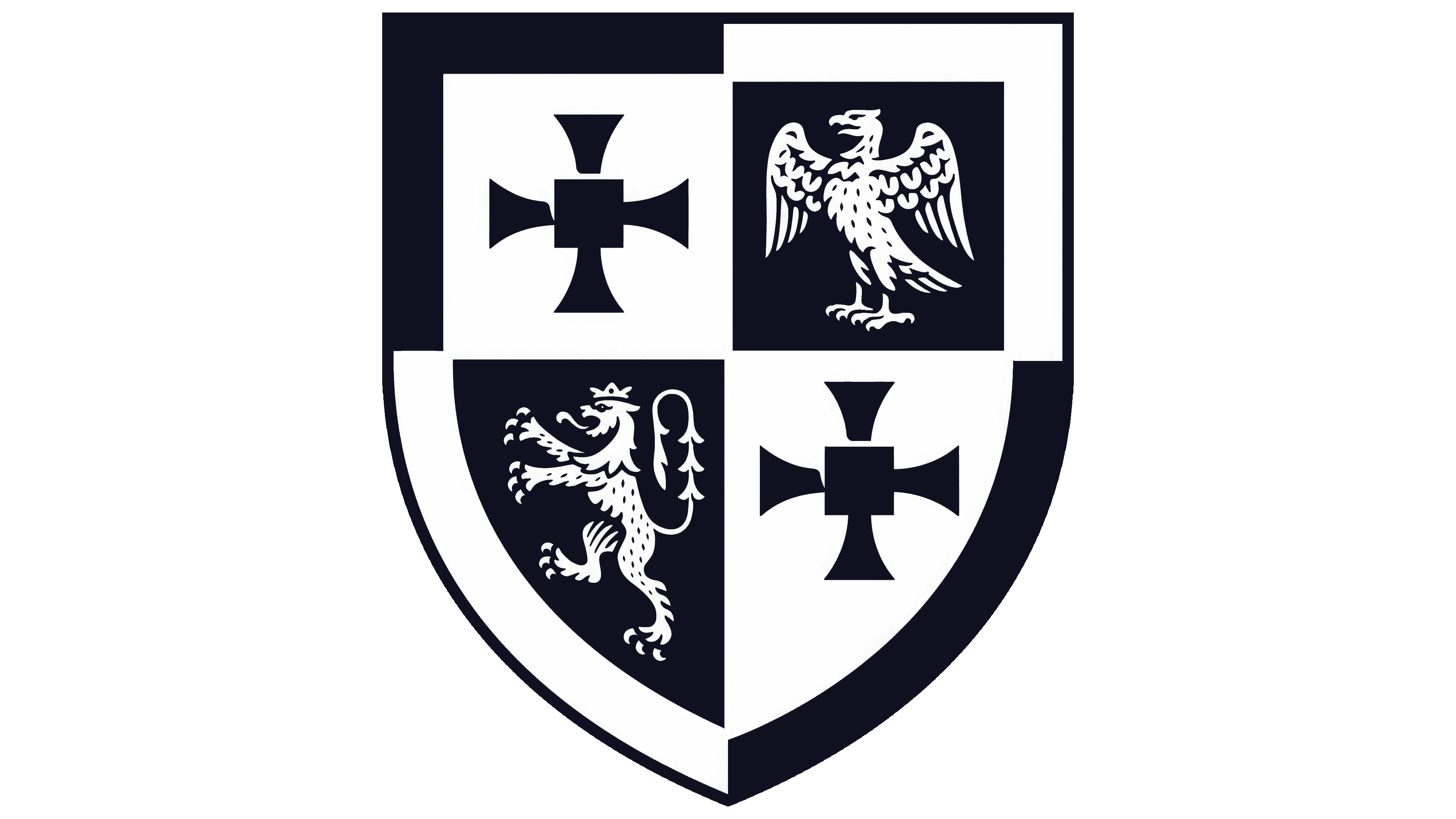
Kit Studio did not take the familiar route of stripping complex marks down for screens. For St John’s College, the team brought back handwork, lines, texture, and heraldic density. The coat of arms was recreated through pencil sketches, tracing paper, and illustration. Because of its handmade foundation, the mark became more alive and better conveys academic continuity.
The new system includes three versions of the coat of arms. The simplified shield works for small formats and digital icons. The detailed version works on large applications. The full coat of arms is needed for representative materials where ornament, the motto, and the full scale of heraldry matter.
The coat of arms once again works as the sign of an academic community with a long memory. For the college, it preserves the connection to academic heritage. For students and alumni, it strengthens a sense of belonging. For outside audiences, it presents St John’s as a community with roots.
The typography next to the coat of arms became lighter. Instead of the previous heavy classicism, the identity uses PP Fragment Glare by Pangram Pangram. The typeface keeps an academic tone, feels more alive, and works better for contemporary communication. Paired with the coat of arms, the style feels mature and ready for the digital environment.
The identity also includes the STJC monogram. It is used when a short mark is needed. The monogram expands the set of visual tools, but the coat of arms remains the main role.
The new St John’s College style shows that heritage need not become simpler for screens. The design studio restored details where they carry meaning and created a new system that works from a favicon to a ceremonial coat of arms.