Keukenhof is updating its image. The garden in Lisse has long been known as a major center for tulips. Over eight weeks, it welcomes about 1.4 million guests. More than 7 million bulb flowers from a hundred growers bloom across the grounds. The new look by thonik, introduced in October 2025 for the 2026 season, presents Keukenhof as a complex with a garden, a castle, and the history of the land.
The old mark tried to include too many images. It had a tulip in the letter, a leaf, a separate flower icon, the word “Holland,” and a red frame. Taken separately, the details were connected with the garden, but together they broke up the image and made it look like a souvenir sign. For a place with an international audience and a history dating back to the 15th century, a more cohesive mark was needed.
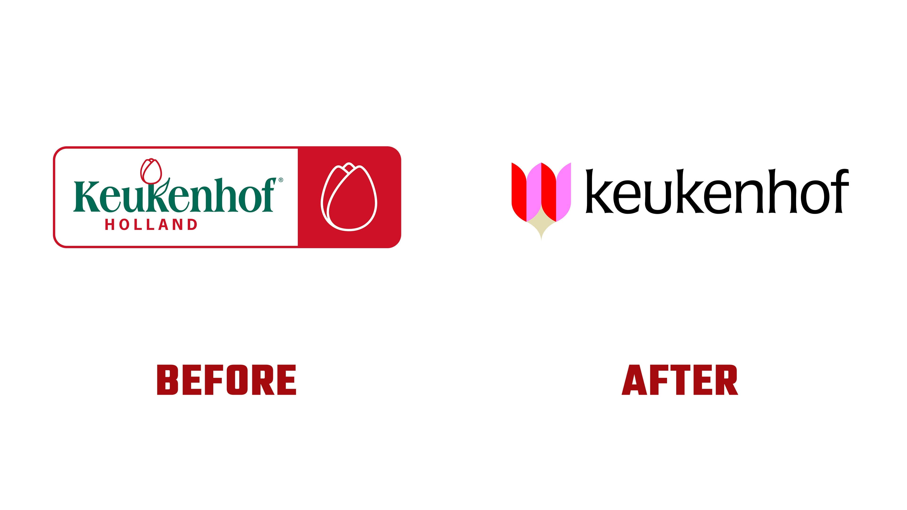
In the new logo, the tulip became a geometric emblem. The form is built on a grid connected with the stonework of the walls of Keukenhof Castle. The flower remains the main image of the garden, but now it is shown through strict abstraction. The mark is easier to understand, works better from a distance, and looks more contemporary while keeping its connection to tulips.
A related mark was created for the castle on the same foundation. Small changes turn the flower form into the image of a coat of arms or shield. It is connected to the estate’s history, which dates back to 1641, when Adriaen Maertensz Block built it. The garden and the castle took on different faces while remaining part of one system. It becomes easier for visitors to see Keukenhof not as a seasonal exhibition, but as a place with architecture, a past, and a cultural role.
The wordmark is set in Brasil by Ludwig Type. The expanding letterforms echo the sharp endings of the symbols and add a ceremonial tone to the style without the heaviness of a museum plaque. Lowercase letters soften the impression and make the logo feel more like a living place where people come to walk, see the blooms, and learn about the grounds’ history.
The update by thonik removes the previous decorative noise, making Keukenhof’s image clearer. The new logo serves as an entry point to the story of a place where a spring exhibition, an old estate, and the land’s history converge into a single system.