


Novameat updated its image. Casa Bien developed the identity. The brand moved from a startup-style presentation with leaves, green color, and obvious references to alternative meat toward a more mature B2B image. The new logo is designed for restaurants, food manufacturers, and professional kitchens.
Novameat makes plant-based meat alternatives in whole-cut formats. The product is based on plant protein and technology that creates a fibrous texture close to meat. For chefs and food manufacturers, the brand emphasizes taste, ingredients, health, and ease of use in the kitchen. The product is presented as a base for different dishes.
The previous logo relied on familiar food tech codes. Leaves, green color, soft forms, and unusual letters pointed to nature and innovation. For retail, that presentation helped people quickly recognize the product as plant-based.
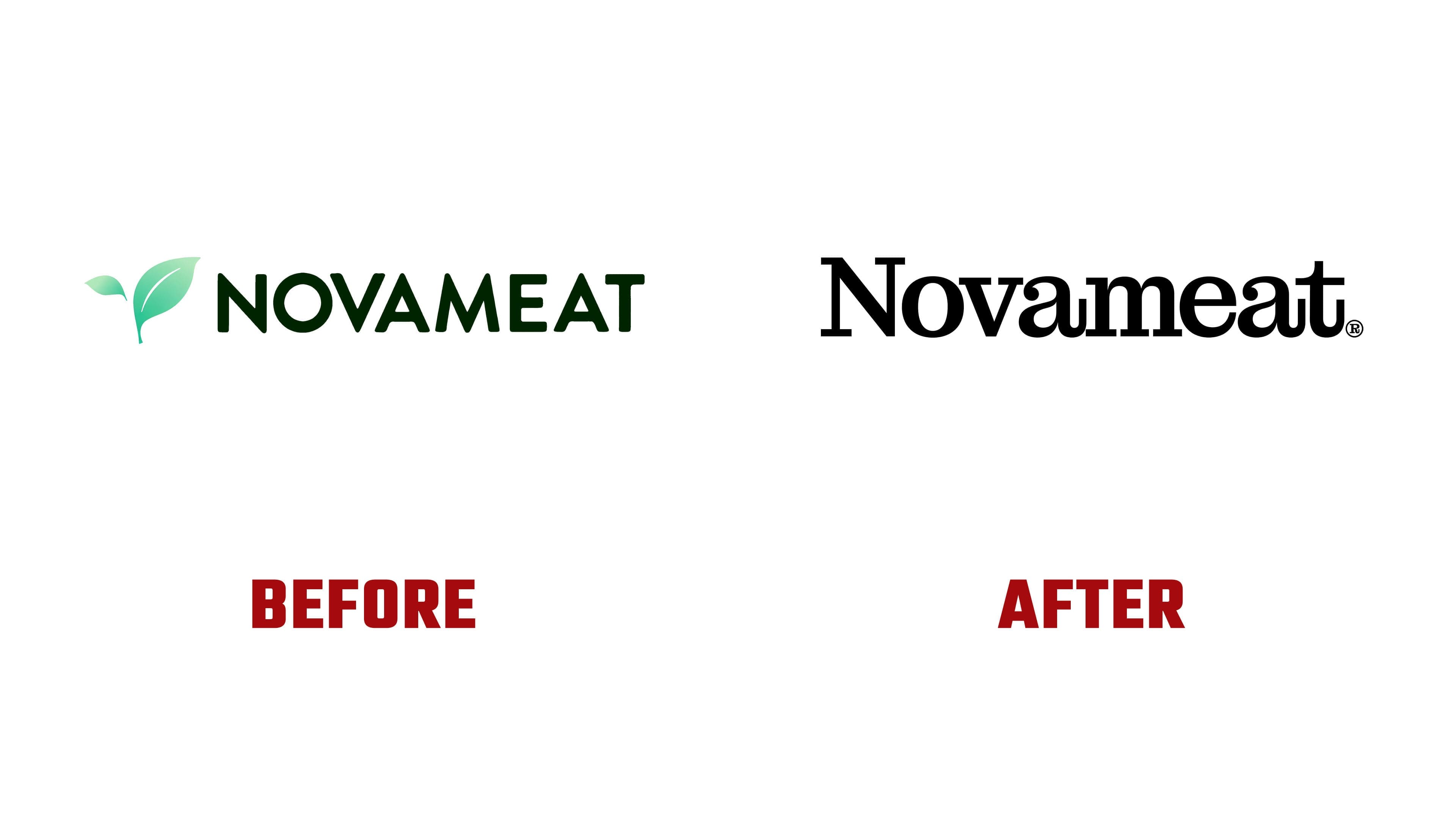
In the new logo, the name Novameat becomes the main element, set in a contrasting serif typeface. The black wordmark looks stricter and more mature. It feels closer to restaurant culture, a premium food brand, and editorial presentation. The logo emphasizes the brand name and moves communication away from nature-based symbols.
The separate symbol is tied to the fibers that form the product’s texture. Through this motif, Casa Bien connected the product’s technology to its plant-based origin. The mark recalls the internal structure of protein, slicing, cooking, and the way the product behaves in a dish. For a professional kitchen, it presents the image of a material that a chef works with through a knife, heat, and a recipe.
The project typography lists Montagu Slab and Haffer. Their combination supports the new tone. The scientific part remains close to gastronomy, while the product presentation moves away from familiar clichés about “eco” products and meat substitutes.
For the brand, the redesign became a way to approach restaurants and food manufacturers with a more mature image. The brand presents plant protein as a working product for a new kitchen, where taste, ingredients, health, and technology are integrated into a single process.