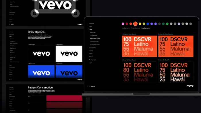
Developed and launched in 2009 by Sony Music Entertainment and Universal Music Group, Vevo’s entertainment platform has become even more attractive. The new style was developed by design studio Porto Rocha from Brooklyn, NY. At the time of its creation, the problem of the lack of the ability to use a single service to access various types of entertainment – music, video, games, etc., was ripe, which led to the emergence of Vevo. Today, the platform includes over 500,000 commercials alone, featuring unique personalized programming, live concerts, and video clips. The constant filling of the library, the formation of new sections taking into account the wishes of users, providing more than 25 billion views per month, and the desire to constantly evolve required fundamental changes to the appearance of the platform.
The development from Porto Rocha relied on the lack of broad information about the Vevo brand itself, although the platform is quite popular. The problem was in communication support. The complexity of communicating messages between different audiences, including the ease of communication between users and the entertainment industry, whose work is used by the brand, required an obvious and urgent solution. This constituted the primary task – to find a solution to the problem for implementation into the internal interface of the service.
The whole construction of the new identity was to expand the capabilities of the brand elements, taking Vevo far beyond a simple watermark. The work done created a new editorial space, the orientation of which was directed towards the culture created by the brand, creating a new additional direction associated with the formation of an expert assessment for each creative product available on the platform. This contributes to the formation of such an assessment, which acquires significance in users’ faces, thanks to the support of figures, facts, the opinion of Vevo professionals, for the correctness and reliability of which only the brand itself claims. The design was built on dynamic solutions developed by professional artists.
It is the secondary tones that have become an important element in forming a new identity. With their help, thanks to the flexibility of the shades of the color palette, it was possible to form a convenient way of information hierarchy, creating an understandable and easy-to-use search engine. The Plain font by François Rappo for the Optimo factory, chosen to reflect the information, very effectively supports and complements the brand’s logo itself, creating an effect of warmth and unity in conjunction with the Grotesque font.


