


![]() VfB Stuttgart Logo PNG
VfB Stuttgart Logo PNG
It’s like a dragon’s flame is blazing on the team emblem. The VfB Stuttgart logo indicates the club’s growth and morale every year. The sign represents courageous, strong players with extensive experience in sports.
On September 9, 1893, twenty young men founded Stuttgarter Fußballverein in Stuttgart. Rugby dominated the early years under the influence of English expatriates such as William Cail. Training took place at Stöckach and later at Cannstatter Wasen, while a football section was formed in 1908.
On April 2, 1912, FV Stuttgart merged with Kronen-Klub Cannstatt at the Concordia hotel, forming VfB Stuttgart. The merger improved infrastructure and opened access to the top regional league. In 1925, the red chest stripe, the “Brustring,” was added to the white kit.
In the 1920s, Stuttgart reached national rounds and won the Württemberg-Baden title in 1927. The first German championship came in 1950 against Kickers Offenbach, followed by another in 1952. Robert Schlienz captained the team despite losing an arm. German Cups followed in 1954 and 1958. VfB became a Bundesliga founding member in 1963.
Relegation in 1974–75 reflected financial strain. Under Jürgen Sundermann, with Karlheinz Förster, Hansi Müller, and Ottmar Hitzfeld, the team scored 100 goals in 1976–77 and returned to form. In 1983–84, Stuttgart won the Bundesliga under Helmut Benthaus.
Jürgen Klinsmann led the scoring in 1987–88. In 1989, Stuttgart lost the UEFA Cup final to Napoli, with Diego Maradona in the team. The 1991–92 title came ahead of Borussia Dortmund on goal difference. In 1997, the club won the DFB-Pokal and lost the Cup Winners’ Cup final to Chelsea.
In 2007, Stuttgart won the Bundesliga under Armin Veh, with Sami Khedira scoring against Energie Cottbus. Relegations in 2016 and 2019 ended with quick returns. In 2023–24, the club finished second in the Bundesliga.
Meaning and History
![]()
The coat of arms, which became the “progenitor” of the current emblem, was first used in 1950, following VfB Stuttgart’s championship victory. He accompanied the team until 1994, which coincided with its participation in the 1992/1993 Champions League. During this time, designers have created four distinct symbols that share common elements. It was based on a heraldic shield. Inside was the original “VfB” monogram, designed by soccer player Hermann Stammler. Slightly below – the year the club was founded, and a small yellow shield with three antlers.
What is VfB Stuttgart?
VfB Stuttgart is the short form of the German professional soccer team Verein für Bewegungsspiele Stuttgart. It was founded in 1893, is based in Baden-Württemberg, and competes in the Bundesliga. The club has won the DFB-Pokal and UEFA Intertoto Cup three times each and has been the national champion five times.
1893 – 1912
![]()
The FV Stuttgart rugby team was created in 1893. At the same time, it got its emblem: a rectangular shield with a round base and crown. In the middle was a white oval with a six-pointed yellow-black star.
1912 – 1950
![]()
After the merger of FV Stuttgart and the Kronen-Klub Cannstatt, tfB Stuttgart was formed. He abandoned the old emblem and introduced a new coat of arms that included the symbols of the House of Wurttemberg, the royal dynasty. The yellow shield with three stylized antlers reflected the kingdom’s heraldic traditions.
1950 – 1963
![]()
After the football league was restored, the club renewed its logo in the post-war period. The designers have reduced the old coat of arms and placed it in a large shield. Above was an unusually designed inscription, “VfB,” and the year of FV Stuttgart’s foundation, divided into two parts.
1963 – 1975
![]()
The emblem has a new version. The small shield with deer horns is now the same color and shape.
1975 – 1984
![]()
In 1975, another transformation took place: red began to replace light brown and yellow.
1984 – 1994
![]()
The founding year of FV Stuttgart has been removed. The logo existed in this form until 1994.
1994 – 1998
![]()
After winning the Bundesliga title, the team redesigned the emblem again. The designers simplified the form of the VfB lettering, restored the number 1893, made the large shield a black outline, changed the yellow shade to a brighter one, and reduced the antlers.
1998 – 2014
![]()
The next logo update took place in 1998. As a result, the horns were straightened, and the year the club was founded was replaced by the inscription “STUTTGART.” The letters of “VfB” are separated, with “V” being the first discovered.
In 2007, the football team received another German championship title. In honor of numerous victories, a gold five-pointed star was added to the emblem, darkening the red color.
2014 – today
![]()
Club President Bernd Wahler brought back the logo used from 1950 to 1993. Fans rejoiced because they had fought for 21 years to regain their favorite coat of arms. The old-new emblem was overwhelmingly approved and debuted in the 2014/2015 season.
Font and Colors
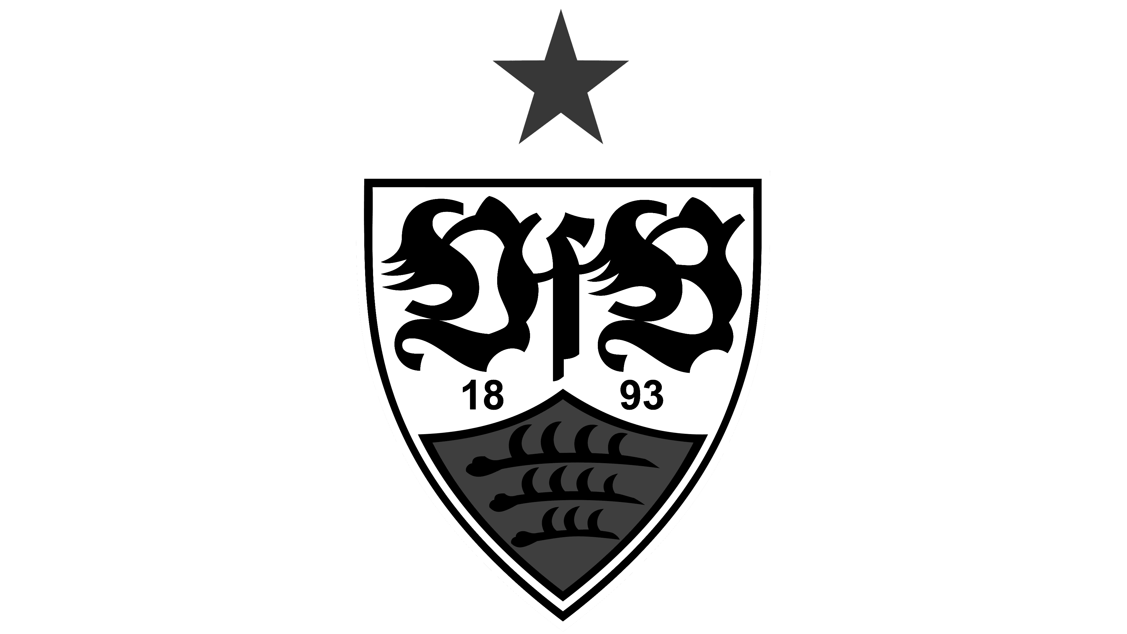
The VfB Stuttgart logo features an important symbol for Württemberg: a yellow shield with three black horns. This heraldic element was first documented in the 13th century. It was first used as a family coat of arms and became a state symbol. The three antlers became part of the VfB badge in 1912 following the merger of the Kronen-Klub Cannstatt and FV Stuttgart.
Another iconic detail of the coat of arms is the “VfB” lettering created by Hermann Stammler. The football player was fond of collecting artwork, so he approached the matter creatively and turned the letters into an unusual ornament.
For the year, divided into two parts (“18” and “93”), a regular sans-serif font is used. Team initials are much more complex: they form a symmetrical monogram. The wordmark’s main decorative elements are arches and tails, which create a dynamic look and maximize logo recognition.
The VfB Stuttgart color scheme contains white and red. This palette is reflected in the club’s emblem and is complemented by three more colors: black (for the antlers), bright yellow (for the small shield), and gold (for the star).