Virgin Wines, an online wine retailer based in the UK, has launched a new logo and brand identity designed by Borne. Established in 2000 by Richard Branson’s Virgin Group and acquired by Direct Wines in 2005, Virgin Wines offers a diverse range of wines and has sold over 100 million bottles.
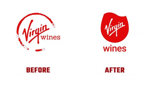
The old logo featured a wine glass mark that appeared grungy. The new logo captures the swirling motion of wine, inviting viewers to imagine a glass. This minimalistic design cleverly incorporates the Virgin logo, with the “V” naturally flowing into the swirl. The word “wines” is positioned underneath, though it may feel somewhat detached. A lock-up where “wines” form the base of the implied glass could have provided a more cohesive look.
The new identity introduces a custom typeface in a condensed, flared serif style with a bold weight. This typeface includes charming ball terminals. The branding applications are mostly well-executed, though some combinations of photography and silhouetted wine bottles feel stylistically inconsistent. Despite this, the new logo and custom typeface provide a solid foundation for an upscale yet approachable identity.
The swirling wine logo symbolizes the release of aromas that enrich the smelling and tasting experience. This simple, adaptable mark includes a low-ink version to reduce its ecological impact.
The new identity’s color palette maintains the Virgin red. Supporting colors are inspired by various wines, with shades named after wine varieties like Malbec, Bacchus, and Riesling. These colors are used in gradients, mimicking the look of wine swirling in a glass.
Typography changes were significant. Borne removed Virgin Wines from the typical sans serif and serif font combination and introduced a custom Dalton Maag font. This font features flowing lines and hidden smiles, such as in the letter “e,” adding a unique and playful touch to the brand’s typography.
The rebranding positions Virgin Wines as a modern, customer-centric company that values accessibility and enjoyment in wine drinking. The new logo and identity reflect the brand’s commitment to delivering extraordinary experiences, from the logo’s visual appeal to the thoughtful use of colors and typography. This fresh, innovative approach sets Virgin Wines apart in the competitive wine market, reinforcing its status as a distinctive and engaging brand.
Virgin Wines’ new identity balances the recognizable Virgin brand elements with a contemporary and elegant look. The swirling wine logo and custom typeface are key highlights that enhance the brand’s visual identity. Despite minor inconsistencies in application, the overall design is a significant step forward, offering a more refined yet approachable image that resonates with both seasoned wine enthusiasts and newcomers.


