VSCO, the photography community platform founded in 2011 by Joel Flory and Greg Lutze, has introduced a new visual identity designed by EST+6. This refresh aligns with VSCO’s mission to nurture creativity and support its community of over 2 million paying members and 200 million total users. The new identity highlights the brand’s focus on “Serious Creators.”
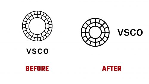
The updated logo is a key part of the rebranding. The original logo, which featured a complex design based on genetic mapping, was not performing well on digital screens and smaller contexts. The new logo retains the core elements but simplifies and modernizes them for better functionality and visual appeal. The custom wordmark is bolder and darker, creating a cohesive and contemporary look.
The iconic ring symbol has been optimized. The inner ring originally had 14 slots, and the outer ring, with 26 slots, has had its segments reduced and geometry cleaned up. This enhances the logo’s performance on digital platforms while maintaining its recognizability. The inner ring represents the creative process, and the outer ring symbolizes creative expression, reflecting VSCO’s dynamic and supportive ecosystem.
The new visual identity includes a custom typographic family, VSCO Gothic, designed by Göran Söderström from Letters from Sweden. This typeface, available in five weights, is designed for digital and print use. It focuses on realism and creates a coherent and elegant graphic language that complements the platform’s photography-centric nature.
The rebranding also features isometric illustrations and animations by Kelsey Robinson. These elements explain the room-by-room heating and cooling system playfully and engagingly, adding motion and interactivity to the brand’s visual language.
The new layout system is ambitious and visually striking. It features complex compositions that crop and re-crop photography, pairing it with type in various combinations. This approach creates a dynamic visual experience highlighting the creators’ work while maintaining a clean and organized aesthetic.
The new identity creates a seamless connection between creators and their audiences. By reducing the number of type sizes and focusing on elegant typography, the design declutters the visual space and allows the artwork to flow seamlessly around the text. This thoughtful approach ensures that the visual identity enhances the creative work showcased on the platform.
The refreshed visual identity modernizes the company’s appearance and reinforces its dedication to supporting and nurturing creativity. Focusing on quality, creativity, and community, the company aims to provide a platform where serious creators can thrive and connect with like-minded individuals.


