


![]() Washington Wizards Logo PNG
Washington Wizards Logo PNG
The Washington Wizards’ emblem reflects the club’s incredibly rich history and symbolizes the district of Maryland and Virginia. The emblem connects both states with the team’s name, reflecting elements iconic to them.
The history of the Washington Wizards dates back to 1961, when the franchise debuted in Chicago as the Chicago Packers, named after the local meatpacking industry. In 1962, it was renamed the Chicago Zephyrs, but limited success and weak attendance led to relocation already in 1963.
The team moved to Baltimore and became the Baltimore Bullets, a name tied to the city’s military past and a former BAA club. The early identity used a bullet symbol, but in 1969, it shifted to a basketball-focused image with hands, reducing direct references to weapons while keeping the name intact.
In 1973, the franchise relocated again, this time to Washington. It briefly used “Capital Bullets” before settling on “Washington Bullets”. The name remained for over twenty years, though criticism grew steadily due to its association with violence, especially in a city facing high crime levels.
By the early 1990s, pressure around the name intensified. In 1995, owner Abe Pollin announced a full rebrand following the assassination of Yitzhak Rabin. Pollin publicly expressed discomfort with a name associated with weapons in that context. A naming contest was organized, and Wizards was selected as the replacement.
The new identity removed direct references to violence, but reactions were mixed. Some critics pointed to unintended cultural associations, while others focused on the abrupt break with decades of history. Despite this, the franchise kept the Wizards name and continued under a revised identity, closing the chapter that began with the Bullets era.
Meaning and History
![]()
The incredibly rich history of the basketball team is reflected in its logos, of which it has had fourteen since 1962. The franchise debuted as the “Chicago Packers.” Then it underwent a series of name changes, from the Chicago Zephyrs to the Baltimore Bullets, the Capital Bullets, the Washington Bullets, and the Washington Wizards. Along with this, the format of individual identification marks also changed.
What is Washington Wizards?
This is an NBA franchise that was previously known as the Washington Bullets, the Capital Bullets, the Baltimore Bullets, the Chicago Zephyrs, and the Chicago Packers. It has existed since 1961 and has moved several times. Its current home stadium is the Capital One Arena.
1962
![]()
The team, now known as the “Washington Wizards,” began performing under the name “Chicago Packers,” a nod to the city’s meatpacking industry. The initial version consists of a basketball with characteristic lines forming an inner oval and a central strip dividing the circle into two symmetrical halves. In the center is an outline of a bull’s head with long horns pressing against the outer edge.
1963
![]()
Just a year later, the team changed its name to “Chicago Zephyrs” (“Zephyr” is a west wind, and Chicago is the Windy City), which naturally led to a new logo. The updated club received a radically new emblem. It consists of the single word “Zephyrs,” stretched diagonally from top to bottom. The inscription is golden with a black-and-white border. Next to each letter are small strokes, indicating the speed of movement when encountering wind resistance during a run.
1963 – 1968
![]()
After moving to Baltimore, Maryland, the franchise changed its name and logo. From 1963 until 1973, it was called the Baltimore Bullets. This is reflected in the individual symbolism: a bullet piercing space against the backdrop of a schematic ball. On the trajectory of its flight is the word “Bullets,” capitalized. Slightly above, in small font, is written “Baltimore.” The logo’s colors are red and blue.
1968 – 1969
![]()
In 1968, a new emblem appeared briefly, consisting of the orange word “Bullets.” It graphically plays with the two letters “l”: they form two hands trying to catch a basketball. The first part of the team’s name is located slightly above the left and is colored blue.
1969 – 1971
![]()
In this version, designers changed the logo’s palette. They removed the orange color and made the words “bullets” blue and “BALTIMORE” light blue. Artists repainted the basketball yellow.
1971 – 1972
![]()
The color change also occurred in the next version of the logo. Both parts of the club’s name turned dark blue, and the ball turned brick red.
1972 – 1973
![]()
This was the end of the “Baltimore” era. The image didn’t undergo significant changes, but the word “Bullets” was written in light blue, and the basketball was now light orange. Designers returned to the 1970 logo.
1973 – 1974
![]()
The franchise was transferred from Baltimore to Landover, Maryland, and spent one season under the name “Capital Bullets.” The name change led to a redesign of the logo, which was created in 1973. In this version, the text is cobalt, the ball is brick-red, and instead of the word “bullets,” “capital” (the first part of the new club name) is used.
1974 – 1987
![]()
After the move, when the franchise was transferred to Washington, the management revised the logo. As a result, above the base inscription “bullets,” the name of the city where the team moved to, Washington, appeared. It’s executed in uppercase. The text and ball color were slightly enhanced.
1987 – 1997
![]()
In this version, the logo creators decided to move away from the concept of hands with open palms and simplified the visual identification structure. They also made the letters cobalt, enlarged the letter “B,” and turned the basketball so its lines were vertical rather than horizontal.
1997 – 2007
![]()
In 1997, a new era began for the sports club and its symbolism: they took a new name, the Washington Wizards, and accordingly, a wizard. In the first version, the wizard’s body and beard form a black letter “W.” With one hand, the magician holds a ball with characteristic lines, and with the other, he points to a star. At the same time, the right hand is stretched out in a throw, and the foot stands behind the crescent moon’s sickle. Below is the word “WIZARDS.”
2007 – 2011
![]()
During this period, changes were minor: the developers lightened the logo color by several shades.
2011 – 2015
![]()
In 2011, the color scheme was redesigned to fully match the American flag’s colors. The palette received a different scheme. Designers made the wizard’s torso, palms, and face blue and his pants, sleeves, star, and hat light red.
2015 – present
![]()
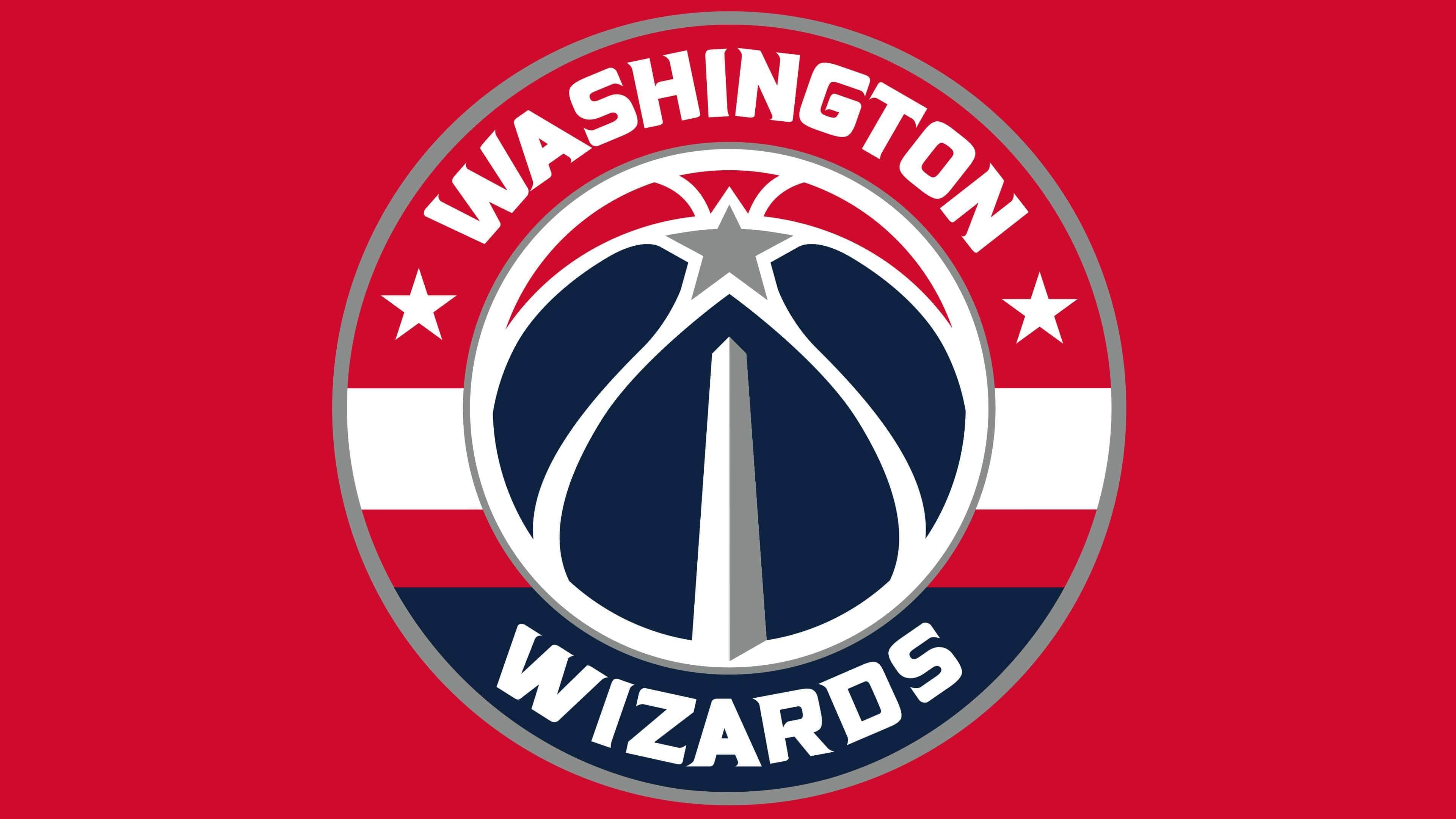
In 2015, the management presented fans with a new version of the team’s logo, based on the “Washington Wizards” alternative emblem (2011-2014). The current version consists of a circle, made in the style of a classic rondel. The logo, in print form, features a central element, a wide border, and thin dividing lines. In the center is a ball with a star. To the right and left of it are two more stars. Above, in a red frame, is written “Washington,” and below, on the blue side, is “Wizards.”
At the same time, the logo featured signature Washington stripes. Three stars represented Maryland, Virginia, and the District of Columbia.
In any case, the peculiarity of the new Washington Wizards logo is not in its appearance (there’s nothing special in it; truth be told, it’s one of the most boring designs in the league). The point is in the moment of its appearance. This is a rare, almost unique case: the team changed its logo right during the season, exactly during the playoffs. In basketball tradition, this is perhaps the first case when an NBA logo was replaced not in the off-season.
Font and Colors
Despite a wide range of design solutions, each logo variant unites one thing: a basketball. In some cases, it serves as the central detail; in others, it is a background. The current version contains the deepest symbols: three stars symbolize the three locations of the team, Washington, Virginia, and Maryland.

The text on the updated emblem resembles Friz Quadrata Bold, a serif font developed by Ernst Friz and Victor Caruso. A similar font is used in the logos of Wizards and Crescents. In previous logo versions, the inscriptions were even and smooth, with no sharp transitions. Now, narrower, strict symbols with miniature serifs at the ends of individual letters are used.
The official Washington Wizards palette includes PMS 877 Silver, PMS 289 Navy Blue, and PMS 186 Red. White is also available as an additional color.