The emblem breathes friendliness and politeness. Wendy’s logo invites you to enter and have fun in the restaurant. The sign promises that the plate contents will please adults and children. The restaurant offers a full and tasty menu.
Wendys: Brand overview
Wendy’s is the third-largest franchised fast-food chain in the United States, second only to Burger King and McDonald’s competitors. It appeared in the fall of 1969 in Columbus, Ohio, where it was founded by Dave Thomas, entrepreneur, philanthropist, and tycoon. He made square burgers, Frosty ice cream, chicken sandwiches, and seasalt fries, the main highlight of his business. Moreover, this representative of the fast-food industry was the first to offer a menu at a single price: in 1988, a card with 99 cents for each dish was entrusted. In the winter of 2006, the company’s headquarters were moved to Dublin. Now, its structure includes more than 6,710 points.
Dave Thomas opened the first Wendy’s in Columbus, Ohio, in 1969. He wanted to create a place serving high-quality, fresh food and named it after his daughter, Melinda, nicknamed “Wendy.” The restaurant was famous for its square burgers and a menu that reminded people of homemade food.
During the 1970s, Wendy’s quickly became a favorite across the United States. Its fresh beef square burgers, rich chili, and freshly cut fries set it apart from other fast-food joints. This period of growth was fueled by a strong commitment to quality that Dave Thomas insisted on from the start.
The 1980s were big for Wendy’s, thanks to the “Where’s the Beef?” ad campaign. It wasn’t just funny; it made Wendy’s a household name, and by 1980, the chain had grown to over 1,000 restaurants.
The 1990s introduced new challenges with stiff competition. Wendy’s responded by adding chicken sandwiches and salads to its menu to appeal to a broader audience. Despite the pressure, the brand kept its focus on quality food.
The early 2000s were a time of change for Wendy’s, especially after the loss of Dave Thomas in 2008. The brand had to rethink its strategy to stay relevant, leading to its branding and menu updates. By 2011, these efforts paid off, and Wendy’s moved up to become the third-largest burger chain in the U.S. This was also when Wendy’s started modernizing its restaurants and improving menu quality with items like bacon burgers and spicy chicken sandwiches.
Since 2016, under CEO Todd Penegor, Wendy’s has embraced digital innovations, focusing on technology and delivery to enhance the dining experience. The brand also refreshed its image with a bold social media presence, engaging customers with humor.
Wendy’s didn’t stop there. It introduced breakfast and vegetarian options to its U.S. menus, aiming for global growth with plans to open 1,500 new restaurants by 2024.
Wendy’s has over 6,500 locations worldwide, maintaining its reputation for quality, innovation, and unique dining experiences despite the competition. The journey from a single restaurant in Ohio to a global fast-food powerhouse illustrates Wendy’s enduring appeal and commitment to staying relevant and loved by customers worldwide.
Meaning and History
His travels to the Kewpee Hamburgers in Kalamazoo, Michigan (his hometown) inspired this fast-food chain. They sold big square burgers and malt cocktails. They impressed him so much that he started with a similar menu when he opened his establishment – a round bun with a square flatbread (not a cutlet) made from fresh ground beef. It was large, and its corners protruded from the sides of the roll, hanging down appetizingly. This gave the impression that a lot of good meat was served here.
Such a marketing move gave a good reason for the development of the network. In 1972, the first franchisee, L.S. Hartzog, signed a contract to open its outlet in Indianapolis, Indiana. At the same time, the first Wendy’s commercials appeared on television. Then, in 1976, a signature restaurant was created in Canada – in Hamilton (Ontario). In the same year, the 500th fast food point was launched (in Toronto), and two years later – the thousandth (in Springfield, Tennessee). The chain has had a very turbulent history, merging with Triarc Companies Inc. in 2008. and Arby’s, after which it became known as The Wendy’s Company.
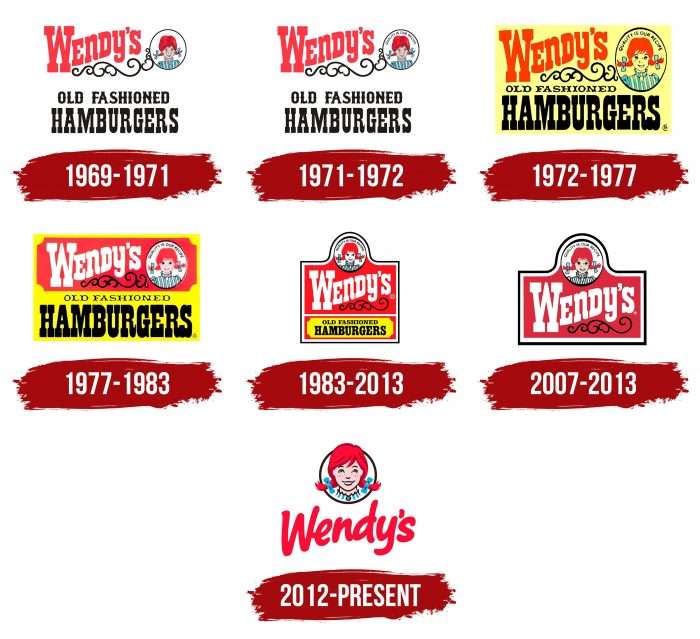
The restaurant’s name came from Melinda Lou “Wendy” Thomas, Dave Thomas’s fourth child. Her childish image became the basis of the emblem, which is still used today. The network had seven logos in total.
What is Wendys?
Wendy’s is a chain of fast food restaurants where you can order french fries, a chicken sandwich, a square hamburger, or a signature dessert. She appeared in 1969 and belonged to the holding company The Wendy’s Company. The founder of the network is an American businessman Dave Thomas. He named the fast food brand after his daughter Melinda Lou Thomas-Morse, who got the nickname Wendy because of her inability to pronounce certain letters. Her youthful face is depicted on the logo of the restaurants.
1969 – 1971
The first emblem set the style for everyone else because they often changed but not drastically. The debut version presents four basic elements that form the restaurant chain’s visual image and convey its concept.
The title is the main one because “Wendy’s” is written in large red type and is located at the top. It has a slightly wavy shape because, at the bottom, a thin winding ornament turns into a circle. It depicts the owner’s daughter, associated with the brand’s name: a smiling girl with red hair, friendly eyes, and two short pigtails braided with blue bows. The stripes on her dress are the same color.
At the bottom is the phrase “Old Fashioned Hamburgers,” which spans two lines. The upper inscription (Old Fashioned) is made in Old English script with curly letters and double-sided sharpening in the middle of the legs. The bottom word (Hamburgers) is written in Showguide Normal with very wide serifs, reminiscent of massive platforms on which the characters are printed. On the contrary, the central part of the letters is thin and elongated.
1971 – 1972
The next emblem appeared after the launch of the second restaurant, where a window was added to serve customers in cars. All elements in the logo remain the same. The only update that touched the circle with Wendy was that the designers placed the slogan “Quality is our recipe” over the girl’s head in a semicircle.
1972 – 1977
For the first time, the portrait of the company’s founder’s daughter was redrawn differently. The artists removed the childish mood and vivid emotionality, making the image more formal. Blue stripes, like on Wendy’s dress, appeared on her collar. The graceful curls separated from the large circle with the girl. The developers changed the slogan, and the words “Old Fashioned” were given a new font, halving them.
1977 – 1983
Since 1977, the emblem has been divided into red and yellow zones. The first (with beveled corners) features a portrait of Wendy against a white background in a round black frame, curls, and a wave-like name for the restaurant chain. The second part (bottom) contains the phrase “Old Fashioned Hamburgers” in two rows. The developers have aligned the phrase “Old Fashioned” in the center.
1983 – 2013
This logo has been used the longest due to its unique shape and upward portrait. The image of the girl remained the same—just the designers changed its location. They put the word “Wendy’s” below, making it very large. White letters on a red background with thin black curls look bright and distinct. The developers changed the font of the slogan “Old Fashioned Hamburgers” again.
2007 – 2013
Parallel to the previous emblem, its simplified version was used at this time. It has no lower part—yellow, where the slogan is.
2012 – today
As a result of the redesign, the fast-food chain received a new logo that was radically different from all the previous ones. The logo was first presented in November 2012 and finally approved in 2013.
This version still has two key parts – the portrait of the red-haired girl with freckles and the company’s name. The difference is that Wendy’s crown and blue-bowed braids extend beyond the thin black border. The text part received a free spelling – in careless handwritten italics with wide strokes.
Wendy’s: Interesting Facts
Wendy’s, famous for its square hamburgers, sea salt fries, and Frostys, is a big name in the fast-food world. Started by Dave Thomas in Columbus, Ohio, in 1969, it’s now the third-largest burger chain globally.
- Square Burgers: Dave Thomas invented the square patties to show that Wendy’s doesn’t compromise on quality.
- Named for Dave’s Daughter: The chain is named after Thomas’s daughter, Melinda Lou “Wendy” Morse, nicknamed “Wendy” because her siblings couldn’t pronounce her name.
- Frosty: A mix of a milkshake and soft-serve ice cream, Frosty has been beloved since the beginning. Originally, it was just in chocolate, but vanilla was added in 2006.
- Drive-Thru Innovation: While not the first to have a drive-thru, Wendy’s helped make it popular with their “Pick-Up Window” in the 1970s.
- “Where’s the Beef?”: This 1984 ad, featuring Clara Peller asking, “Where’s the beef?” became a catchphrase and boosted Wendy’s sales, becoming an iconic moment in advertising.
- Menu Innovation: Wendy’s experiments with its menu, offering fresh beef patties, baked potatoes, and chili, setting it apart from the usual fast-food fare.
- Dave Thomas’s Legacy: The founder, appearing in ads until he died in 2002, also started the Dave Thomas Foundation for Adoption, showing his commitment to community support.
- Social Media Personality: Known for its witty and engaging presence, Wendy’s has a significant and acclaimed online following, especially on Twitter.
- Global Reach: Wendy’s has gone international, spreading its unique fast-food approach worldwide.
- Quality Focus: It emphasizes quality ingredients and preparation, aiming to exceed the fast-food industry.
Wendy’s remains a favorite because of its quality food, memorable ads, and innovation. Its story reflects the lasting appeal of its brand and offerings.
Font and Colors
Wendy’s logo has always been associated with the portrait of the daughter of the franchise’s creator. It has never changed – even after the redesigns. He always wore a freckled, smiling girl with two pigtails and a striped collar. Only the drawing style was updated. The most recent version is even more friendly than the others, as the surrounding details have disappeared, and all attention is focused on a friendly smile. There is also special encryption in the logo: the word “mom,” written by hand, is hidden in the teeth of the collar.
The designers chose a retro typeface for the first emblems: the upper part was made in Old English letters, and the lower one was in Showguide Normal font with large rectangular serifs. An individual typeface is reminiscent of handwritten text made with broad strokes.
The fast-food chain’s signature palette is red, blue, black, and white, which creates an attractive contrast. Yellow was also previously used. Company representatives note that they strictly observe style and color in all franchise outlets.
FAQ
What font is the Wendy’s logo?
The Wendy’s logo has changed to stand out more and be memorable, moving away from the common fast-food chain look. This is part of Wendy’s effort to be unique in the competitive fast-food market.
In the past, before the early 2010s, Wendy’s used the Neutraface font, which played a big role in how the brand looked. Neutraface is clean and modern, giving Wendy’s a different vibe from the usual fast-food logo. This was Wendy’s way of trying to attract younger, design-savvy customers.
When Wendy’s updated its logo, it was to make the brand look better. The details of the new font aren’t shared much, but it’s clear Wendy’s wanted a look that fits modern tastes while keeping its classic feel. The new logo probably uses a special font for Wendy’s to show its unique style. Wendy’s new logo shows it wants to be seen as modern and different from other fast-food places. Even though we might not know the exact font, the new design shows Wendy’s commitment to improving its image and appealing to more people.
What is the meaning of the Wendy’s Logo?
The Wendy’s logo shows a smiling girl named Wendy, the founder’s daughter, and the restaurant’s name. This logo tells a story about how Wendy’s wants to connect with its customers in a friendly way. Dave Thomas wanted his brand to feel personal and welcoming, so he used Wendy’s face and nickname for the logo. This makes the brand stand out because it adds a human touch to fast food, which often feels impersonal.
The logo does a few important things. It makes Wendy’s different from other fast-food places by making it seem more friendly and personal. It also shows that Wendy’s cares about quality and treating customers well, like a father who wants the best for his daughter.
What does the logo symbolize, Wendy’s Logo?
The Wendy’s logo, featuring Wendy Thomas, the eight-year-old daughter of the founder Dave Thomas, stands for the restaurant’s aim to be a friendly place for its customers. Dave Thomas named his restaurant after his fourth child, adding a personal touch to the brand.
The logo with Wendy’s smiling face is meant to be welcoming. It’s designed to make people feel comfortable as soon as they see it. The freckles on her face make the logo even more charming, showing that Wendy’s is a place for simple pleasures and genuine fun. Using Wendy’s image makes the brand feel more personal and family-oriented. It shows the restaurant values bringing people together in a happy, relaxed setting. It also helps Wendy’s stand out by showing its commitment to being real and natural in an industry that often seems fake.
What is the hidden message in Wendy’s logo?
The Wendy’s logo has a secret message that’s easy to miss. Looking closely at Wendy’s collar, you’ll find the word “mom” hidden in the design. The ‘o’ is a light blue circle, and the ‘m’s are made from the collar’s folds, also in light blue.
This discovery has led to lots of talk. Wendy’s says this was a happy accident when they redesigned the logo. However, the word “mom” fits well with Wendy’s image of a family-friendly place. The logo suggests warmth, care, and the kind of meals you’d get at home, which is exactly how Wendy’s wants to be seen—not just as a fast-food joint but as a cozy spot for family meals.
This hidden “mom” message makes the Wendy’s logo more meaningful. It shows that Wendy’s values family time and wants to offer a comforting, home-like dining experience. Even though it wasn’t planned, this message reinforces Wendy’s reputation as a place that cares about its customers and their families.
Why is Wendy’s mascot a girl?
Wendy’s mascot is a girl named Wendy, with red pigtails and freckles. She’s based on the real daughter of Dave Thomas, the man who started Wendy’s. Her real name is Melinda Lou Thomas-Morse, but she was nicknamed “Wendy” because she couldn’t say some letters right when she was little. Dave Thomas decided to use Wendy’s name and image for his restaurant to show his love for her and make his brand stand out.
This decision did more than just give Wendy’s its name; it gave the fast-food chain a friendly face. Dave Thomas wanted Wendy’s to feel like a place where families could enjoy a homemade meal, unlike other fast-food places that use made-up characters. Wendy’s smiling face on the logo helped make the restaurant look welcoming and family-friendly.
This move worked well for Wendy’s. Today, people see Wendy’s as a place where families are welcome and the food is made with care. The story behind the mascot shows that Wendy’s is not just another fast-food place; it’s a restaurant with heart and family values at its core. Dave Thomas’s choice to name Wendy’s after his daughter and use her image as the logo has made the brand feel warm, loving, and genuine.
Why did Wendy’s change their logo?
In 2012, Wendy’s changed its look to stand out in the fast-food world. They wanted to look like a fancy burger place instead of just another fast-food chain. The big change was in their logo, especially the picture of the girl, Wendy. She got a modern update. Her face was redrawn, and her hair looked more real with different shades. This made the logo catch your eye more.
The logo’s writing also got a makeover to fit Wendy’s new style. The letters looked like they had been written by hand, which made the logo feel friendlier and more welcoming. This wasn’t just for looks; it was a big part of Wendy’s plan to make the restaurant seem nicer than other fast-food spots.
By updating its logo, Wendy’s told everyone it was more than a regular fast-food restaurant. It wanted to be seen as a place where the food and the experience were better. This change was part of a bigger plan to show customers that Wendy’s was a great choice for tasty food and a nice place to eat.
Why does Wendy’s logo have Mom in it?
Many people have noticed the word “mom” hidden in the Wendy’s logo, which has become a fun fact about the brand. The logo’s designers did not plan this detail. It happened by accident when they were updating the logo. They were working on the image of the girl, Wendy Thomas, the founder’s daughter. They changed her portrait, making it bigger, and decided to leave out the sleeves. Because of these changes, Wendy’s jewelry is called a cameo, and the way the collar is folded looks like the word “mom.”
This unexpected detail has made many people wonder if it was meant to make customers think of home-cooked meals and family warmth. Wendy’s has said that finding “mom” in the logo was a complete surprise. Even though it was not on purpose, this little accident makes Wendy’s feel even more welcoming and reminds us of comfort food like the kind a mom might make.
Who is the Wendy’s logo girl?
The girl in the Wendy’s logo is Melinda Lou Thomas-Morse, the real-life daughter of Dave Thomas, who founded the Wendy’s restaurant chain. The logo shows Melinda as an eight-year-old, the same age she was when her dad opened the first Wendy’s.
The name “Wendy” comes from a nickname given to Melinda. She had trouble saying the “l” sound in her name, turning “Melinda” into something like “Wenda.” Dave Thomas loved this and chose “Wendy” for his restaurant to give it a personal and family-oriented feel.
The Wendy’s logo is more than just a design; it’s a nod to Melinda and her family nickname. It represents the restaurant’s family roots and the warm, welcoming vibe Dave Thomas wanted to create for his customers.
What year did Wendy’s turn red?
Since its opening in 1969, Wendy’s has used red in its logo. Red has always been a big part of how Wendy’s looks, chosen because it represents energy, strength, and passion—qualities Wendy’s wanted to show in its brand. Also, red is good at grabbing people’s attention, which is important for standing out in the fast-food world.
In 2007, Wendy’s made a big change by removing yellow from its logo. This made red even more of a standout color for the brand. By doubling down on red, Wendy’s has made itself more noticeable and memorable, helping it to stand out from other fast-food places and draw in more customers.
