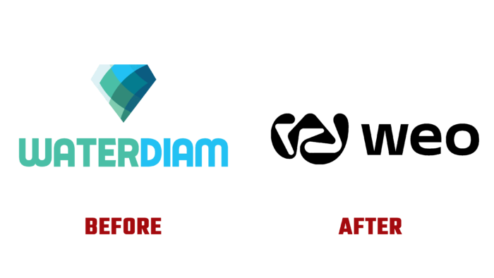
The brand was founded by the Swiss Center for Electronics and Microtechnology in the field of chemical-free water purification. Many scientific experiments and tests have been conducted over the last 40 years to prove that Weo biotechnology provides humanity with the purest thirst quencher and dramatically changes the structure of water at the molecular level. By consuming this product, a person strengthens his immune system and can effectively fight the aging process at the cellular level. An important feature of the development was using a reusable container in which the product is poured, which reduces the negative impact on the environment.
The water bottle is equipped with a built-in conditioning system and the ability to connect it to the electronic application Weo, which allows activating the purification system, providing even simple tap water with the unique properties of water Weo. This technology has reflected its main objectives and features in its own visual identity, which has been given an original brand name and a modern demonstration.
The visualization has managed to reflect an important feature of the brand – it belongs to the promising scientific achievements. This is facilitated by the designed original sign, which repeats the structure of the molecule and additional graphic elements in the form of figures reminiscent of microscope glasses and various forms of organic origin. The application of high style in the formation of the image only strengthened the effect of perception of the brand as a serious scientific achievement. At the same time, the mode of messaging was chosen as conversational, requiring no special skills or means for its expression. The technical language was muted to the point of being understood by the average user. The demonstration of the scientific advances by which the applications are communicated was created using understandable images.
The text module of the logo is created with accent elements, such as the monogram “w,” which has an incredible appeal due to its somewhat oddity – the presence of many curves. At the same time, it can effectively serve as a sign for both the research center itself and the product it creates. In Pangram Pangram’s Cirka font, which is also used in the applications, the word block itself is quite beautiful, easy to read and remember, despite its peculiarities. It provides recognition and personality for the entire brand.


