


![]() West Bromwich Logo PNG
West Bromwich Logo PNG
The emblem of a sports club often features a bird. The “West Bromwich” logo is no exception. The image of a thrush on a hawthorn branch, the mascot, the official uniform colors, and the club’s full name became the primary elements of the visual graphics.
The club was created by workers of Salter’s Spring Works in West Bromwich in 1878. Initially, the team was called West Bromwich Strollers, and the name West Bromwich Albion has been in use since 1880. Albion is an area in West Bromwich where the team members live or work.
In 1885, the team gained professional status. Then, in the 1880s, the “Throstles” reached the FA Cup final four times, and after three unsuccessful attempts, they finally won the trophy in 1888. That same year, the team became one of the twelve founders of the Football League. In 1901, it moved to the Hawthorns stadium.
The nickname “Throstle” is considered official because the club’s emblem features a thrush. Initially, the bird was depicted sitting on the crossbar of a goal, but now, instead of a crossbar, the “West Bromwich” emblem depicts a hawthorn branch, hence the other nickname “The Hawthorns.”
Football fans often refer to the “West Bromwich” players as the Baggies. According to its history, the club’s origins date to the late 19th and early 20th centuries, when its main supporters were workers at the nearby West Brom enterprise, Salter’s Spring Works. They attended their favorite team’s games in baggy trousers, and rival fans began calling the players “Baggies.” According to another version, leather bags were used to collect ticket money, which led to the nickname. There’s also a third theory that the nickname arose because the players played in baggy shorts.
Meaning and History
![]()
Throughout the club’s existence, two logos can be highlighted: the first featured a thrush perched on a crossbar, while the second was more modern, incorporating the club’s name, West Bromwich Albion, and replacing the crossbar with a hawthorn branch. The thrush was a constant symbol throughout the club’s history. But why did the designers depict this particular bird? If you have a songbird on your coat of arms, please create a beautiful legend about how the animal appeared on the “West Bromwich” emblem. At WBA, children are told that the thrush often sits on the goal’s crossbar. That’s why it was depicted until the thicket was replaced with hawthorn leaves. It’s known that these birds prefer to nest in Crataegus bushes, which grow on the site of the future stadium. Adults know another version: in the early 20th century, footballers often visited a brothel where the girls kept a thrush in a cage. That’s how the symbol was chosen. In the 1930s, birds were kept at the stadium, and, according to legend, their beautiful singing was believed to indicate that the team would win.
Today, the “West Bromwich Albion” emblem remains the same, featuring a songbird perched on a hawthorn branch, enclosed within a shield. At the top of the shield, the club’s full name is displayed in blue on a white background. The second part of the shield features blue and white stripes, indicating the colors and design of the football players’ uniforms.
Most of the “West Bromwich Albion” logos feature a thistle. According to legend, this bird often flew onto the football field during matches. Another version says it was kept in a brothel that the footballers visited.
What is West Bromwich?
“West Bromwich Albion” is a successful participant in the EFL Championship, nicknamed “Throstles” because of its old emblem featuring a bird. The owner and chairman of the board of directors is Chinese businessman Lai Guochuan. The football club has existed since 1878.
1969 – 1972
![]()
The central image of the 1969 emblem is the song Thrush. Secretary Tom Smith first suggested using it as a club badge. Initially (in the 1880s), the bird sat on the goal’s crossbar. In 1900, it was “relocated” to a hawthorn branch. This plant was chosen because it symbolizes the Hawthorns, the stadium where the team moved at the beginning of the new century.
1973
![]()
Designers placed the thistle and branch inside a heraldic shield. The background is adorned with three blue and two white vertical stripes, which refer to the players’ uniforms. Above the club name, “W.B. Albion” is written.
1972 – 1975
![]()
The 1972 emblem features a yellow outline of the bird on a light green background, resembling the lowercase letter “a.”
1970s
![]()
This is another variation of the striped shield. The background pattern consists of six blue and seven white lines. In the center, a white bird is depicted sitting on a long branch with leaves and berries.
1975 – 1986
![]()
In 1975, a simplified logo with the team’s initials was introduced. The letters “WBA” are embroidered in blue on a white background. The font imitates calligraphic handwriting with curls.
1986 – 1994
![]()
The club restored the 1969 emblem, changing only the color scheme. The leaves became dark green. The twigs and branches were black, with white outlines. Below is the inscription “W.B.A.,” the abbreviated full name of the club.
1994 – 2000
![]()
At the end of the 1990s, the players’ uniforms were adorned with the coat of arms of the West Bromwich district council. It features a deer, a knight’s helmet, feathers, and a scroll with the motto “Labor omnia vincit” (“Labor conquers all”).
2000 – 2001
![]()
The logo, featuring the shield and thrush, returned, as it did in the 1970s. The bird is again sitting on a hawthorn branch against a white-and-light-blue background. All elements in the logo are outlined in black.
2001 – 2006
![]()
This is another variation of the 1970s emblem. A light blue border surrounds the shield, and the thrush is white with blue outlines.
2006 – 2011
![]()
In 2006, West Bromwich Albion changed the design of the club badge. The team’s full name appeared on the emblem for the first time. The leaves and berries replaced the hawthorn branch. The bird looks more realistic thanks to modern graphics and accurate color reproduction. The shield is placed in a silver frame.
2011 – today
![]()
In the latest version of the logo, several shades of blue and brown became darker. The silver frame around the shield on the logo disappeared.
Font and Colors
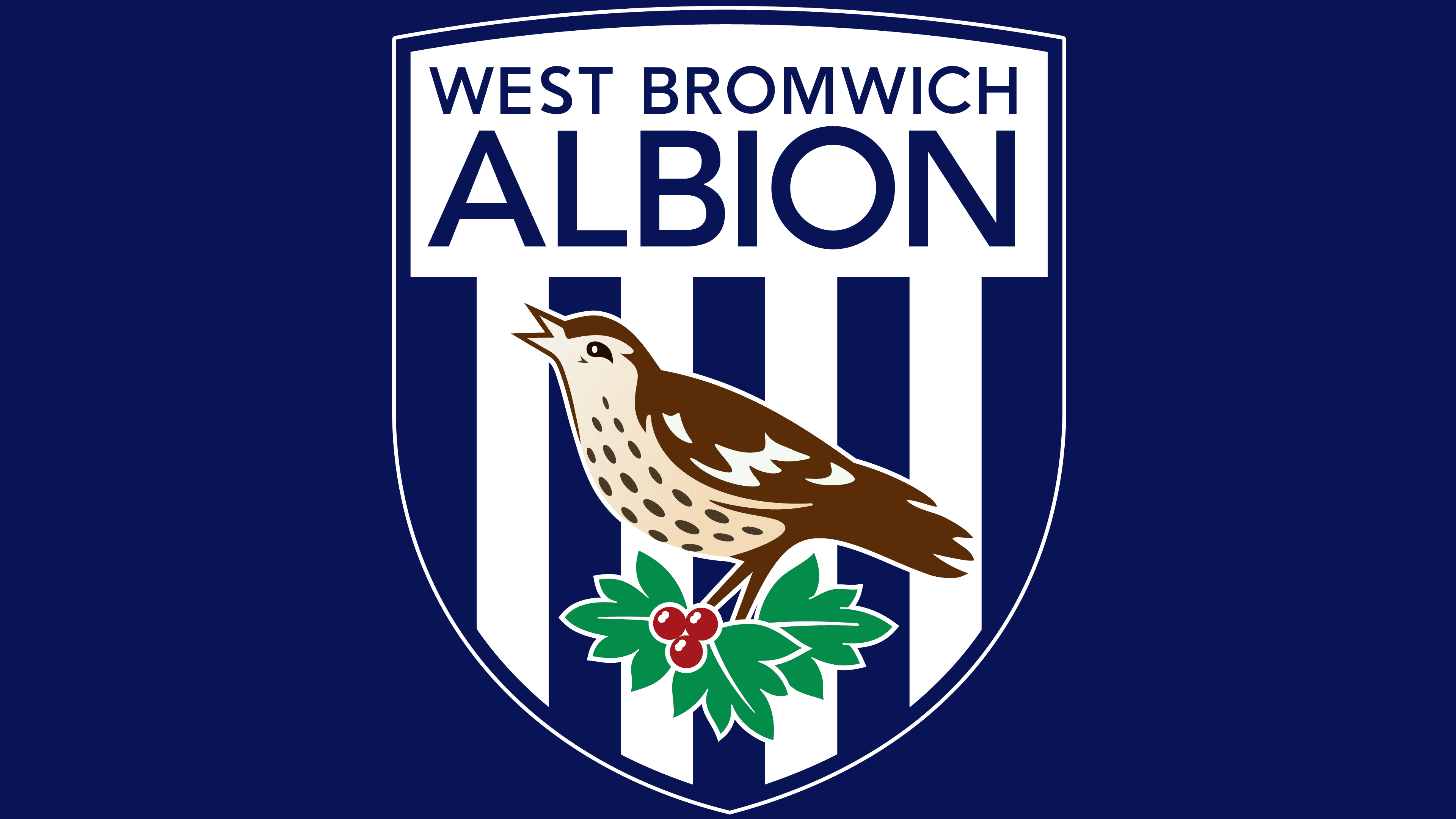
The “West Bromwich” trademark is oriented towards nature, with a focus on plants and animals. In contrast, football symbolism is completely absent. The inscription with its name, located above the thrush, is the only indication of the logo’s affiliation with the club. On the other hand, designers adhered to heraldic traditions, depicting a bird against a heraldic shield, a shape popular among sports teams. Therefore, even though attention is focused on the thorn and the hawthorn, the main requirements for the emblem design are met as well.
The inscription “WEST BROMWICH ALBION” is divided into two parts. The first fragment, “WEST BROMWICH,” is at the very top and written in medium-sized letters. The word “ALBION” is located slightly below. It is separated from the city’s name and highlighted with enlarged letters. The differences end there: the Avenir Medium font is presented in both cases. Typographer Adrian Frutiger developed this geometric sans-serif.
The logo’s dominant colors are dark blue (#122F67) and white (#FFFFFF), which comprise the shield’s base. They are complemented by red (#A41B22), green (#149557), and brown (#755031), which denote berries, leaves, and the song thrush. The brown color is uneven, with a gradient that features several shades.