


![]() West Ham Logo PNG
West Ham Logo PNG
British football features the club “West Ham,” whose logo reflects its history. The heraldic shield depicts the coat of arms of the founder’s enterprise. The club’s symbolism is a tribute to its history and respect for “West Ham,” demonstrating professionalism.
West Ham United was founded in 1895 as Thames Ironworks FC, a team created for workers of a shipbuilding company in East London. Supported by Arnold Hills, the club reflected its industrial roots from the start.
In 1896, the team joined the London League and won it in 1897–1898, then entered the Southern League in 1898 and turned professional. In 1900, it was reorganized as West Ham United, separating from the company while retaining its identity as a working-class club.
In 1919, the club joined the Football League, and in 1923, it reached the FA Cup final in the first match at Wembley, losing to Bolton but gaining national attention.
Through the early 20th century, West Ham moved between divisions while building a reputation for developing players. In 1958, it returned to the top division under Ted Fenton.
The 1960s marked a peak period. Players like Bobby Moore, Geoff Hurst, and Martin Peters formed the core of England’s 1966 World Cup-winning team. At club level, West Ham won the FA Cup in 1964 and the European Cup Winners’ Cup in 1965.
In later decades, results were inconsistent, with movement between divisions. In 1980, the club won the FA Cup again, defeating Arsenal.
As a founding member of the Premier League in 1992, West Ham maintained a place in English top football, with occasional relegations.
In 2016, the club moved from Upton Park to the Olympic Stadium, ending over a century at its historic ground.
Meaning and History
![]()
West Ham has a rich history of changing logos, but over such a long period, the emblem has always had two constant elements: hammers and a castle, which was added a little later. Only the shape and color of the emblem have changed over time.
There’s no official confirmation of exactly when the crossed hammers became the symbol of “West Ham.” The “Thames Ironworks” players, who played as a team for the shipbuilding yard, were disbanded in 1900 and later resurrected as the professional club “West Ham United.” The earliest publication with an image of the hammers was the program of the official match season 1910/11. The team’s shipyard emblem featured the British flag, with the inscriptions “T.I.W.” at the top and “FC” at the bottom.
The first image of a fortress appeared in official pre-match programs in the 1921/22 season. The castle, located at the home arena’s site, is traditionally associated with Henry VIII’s second wife, Anne Boleyn. However, this opinion is not based on facts, and the fortress was a building known as Green Street House. It was built in 1544, eight years after the execution of Anne Boleyn. Two years later, to emphasize the beauty of the local surroundings, a pair of towers was added to the house, one of which long survived after World War II (demolished in 1955).
After the 1957/58 season, when “West Ham” returned to the top English league, the fortress and crossed hammers began to be depicted separately on the emblem. The first image of the fortress and hammers as a single composition appeared in a 1958 souvenir guide. It was dedicated to the club’s return to the First Division.
Another interesting detail of the “West Ham” emblem is the shape of the shield. It resembles a part of the Royal British Navy’s armored frigate named Warrior, built by the Thames Ironworks in 1860.
Over the following decades, the crest underwent numerous changes, but the basic concept (crossed hammers against a fortress backdrop) remained unchanged.
![]()
In the late 1990s, the “West Ham” logo was significantly reworked and updated by the London design agency Springett Associates. The fortress became yellow and wider, with fewer cross-shaped openings. The spike-like ends of the towers also disappeared. Designers changed the shape of the hammers, edging, and other minor details to give the logo more solidity. Thus, the modern “West Ham” was born.
In 2014, the Premier League club “West Ham” unveiled a new emblem to mark its move to the Olympic Stadium. Based on the club’s traditional colors, the new “West Ham” emblem has a simpler, more streamlined shape. The iconic image of the hammers was placed in the center of the emblem and painted in gold.
The fortress from the previous emblem disappeared, and the inscription “West Ham United” moved to the inner part and is now at the top. The inscription “London” at the bottom of the emblem is a new detail not present in the previous version of the “West Ham” logo.
Most “West Ham United” logos feature crossed hammers and Boleyn Castle. This concept has never changed: designers only experimented with shapes and colors.
What is West Ham?
“West Ham” is a British professional football club based in Stratford. It was founded in 1895 as a sports team of a shipbuilding company and has achieved great success, competing in the Premier League. Its original name was Thames Ironworks, which it left in 1900. English footballers are also nicknamed The Hammers, as their emblem features two hammers.
1895 – 1900
![]()
In the year of its foundation, the club presented its debut emblem: an image of the British flag with the inscriptions “T I W” (top) and “F C” (bottom). This is the abbreviation of the football club’s name, Thames Iron Works.
1923 – 1950
![]()
After rebranding, the central image of the logo became crossed riveting hammers used in shipbuilding. Similar hammers are found in the coat of arms of the county of West Ham and the London borough of Newham.
The tools reflect the club’s origin as the amateur team Thames Iron Works, founded by shipbuilders. The tools are surrounded by a burgundy ring and placed at the center of a stylized blue shield.
1950 – 1952
![]()
The new logo lacks the ring. The hammers are enlarged and occupy all the free space. The shield is a quadrilateral with a burgundy border.
1952 – 1958
![]()
In 1952, the shield design on the logo changed again. It resembles the 1923 version but with a double stroke.
1958 – 1963
![]()
The 1950 emblem returned. Now, the logo is surrounded by a wide blue line.
1963 – 1968
![]()
The blue color on the logo completely disappeared. The background became white.
1964 – FA-Cup-Final
![]()
During the FA Cup final, the club used a logo with hammers and Boleyn Castle. According to legend, it was inhabited by Anne Boleyn, the second wife of Henry VIII. At the bottom of the triangular shield is the inscription “Wembley 1964,” the stadium’s name, and the year of the match.
1965 – E.C.W.C.Final
![]()
The logo dedicated to the E.C.W.C. final is similar to the previous one. The only difference is the inscription “E. C. W. C. Wembley 1965.”
1968 – 1975
![]()
The hammers and castle on the emblem are inside a quadrilateral heraldic shield with a sharp base. Below is a curved ribbon with the team’s name.
1975 – 1980
![]()
Key elements of the 1975 emblem are a large burgundy circle, a white castle with rounded towers, and blue hammers crossed in the center.
1980 – 1983
![]()
The 1968 version of the logo returned. The sketch now has more angles and straight lines. The color palette is yellow and blue.
1983 – 1985
![]()
For two years, minimalist symbols were used: a burgundy square with white crossed hammers and the abbreviation “W.H.U.F.C.”
1985 – 1987
![]()
An identical copy of the 1980 emblem.
1987 – 1999
![]()
The emblem’s color palette changed. The background inside the shield became red.
1999 – 2016
![]()
In 1997, designers at Springett Associates revised the logo’s style. The castle increased, and the triangular tops of the towers disappeared. A white inscription, “West Ham United,” appeared on the ribbon under the shield.
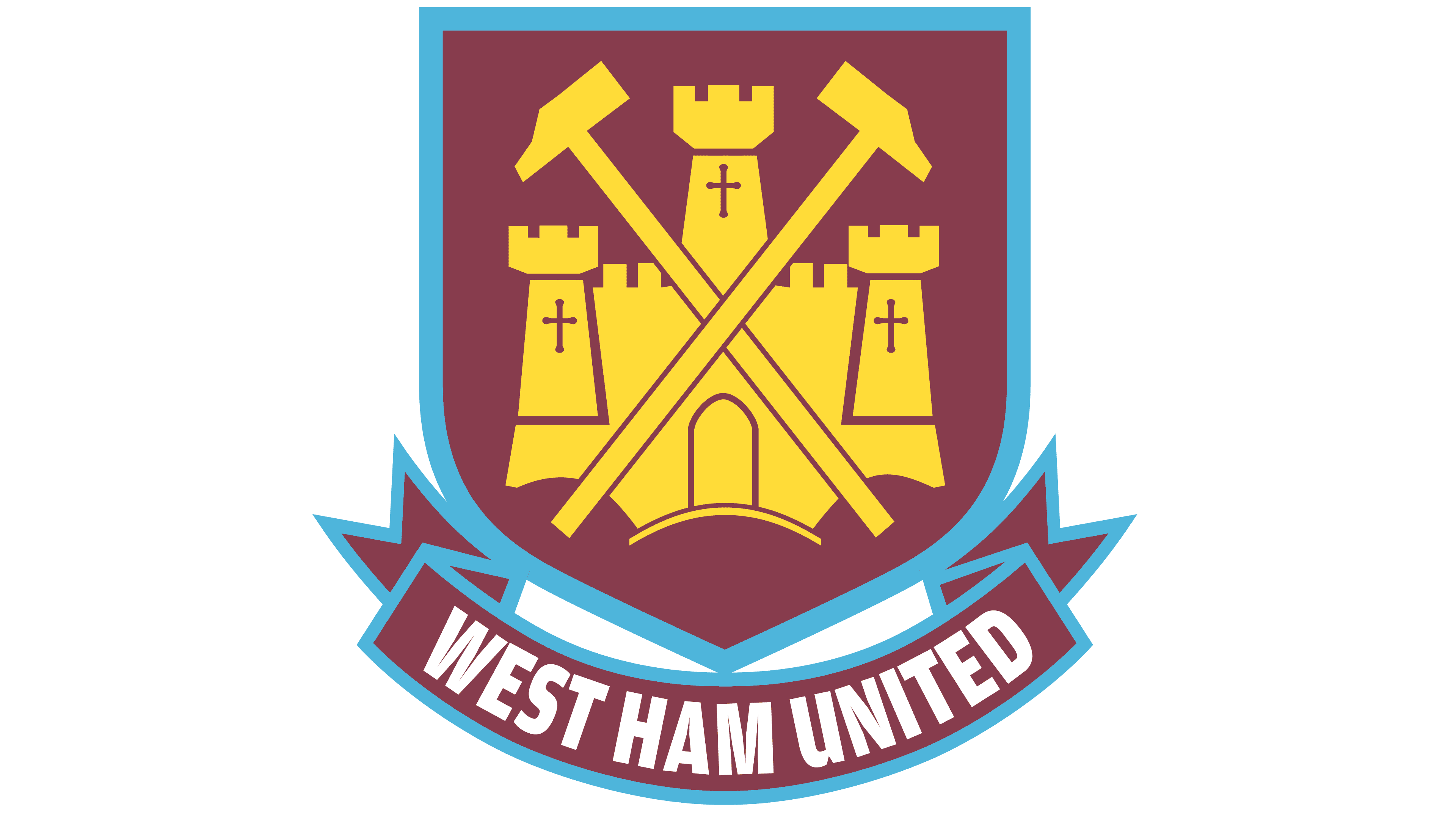
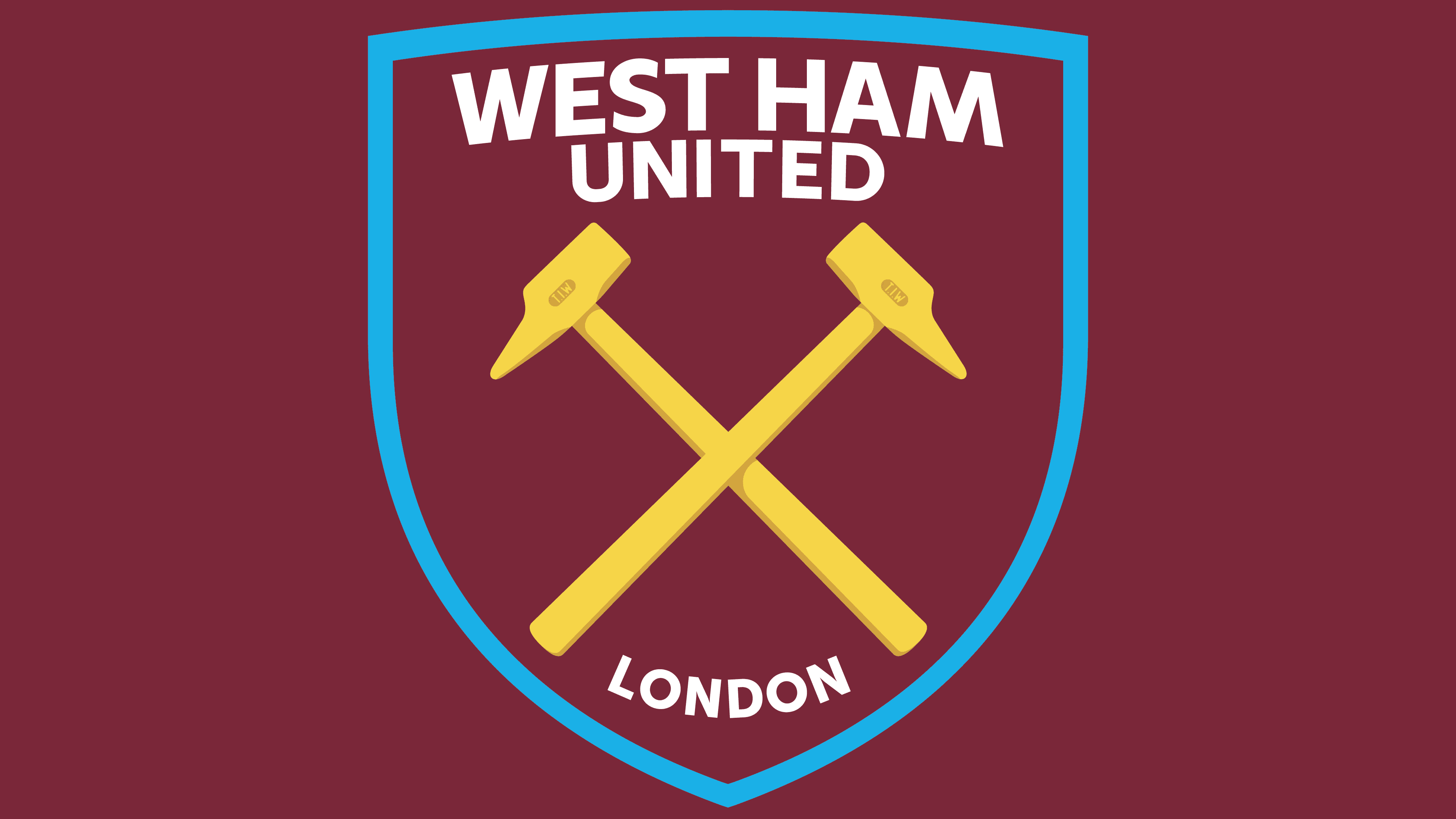
2016 – today
![]()
The new logo lacks Boleyn Castle because the club moved from “Boleyn Ground” to the London Olympic Arena. There are only hammers with the engraving “T.I.W.” on the sides, a tribute to the Thames Iron Works company. The team’s name moved to the top of the shield. Below is the word “London.” According to legend, the shape of the shield matches the cross-section of the frigate H.M.S. Warrior, but real diagrams prove otherwise.
Font and Colors
The two crossed hammers on the “West Ham” logo are symbols of the distant past. They remind us that the club was once called Thames Iron Works and was founded by shipyard workers. However, the designers could have chosen any other shipbuilding-related element. Why exactly riveting hammers? They didn’t appear by accident: such signs can be found on the area’s coat of arms, which means they are a national treasure. So here, we see not so much a historical as a political context.
The inscription “WEST HAM UNITED LONDON” is as integral an element of the logo as the crossed hammers. It is divided into two parts: the team’s full name is at the top, and the word “LONDON” is in the bottom corner of the shield. To draw attention to them, designers used the Futura Bold Condensed font, a geometric sans-serif created in the distant past by German typographer Paul Renner.
Special attention was paid to selecting the color palette. They combined dark burgundy (#7A263A), yellow (#F3D459), light blue (#1BB1E7), and white, and in some cases, even combined several shades of one color to create a gradient.