 Western Union Logo PNG
The Western Union Logo is the brainchild of Love Street and Company, an innovative Los Angeles-based creative agency. A central feature of this innovative design is a dynamic monogram that evokes calligraphic strokes moving in various directions. This abstract form, coupled with a powerful sans-serif font, imparts a sense of modernity and dynamism to the logo, making it stand out and be easily remembered.
This unique monogram plays an important role in the emblem’s symbolism, representing both movement and interconnectedness. The varied angles within the monogram suggest a comprehensive network of connections spanning the world, underscoring the brand’s global reach.
One of the defining elements of the logo is its color – a vibrant and bold yellow, a shade that has become synonymous with the brand. This shade lends the logo an unmistakable identity, immediately linking it to the brand it represents.
Through its design, the emblem aims to showcase a focus on digital interfaces and technologies, aligning with contemporary consumers’ expectations. The innovative design, together with the signature color and dynamic form, conveys the brand’s commitment to constant movement, global connectivity, and modern solutions.
Western Union began almost 170 years ago as the New York and Mississippi Valley Printing Telegraph Company. Its first business was based on telegraph communication, a technology that connected people, companies, and transactions across the United States. In 1856, the company adopted the Western Union name, reflecting its aim to link the eastern and western parts of the country through one communication network.
In its early decades, Western Union became associated with national communication and money transfers. The invention of the telephone by Alexander Graham Bell in 1876 challenged the telegraph industry. It forced the company to revise its business model. Western Union shifted its focus toward messaging services, especially telegrams, while maintaining its role in long-distance financial transfers.
In the 20th century, Western Union expanded outside the United States. It acquired a British telegraph company, strengthened its position in Europe, and later opened offices in South America, Asia, and Africa. In the 1930s, the company introduced a national payment card, allowing customers to buy now and pay later. In the 1960s, its Telex service gave businesses a faster channel for exchanging information across borders.
As technology changed, Western Union moved from telegraph lines and telegrams toward digital payments. Customers in more than 200 countries and territories gained access to its services online, through mobile channels, and through agent locations. The company’s history moved through several stages: telegraph operator, telegram network, payment-card provider, Telex service, and global money-transfer platform.
Meaning and History
The company’s brand identity is deeply rooted in reliability and global reach. The logo’s design, a timeless sphere with meridians and parallels, illustrates the global scale of its operations and the multitude of connections it facilitates daily. It represents the company’s commitment to connecting people across the globe, regardless of distance.
The brand’s yellow color scheme further strengthens this identity, portraying a balance of dependability and optimism. Yellow symbolizes positivity, aligning with the optimism that accompanies the possibilities enabled by financial transactions.
The identity of this multinational financial services firm is rooted in its rich history and enduring commitment to reliable, secure, and efficient money transfers. Its brand elements, including the color scheme and logo, reflect these core values, contributing to its global recognition and trustworthiness.
What is Western Union?
The Western Union Company, a financial services giant based in Denver, Colorado, has a rich history that speaks to its standing in today’s financial world. The story of this American multinational firm is one of constant innovation and adaptation in response to the evolving needs of global customers. Since its establishment, the company has evolved from a 19th-century telegraph operator to a 21st-century leader in cross-border digital and retail money transfers and payments. Over time, this firm has adapted to the evolving technological landscape, introducing new services and money transfer methods, always staying ahead of the curve.
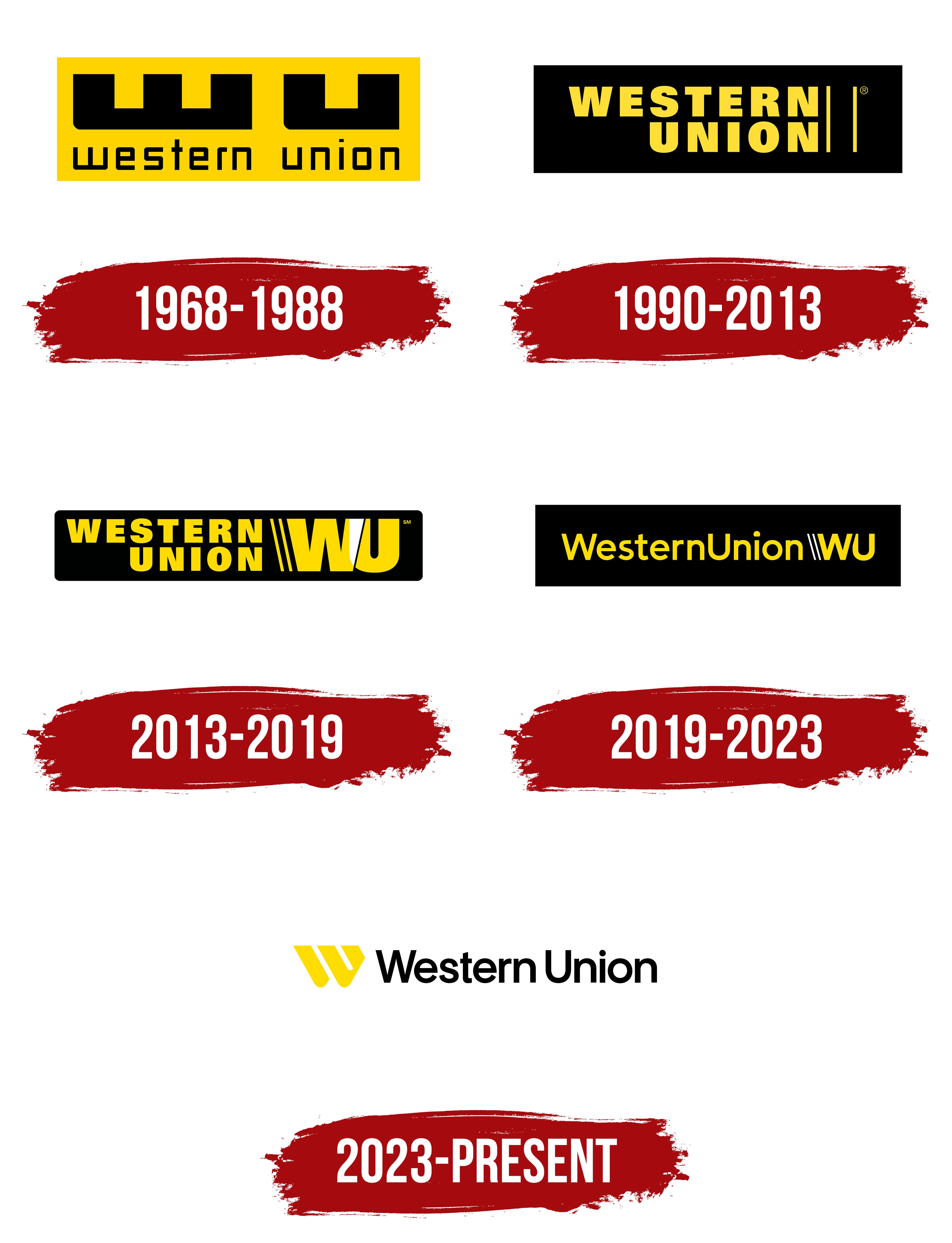
1968 – 1988

1990 – 2013

2013 – 2019

2019 – 2023

2023 – today