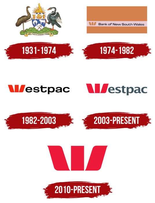
The emblem immediately shows the organization’s globality, solidity, and reliability. The Westpac logo demonstrates the powerful financial flow through bank accounts. Due to this, it grows and spreads, creating branches.
Westpac: Brand overview
Meaning and History
The bank was conceived as the largest financial institution in the vast Western Pacific area. First, BNSW (short for Bank of New South Wales) opened branches in Australia and almost all of Oceania. This event stretched over the 19th and 20th centuries. In 1850, his branch opened in Moreton Bay; a year later – in the city of Victoria; in 1861 – in New Zealand; in 1877 – in the southern part of the country; and 1883, in the western part. Then, the bank moved to a more expanded expansion: in 1901, it opened a Fiji branch in 1910 – in Papua New Guinea and Tasmania. Thus, the Westpac logo gained widespread recognition.
This was followed by several mergers and offshoots, which were not reflected in the corporate logo. Its current name was and remained its basis. It comprises two parts indicating this financial institution’s region: “WESTern” and “PACific.” In some cases, the full name was used; in others, it was abbreviated. In total, there are five basic logos in the bank’s history.
What is Westpac?
Westpac is the oldest bank in Australia, dating back to 1817. It is one of the big four financial institutions in the country.
1931 – 1974
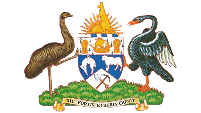
Initially, management approved a custom-made monochrome heraldic coat of arms. It is not a symbol of any kind or dynasty but a specially designed paraphernalia. The logo depicts a classic shield – narrow at the bottom and wide at the top. It is surrounded by national talismans: emu (an ostrich on the left), a swan (on the right), and a kangaroo (above). On the shield itself, there are tools and various elements that emphasize the bank’s close connection with the state’s heritage and its roots.
1974 – 1982
The modern BNSW identity era began in 1974 with the institution’s full name on an orange-and-sand canvas. On the white horizontal stripe inside the rectangle is the inscription “Bank of New South Wales.” It consists of black sans-serif characters. The initial letters in words are uppercase; the rest are lowercase. To the left of the text is the original icon – a stylized “W.” The symbol has three wide petals: one straight (vertical rectangle) and two obliques (two lateral parallelograms).
1982 – 2003
In 1982, the Bank of New South Wales merged with the Commercial Bank of Australia to create the Westpac Business Corporation. The new name was used for the first time in the emblem, formed from the merger of “western” and “pacific.” There are no other verbal designations. The graphic part is expressed by “W” – a single red character with three wide stripes. In this case, it replaces the capital letter. The other characters are lowercase, squat, and slightly elongated horizontally.
2003 – today
In this version, the developers have corrected the font: they removed the letters’ elongation and replaced the black color with dark gray. Also, they added brightness to the icon, so it is now a rich red. This logo has not been canceled and is still used by the bank.
2010 – today
In parallel with the existing emblem, another one was approved—the same but simplified. Designers deleted the word “Westpac” because, by the beginning of 2010, banking symbols had become well-recognizable even without it. This minimalistic “W” version is mainly intended for advertising materials; therefore, it is created in several samples: white on red, black on white, and volumetric (in 3D format).
Westpac: Interesting Facts
Westpac Banking Corporation, often just called Westpac, is one of the top banks in Australia and a big name in financial services in the Australasia region.
- Early Days: Founded in 1817 as the Bank of New South Wales, Westpac is Australia’s first and oldest bank, showcasing over 200 years of financial history and ability to adapt through changing economic times.
- Becoming Westpac: In 1982, after buying the Commercial Bank of Australia, it changed its name to Westpac, blending “Western” and “Pacific” to reflect its broader ambitions.
- Banking Firsts: Westpac has introduced several banking milestones in Australia, including the first credit card in 1974 and the first online banking service in 1994.
- Worldwide Reach: Beyond Australia, Westpac operates in New Zealand, Asia, and the Pacific and has offices in global finance hubs like London and New York, offering a wide range of services.
- Eco-Friendly Efforts: It’s known for its commitment to the environment, with goals like funding renewable energy projects and achieving net-zero emissions in its lending by 2050.
- Rescue Helicopter Sponsorship: Westpac sponsors rescue helicopter services, providing vital search and rescue operations and underscoring its community support.
- Boosting Financial Knowledge: The bank has rolled out many programs to improve financial literacy across different age groups and sectors, helping people make better financial choices.
- Tech Innovations: Westpac has been a leader in adopting mobile banking and contactless payments, focusing on improving customer experience with technology.
- Diversity and Inclusion: It supports various groups, including women in business, indigenous communities, and the LGBTIQ+ community, through dedicated programs.
- Bicentenary Foundation: Marking its 200th anniversary in 2017, Westpac started a scholarship fund to support education and leadership development for the nation’s future benefit.
Westpac’s story reflects its longstanding presence, focus on innovation, commitment to sustainability and community, and efforts in financial education, solidifying its role as a leading bank in Australia and globally.
Font and Colors
The Australian bank’s visual identity moved from complex forms to simple ones. While the debut logo featured many local talismans and heraldry, now everything is limited to one stylized letter. “W” looks like a blossoming flower with three petals: straight central and oblique lateral. They are made of geometric shapes—a rectangle and a parallelepiped, which do not touch at the bottom.
The first lettering is made in a typeface reminiscent of Urbano Bold Expanded but with an elongated “f” hook. The next version of the logo contains the bank’s name with a font close to the commercial version of Foundation Sans Bold Extended and the free “FunZone Regular.” The letter “t” with an elongated right part is individually beaten. The current emblem consists of the word “Westpac” written in the typeface Lucida Sans Demi. It was created by design studio Charles Bigelow & Kris Holmes and was first published in URW ++.
The color palette is more stable. It has always consisted of bright shades of red with a bias in orange or scarlet. They have now added dark gray and black to it. The background is usually white, but versions are also available with a black backing.
FAQ
What are the colors of the Westpac logo?
The logo uses red as its main color, which has always been a key part of the brand’s uniqueness. The letter W in the logo takes center stage and defines the brand’s design, font, photography style, and background.
In addition to the primary red, the brand uses a vibrant palette of accent and tertiary colors. These colors enhance the logo and other brand elements, creating a more dynamic and engaging look across media and platforms.
This use of color helps the brand remain strong and recognizable while allowing for flexibility and innovation in visual communications.
What services does Westpac provide?
The brand offers a wide range of services to meet customer needs:
- Telephone Banking: Manage accounts, pay bills, and conduct transactions over the phone.
- ATMs: Withdraw cash, deposit money, check account balances, and perform other basic tasks anytime.
- Banking Services: Savings and checking accounts, personal and business loans, credit cards, and mortgages.
- Premium Wealth Management Services: Investment advice, portfolio management, and personalized financial planning.
- Financial Education: Resources and programs to improve financial literacy and provide guidance on budgeting, saving, and investing.
- Assistance with a Deceased Estate: Help in managing the financial affairs of a deceased loved one, including closing accounts and transferring funds.
- Family Banking: Joint accounts, family savings plans, and products to help families manage their finances together.
- Alumni Banking: Specialized services for graduates of specific institutions with unique benefits and offers.
These services ensure that customers have access to the financial tools and support they need for day-to-day banking and planning for the future.
What does the Westpac logo mean?
The logo is a red symbol with three multi-directional stripes forming a stylized W. This W represents the bank’s name and is a key part of the logo. The color red shows the brand’s strong presence in the financial sector and symbolizes energy, stability, and vision. This simple and bold design makes the logo easily recognizable and memorable.
Is Westpac in New Zealand?
Yes, it operates in New Zealand. The Australian bank-owned brand has a strong presence there, offering a full range of banking services such as savings and current accounts, loans, credit cards, and investment services.
In New Zealand, it serves individuals, families, and businesses with tailored financial solutions. It supports the local community and economy through various initiatives and programs. Through its strong presence, the brand provides customers in New Zealand with access to comprehensive and reliable banking services.
What is the meaning of Westpac?
The name combines the words “Western” and “Pacific.” This name shows the bank’s roots and the area of its activities. Starting in Australia, the brand is associated with the Western Pacific region, including countries such as Australia and New Zealand.
The name reflects the brand’s focus on this area and its promise to meet the financial needs of people and businesses. Combining these words, the brand highlights its strong ties to the Western Pacific in providing regional banking services.
What is the purpose of Westpac?
The company’s main goal is to help people in Australia and New Zealand achieve success. The brand supports the financial well-being of individuals, families, and businesses through a wide range of banking and financial services.
It offers products and services for various financial needs, from everyday banking to financial planning and wealth management. The company is committed to promoting economic growth and stability by providing clients with the tools and resources to achieve their financial goals.

