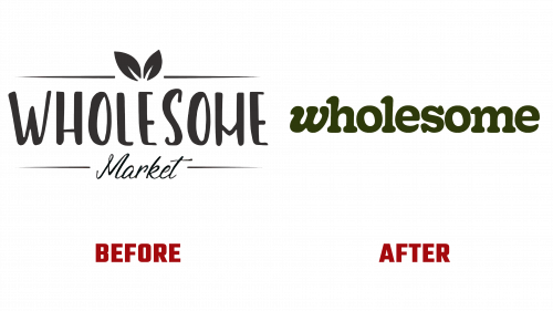
Wholesome, an emerging Australian online retailer and community-focused membership platform, recently unveiled its new brand identity, reflecting its dedication to eco-friendly and health-conscious consumerism. Since its inception in 2020 by Alene Sullivan and Jerry Li, Wholesome has made significant strides as a provider of sustainable pantry and household items, gaining popularity for its affordability and commitment to environmentally responsible products.
The rebranding, spearheaded by Sydney-based design firm Universal Favourite, is aimed at strengthening Wholesome’s position in the direct-to-consumer (DTC) market. The revamped brand, including a new Wholesome logo, embodies the company’s ethos of promoting personal health, sustainability, and community awareness. The rebranding initiative extends beyond the logo, encompassing a comprehensive overhaul of the brand’s visual language to suit its modern retail approach better.
Wholesome’s former logo, which resonated more with a small-scale farmer’s market vendor, has been transformed into a design that projects a contemporary and professional image. The new Wholesome logo adopts a minimalist approach, utilizing the typeface Gooper for its wholesome and inviting appeal. The standout feature of the logo is its singular italicized “w,” which, though not deeply conceptual, offers a distinctive flair to the overall design.
The brand’s identity is further enhanced by the use of Gooper in Semi-condensed width and lighter weight across various applications, endowing the brand with a unique and instantly recognizable character. This is complemented by the incorporation of Maison Neue and Kale Sans Mono typefaces, resulting in a solid and harmonious typographic framework. The spot illustrations employed by the brand, with their slightly imperfect lines, echo the style of Gooper, contributing an additional layer of charm and personality.
Wholesome’s new branding divides its identity to effectively communicate the various facets of its business, ensuring versatility and coherence in different contexts. This is particularly evident in the brand’s Instagram presence, where the dynamic and engaging qualities of the new design are on full display. The brand’s choice of a bright mint color, central to the new color palette, is eye-catching and supported by a spectrum of lower saturation colors, reinforcing Wholesome’s commitment to environmental friendliness.
The rebranding of Wholesome extends beyond aesthetics, reflecting the company’s core mission. In a remarkable move, for every new membership, Wholesome donates one to an Australian in need, targeting firefighters, students, nurses, and teachers. This gesture highlights the brand’s focus on making a positive impact, both in terms of individual health and broader community well-being.
In summary, Wholesome’s refreshed visual identity, marked by the new Wholesome logo, resonates perfectly with its mission to offer products that benefit both the planet and its inhabitants. The brand’s emphasis on sustainability, inclusivity, and support for Australian communities and products is vividly captured in its engaging and renewed branding.


