In late April of this year, the online store Wiggle, which sells gear and clothing for outdoor activities, was temporarily closed for maintenance. The reason was a total overhaul of its visual identity to better align with the demands of modern users. At the same time, the brand improved some of the website’s functionality.
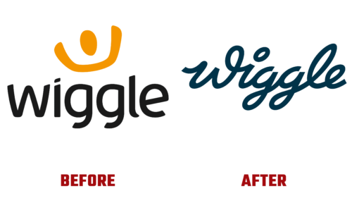
The company revealed its refreshed store appearance on social media, accompanied by the slogan “New look. New logo. New energy.” The design was implemented on April 25 and showcased a modernized color scheme. The familiar black and orange palette was replaced with green – the color of safety and vast opportunities. Moreover, the website now operates much faster to serve its customers better.
As a result, the largest online bicycle store in Europe has undergone a radical transformation. It is now simpler, lighter, more accessible, and closer to users, as highlighted by the updated branding. The basic configuration of the logo features a text-based symbol with an italicized name, executed in a font that imitates fluid handwriting. For this, lowercase bold glyphs were chosen.
The inscription is cohesive and follows the contours of a complex bicycle track (top view). Even the dot above the “i” resembles a roundabout or a stadium track. This approach has two conceptual interpretations.
- First: The logo indicates that the website sells high-performance and high-speed bicycles for various purposes.
- Second: The icon demonstrates the limitless possibilities of the modernized store – its quick responsiveness to visitor requests.
Although Wiggle’s symbol has already been updated, company representatives report that work on the website continues, and a complete redesign will take some more time. The new emblem marks the first step towards a successful future.


