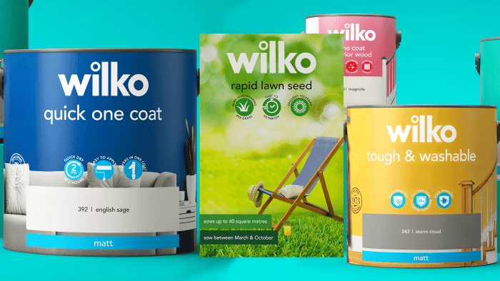
Creative agents from Free The Birds have unveiled the new brand identity for UK retail chain Wilko.
The brand begins a new stage in its life with an attractive, bright appearance. We decided to refresh the appearance, improve communication with customers and fill everything that the brand is wearing with paints – we improved the packaging, typography, and, in general, the brand’s architecture.
A logo will be placed at the top of any product because of the product’s name. According to design experts, it should be at the forefront of the competent arrangement of graphic elements for the adequate perception of the product. Introduce a pictogram system to make it easier to read and convey the unique benefits of products. This will make it easier to see meaningful information both on the shelf in the store and digitally on the website.
Also, nine labels were presented for different product lines, which will differentiate products, and at the same time, unite under the Wilko brand. A total of 15,000 warehousing units will be released under the labels and will implement a visual strategy.
In general, speaking about the new corporate style, one should note a positive attitude, brightness of graphic elements, a variety of visual magnets that attract the consumer and remain in the memory for a long time. For example, exaggeration of vowels in product names and labels design. This becomes an integral part of the brand and promotes easy perception and better memorization.
Bright colors have been chosen that do not sparkle but please the eye. This will not remain unnoticed by the target audience, and with the new packaging design, Wilko products will quickly leave the shelves for a home to dear customers.


